一、基本步骤
-
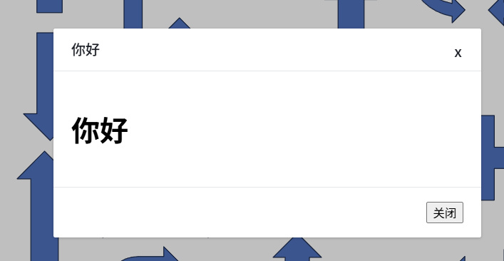
1、最终运行效果
-
2、具体代码实现
<template><Teleport to="body"><Transition name="modal-fade"><div class="modal" ref="modalRef" v-show="visible" tabindex="-1" @keyup.esc="onEsc()"><div class="mask" @click="onClickMask()"></div><Transition name="modal-zoom" @afterLeave="contentVisible = false" @before-enter="contentVisible = true"><div class="modal-content" v-show="visible" :style="contentStyle"><div class="modal-header"><template v-if="isHeader"><slot name="title"></slot></template><template v-else>{{ title }}</template><span class="close-btn" v-if="closeButton" @click="close()">x</span></div><div class="modal-body"><slot v-if="contentVisible"></slot></div><div class="modal-footer" v-if="isFooter"><slot name="footer"></slot></div></div></Transition></div></Transition></Teleport> </template><script lang="js" setup> import { computed, defineProps, nextTick, ref, watch ,useSlots} from 'vue';const isHeader = !!useSlots().title; const isFooter = !!useSlots().footer; const props = defineProps({title: {type: String,default: '',},visible: {type: Boolean,required: true,},width: {type: Number,default: 480,},closeButton: {type: Boolean,default: true,},closeOnClickMask: {type: Boolean,default: true,},closeOnEsc: {type: Boolean,default: true,},contentStyle: {type: Object,default: () => ({}),}, });const modalRef = ref();const emit = defineEmits(['update:visible', 'closed']);const contentVisible = ref(false);const contentStyle = computed(() => {return {width: props.width + 'px',...(props.contentStyle || {}),}; });watch(() => props.visible,() => {if (props.visible) {nextTick(() => modalRef.value.focus());}} );const close = () => {emit('update:visible', false);emit('closed'); };const onEsc = () => {if (props.visible && props.closeOnEsc) close(); };const onClickMask = () => {if (props.closeOnClickMask) close(); }; </script><style lang="scss" scoped> .modal, .mask {top: 0;left: 0;width: 100%;height: 100%;z-index: 5000; }.modal {position: fixed;display: flex;justify-content: center;align-items: center;outline: 0;border: 0; }.mask {position: absolute;background: rgba(0, 0, 0, 0.25); }.modal-content {z-index: 5001;background: #fff;border-radius: 2px;overflow: hidden;box-shadow: 0 1px 3px rgba(0, 0, 0, 0.2);.modal-header {width: 100%;height: 48px;padding: 0 20px;box-sizing: border-box;font-size: 16px;font-weight: 500;color: #1d2129;line-height: 48px;border-bottom: 1px solid #e5e6eb;position: relative;display: flex;flex-direction: row;align-items: center;.close-btn {width: 20px;height: 20px;display: flex;justify-content: center;align-items: center;position: absolute;top: 16px;right: 16px;cursor: pointer;}}.modal-body {padding: 20px;box-sizing: border-box;}.modal-footer {border-top: 1px solid #e5e6eb;padding: 16px 20px;display: flex;flex-direction: row;justify-content: flex-end;align-items: center;} }.modal-fade-enter-active {animation: modal-fade-enter 0.25s both ease-in; } .modal-fade-leave-active {animation: modal-fade-leave 0.25s both ease-out; } .modal-zoom-enter-active {animation: modal-zoom-enter 0.25s both cubic-bezier(0.4, 0, 0, 1.5); } .modal-zoom-leave-active {animation: modal-zoom-leave 0.25s both; }@keyframes modal-fade-enter {from {opacity: 0;} } @keyframes modal-fade-leave {to {opacity: 0;} } @keyframes modal-zoom-enter {from {transform: scale3d(0.3, 0.3, 0.3);} } @keyframes modal-zoom-leave {to {transform: scale3d(0.3, 0.3, 0.3);} } </style> -
3、使用组件的时候
<Modal title="导出" :visible="!!dialogForExport" @closed="closeExportDialog()"><template #title>你好</template><h1>你好</h1><template #footer><button @click="dialogForExport = false">关闭</button></template></Modal>