1. Pandas绘图
- Series和DataFrame都有一个用于生成各类图表的plot方法
- Pandas的绘图时基于Matplotlib,可以快速实现基本图形的绘制,复杂的图形还是需要用Matplotlib
# 导包
import numpy as np
import pandas as pd
import matplotlib.pyplot as plt
2. 折线图
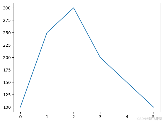
2.1 Series图表
s = pd.Series([100,250,300,200,150,100])
s
s.plot()
<Axes: >
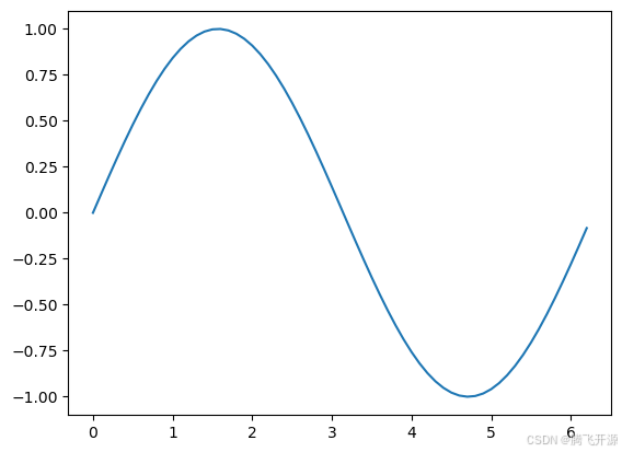
- 画正弦曲线
# sin曲线
x = np.arange(0,2*np.pi,0.1)
xy = np.sin(x)s = pd.Series(data=y,index=x)
ss.plot()
<Axes: >
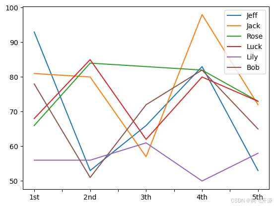
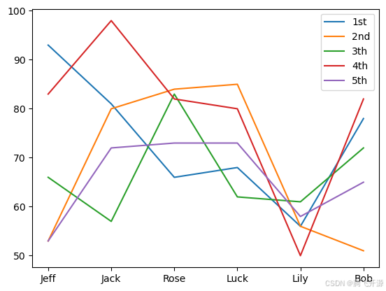
2.2 DataFrame图表
- 图例的位置可能会随着数据的不同而不同
data = np.random.randint(50,100,size=(5,6))
index =["1st","2nd","3th","4th","5th"]
columns = ["Jeff","Jack","Rose","Luck","Lily","Bob"]
df = pd.DataFrame(data=data,index=index,columns=columns)
df
| Jeff | Jack | Rose | Luck | Lily | Bob | |
|---|---|---|---|---|---|---|
| 1st | 93 | 81 | 66 | 68 | 56 | 78 |
| 2nd | 53 | 80 | 84 | 85 | 56 | 51 |
| 3th | 66 | 57 | 83 | 62 | 61 | 72 |
| 4th | 83 | 98 | 82 | 80 | 50 | 82 |
| 5th | 53 | 72 | 73 | 73 | 58 | 65 |
# 每一列一根线
df.plot()
<Axes: >
# 每一行一根线
df.T.plot()
<Axes: >
3. 柱状图和条形图
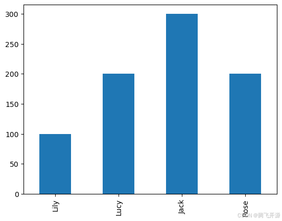
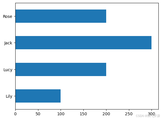
3.1 Series柱状图示例,kind = ‘bar’/‘barh’
s = pd.Series(data=[100,200,300,200])
s.index = ["Lily","Lucy","Jack","Rose"]
"""
kind : strThe kind of plot to produce:- 'line' : line plot (default)- 'bar' : vertical bar plot- 'barh' : horizontal bar plot- 'hist' : histogram- 'box' : boxplot- 'kde' : Kernel Density Estimation plot- 'density' : same as 'kde'- 'area' : area plot- 'pie' : pie plot- 'scatter' : scatter plot (DataFrame only)- 'hexbin' : hexbin plot (DataFrame only)
"""
# 柱状图
s.plot(kind="bar")
<Axes: >
# 条形图
s.plot(kind="barh")
<Axes: >
df = pd.DataFrame(data=np.random.rand(10,4))
# 第一种方式
df.plot(kind="bar")
<Axes: >

# 第二种方式
df.plot.bar()
<Axes: >
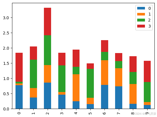
# 是否堆叠
df.plot.bar(stacked=True)
<Axes: >
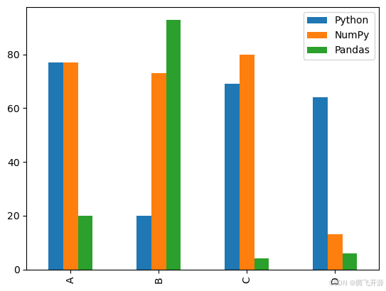
3.2 DataFrame柱形图示例
data = np.random.randint(0,100,size=(4,3))
index = list("ABCD")
columns = ["Python","NumPy","Pandas"]
df = pd.DataFrame(data=data,index=index,columns=columns)
df
| Python | NumPy | Pandas | |
|---|---|---|---|
| A | 77 | 77 | 20 |
| B | 20 | 73 | 93 |
| C | 69 | 80 | 4 |
| D | 64 | 13 | 6 |
df.plot(kind="bar")
<Axes: >
df.plot(kind="barh")
<Axes: >

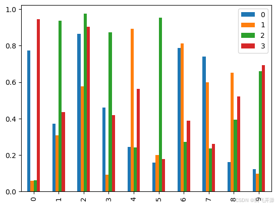
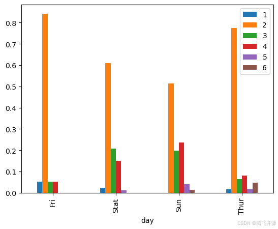
3.3 聚会规模可视化项目
- 读取文件 tips.csv,查看每天各种聚会规模的比例
- 求和 df.sum(),注意灵活使用 axis
- df.div():获取数 DataFrame 和其他元素的浮点除法
tips = pd.read_csv("11_Pandas绘图_tips.csv")
tips
| day | 1 | 2 | 3 | 4 | 5 | 6 | |
|---|---|---|---|---|---|---|---|
| 0 | Fri | 1 | 16 | 1 | 1 | 0 | 0 |
| 1 | Stat | 2 | 53 | 18 | 13 | 1 | 0 |
| 2 | Sun | 0 | 39 | 15 | 18 | 3 | 1 |
| 3 | Thur | 1 | 48 | 4 | 5 | 1 | 3 |
把day作为行索引
tips2 = tips.set_index("day")
tips2
| 1 | 2 | 3 | 4 | 5 | 6 | |
|---|---|---|---|---|---|---|
| day | ||||||
| Fri | 1 | 16 | 1 | 1 | 0 | 0 |
| Stat | 2 | 53 | 18 | 13 | 1 | 0 |
| Sun | 0 | 39 | 15 | 18 | 3 | 1 |
| Thur | 1 | 48 | 4 | 5 | 1 | 3 |
求每天的聚会规模
day_sum = tips2.sum(axis=1)
day_sum
day
Fri     19
Stat    87
Sun     76
Thur    62
dtype: int64
每天各种聚会规模的比例
tips3 = tips2.div(day_sum,axis=0)
tips3
| 1 | 2 | 3 | 4 | 5 | 6 | |
|---|---|---|---|---|---|---|
| day | ||||||
| Fri | 0.052632 | 0.842105 | 0.052632 | 0.052632 | 0.000000 | 0.000000 |
| Stat | 0.022989 | 0.609195 | 0.206897 | 0.149425 | 0.011494 | 0.000000 |
| Sun | 0.000000 | 0.513158 | 0.197368 | 0.236842 | 0.039474 | 0.013158 |
| Thur | 0.016129 | 0.774194 | 0.064516 | 0.080645 | 0.016129 | 0.048387 |
tips3.plot(kind="bar")
<Axes: xlabel='day'>
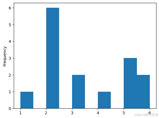
4. 直方图
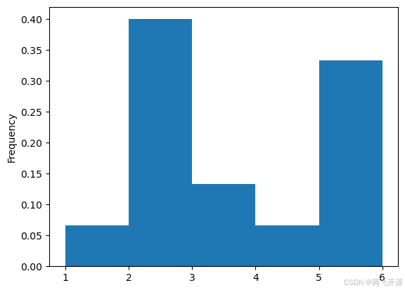
4.1rondom生成随机百分比直方图,调用hist方法
- 柱高表示数据的频数,柱宽表示各组数据的组距
- 参数bins可以设置直方图方柱的个数上限,越大柱宽小,数据分组越细致
- 设置density参数为True,可以把频数转换为概率
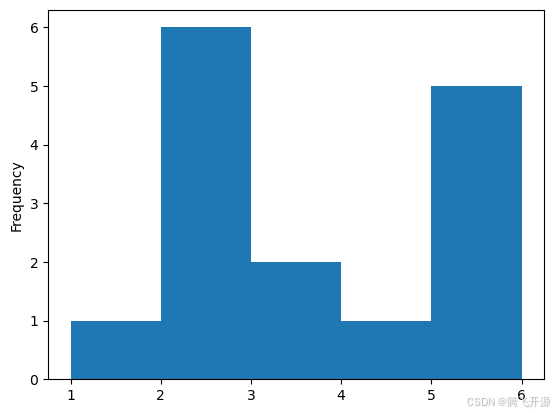
s = pd.Series([1,2,2,2,2,2,2,3,3,4,5,5,5,6,6])
s.plot(kind="hist")
<Axes: ylabel='Frequency'>
# bins=5 表示分为5组
s.plot(kind="hist",bins=5)
<Axes: ylabel='Frequency'>
# density:频数转换为概率
s.plot(kind="hist",bins=5,density=True)
<Axes: ylabel='Frequency'>
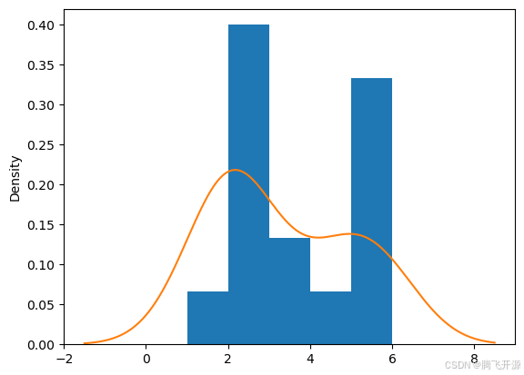
4.2 kde图:核密度估计,用于弥补直方图由于参数bins设置的不合理导致的精度缺失问题
# kde图:核密度估计
s.plot(kind="hist",bins=5,density=True)
# 可以结合上面的直方图一起显示,效果更好
s.plot(kind="kde")
<Axes: ylabel='Density'>
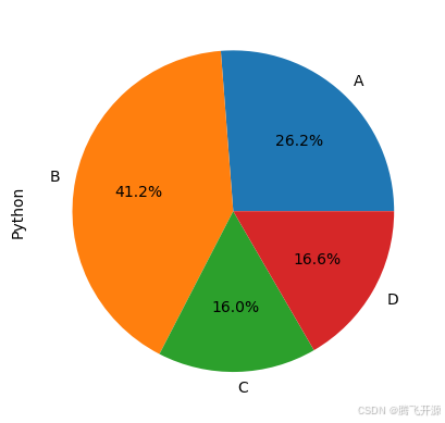
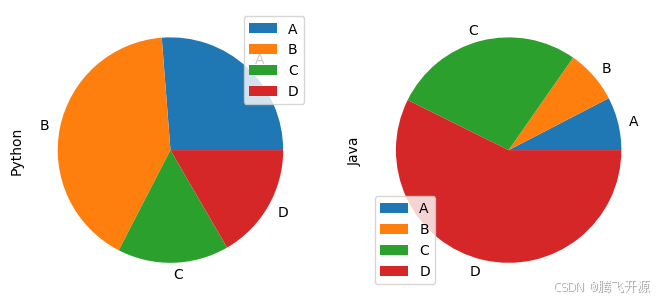
4. 饼图
- 主要是用来描述占比
df = pd.DataFrame(data=np.random.rand(4,2),index=list("ABCD"),columns=["Python","Java"])
df
| Python | Java | |
|---|---|---|
| A | 0.540495 | 0.100629 |
| B | 0.848605 | 0.101815 |
| C | 0.328714 | 0.361827 |
| D | 0.342602 | 0.757760 |
# 画饼图,autopct:显示百分比占比
df["Python"].plot(kind="pie",autopct="%.1f%%")
<Axes: ylabel='Python'>
# subplots:子图
df.plot.pie(subplots=True,figsize=(8,8))
array([<Axes: ylabel='Python'>, <Axes: ylabel='Java'>], dtype=object)
- pandas画图:快速画简单的图
- 复杂的图可以用matplotlib
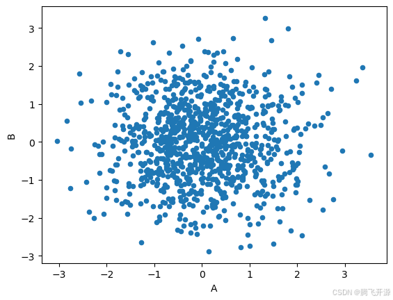
5. 散点图
- 散点图是观察两个一维数据列之间的关系有效方法,DataFrame对象可用
data = np.random.normal(size=(1000,2))
datadf = pd.DataFrame(data=data,columns=list("AB"))
df.head()
| A | B | |
|---|---|---|
| 0 | -0.291759 | 1.550484 |
| 1 | -0.935913 | 0.631661 |
| 2 | -0.883316 | 0.040398 |
| 3 | -0.261854 | -0.745847 |
| 4 | 1.843412 | -0.794660 |
# 一般用于显示两列数据
df.plot(kind="scatter",x="A",y="B")
<Axes: xlabel='A', ylabel='B'>

# 方式二
# x="A":使用A列作为X轴
# y="B":使用B列作为Y轴
df.plot.scatter(x="A",y="B")
<Axes: xlabel='A', ylabel='B'>
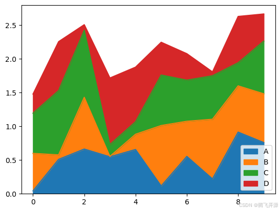
6. 面积图
df = pd.DataFrame(data=np.random.rand(10,4),columns=list("ABCD"))
df
| A | B | C | D | |
|---|---|---|---|---|
| 0 | 0.042626 | 0.555709 | 0.595140 | 0.283489 |
| 1 | 0.510244 | 0.066011 | 0.951883 | 0.726001 |
| 2 | 0.663038 | 0.765964 | 0.992662 | 0.083721 |
| 3 | 0.548282 | 0.005492 | 0.175496 | 0.986480 |
| 4 | 0.656553 | 0.225131 | 0.184848 | 0.810095 |
| 5 | 0.116009 | 0.895350 | 0.748115 | 0.485771 |
| 6 | 0.554334 | 0.519759 | 0.609096 | 0.392924 |
| 7 | 0.221381 | 0.882820 | 0.644140 | 0.057933 |
| 8 | 0.913984 | 0.684586 | 0.342234 | 0.686879 |
| 9 | 0.759520 | 0.721572 | 0.780937 | 0.402259 |
df.plot(kind="area")
<Axes: >

# 堆叠
df.plot.area(stacked=True)
<Axes: >
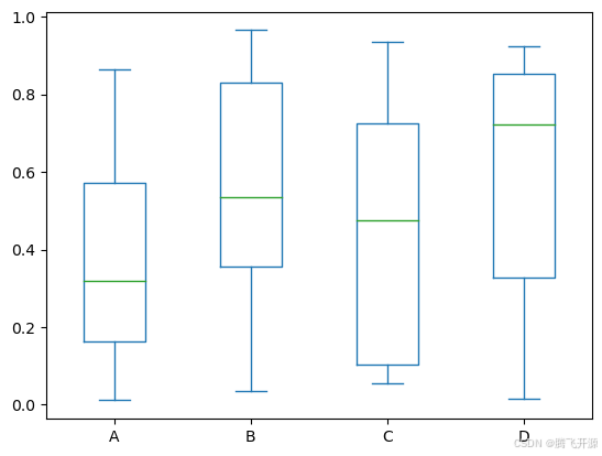
7. 箱型图
df = pd.DataFrame(data=np.random.rand(10,4),columns=list("ABCD"))
df
| A | B | C | D | |
|---|---|---|---|---|
| 0 | 0.677702 | 0.066629 | 0.854846 | 0.856027 |
| 1 | 0.149347 | 0.722314 | 0.085458 | 0.902034 |
| 2 | 0.010958 | 0.035523 | 0.286902 | 0.923202 |
| 3 | 0.864328 | 0.965760 | 0.662281 | 0.774940 |
| 4 | 0.306896 | 0.866431 | 0.720461 | 0.842470 |
| 5 | 0.561130 | 0.371032 | 0.055305 | 0.304149 |
| 6 | 0.157795 | 0.473306 | 0.152361 | 0.673328 |
| 7 | 0.176309 | 0.596900 | 0.935771 | 0.399409 |
| 8 | 0.328981 | 0.916401 | 0.075412 | 0.015534 |
| 9 | 0.574044 | 0.351302 | 0.728465 | 0.227091 |
df.plot(kind="box")
<Axes: >

# 数据显示位置:最大值、75%、50%、25%、最小值
# 圆点:离群点表示异常值
df.plot.box()
<Axes: >