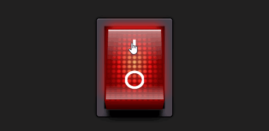
效果演示
这段代码是一个HTML和CSS的组合,用于创建一个3D风格的开关按钮(通常用于控制某些设置的开启或关闭)
HTML
<label class="switch"><input type="checkbox" checked="checked"><div class="button"><div class="light"></div><div class="dots"></div><div class="characters"></div><div class="shine"></div><div class="shadow"></div></div>
</label>
- switch:这是一个包裹整个开关的标签,使用switch类来应用CSS样式。
- checkbox" checked="checked:这是一个复选框,用于控制开关的状态。checked="checked"属性表示复选框默认是选中状态。
- button:这是开关的主要部分,包含了多个子div,每个div都有不同的类,用于创建开关的不同视觉效果。
- light:用于创建开关点亮时的光效。
- dots:用于创建开关上的点状纹理。
- characters:用于创建开关上的字符或图案。
- shine:用于创建开关上的高光效果。
- shadow:用于创建开关上的阴影效果。
CSS
.switch {display: block;background-color: black;width: 150px;height: 195px;box-shadow: 0 0 10px 2px rgba(0, 0, 0, 0.2), 0 0 1px 2px black, inset 0 2px 2px -2px white, inset 0 0 2px 15px #47434c, inset 0 0 2px 22px black;border-radius: 5px;padding: 20px;perspective: 700px;
}.switch input {display: none;
}.switch input:checked + .button {transform: translateZ(20px) rotateX(25deg);box-shadow: 0 -10px 20px #ff1818;
}.switch input:checked + .button .light {animation: flicker 0.2s infinite 0.3s;
}.switch input:checked + .button .shine {opacity: 1;
}.switch input:checked + .button .shadow {opacity: 0;
}.switch .button {display: block;transition: all 0.3s cubic-bezier(1, 0, 1, 1);transform-origin: center center -20px;transform: translateZ(20px) rotateX(-25deg);transform-style: preserve-3d;background-color: #9b0621;height: 100%;position: relative;cursor: pointer;background: linear-gradient(#980000 0%, #6f0000 30%, #6f0000 70%, #980000 100%);background-repeat: no-repeat;
}.switch .button::before {content: "";background: linear-gradient(rgba(255, 255, 255, 0.8) 10%, rgba(255, 255, 255, 0.3) 30%, #650000 75%, #320000) 50% 50%/97% 97%, #b10000;background-repeat: no-repeat;width: 100%;height: 50px;transform-origin: top;transform: rotateX(-90deg);position: absolute;top: 0;
}.switch .button::after {content: "";background-image: linear-gradient(#650000, #320000);width: 100%;height: 50px;transform-origin: top;transform: translateY(50px) rotateX(-90deg);position: absolute;bottom: 0;box-shadow: 0 50px 8px 0px black, 0 80px 20px 0px rgba(0, 0, 0, 0.5);
}.switch .light {opacity: 0;animation: light-off 1s;position: absolute;width: 100%;height: 100%;background-image: radial-gradient(#ffc97e, #ff1818 40%, transparent 70%);
}.switch .dots {position: absolute;width: 100%;height: 100%;background-image: radial-gradient(transparent 30%, rgba(101, 0, 0, 0.7) 70%);background-size: 10px 10px;
}.switch .characters {position: absolute;width: 100%;height: 100%;background: linear-gradient(white, white) 50% 20%/5% 20%, radial-gradient(circle, transparent 50%, white 52%, white 70%, transparent 72%) 50% 80%/33% 25%;background-repeat: no-repeat;
}.switch .shine {transition: all 0.3s cubic-bezier(1, 0, 1, 1);opacity: 0.3;position: absolute;width: 100%;height: 100%;background: linear-gradient(white, transparent 3%) 50% 50%/97% 97%, linear-gradient(rgba(255, 255, 255, 0.5), transparent 50%, transparent 80%, rgba(255, 255, 255, 0.5)) 50% 50%/97% 97%;background-repeat: no-repeat;
}.switch .shadow {transition: all 0.3s cubic-bezier(1, 0, 1, 1);opacity: 1;position: absolute;width: 100%;height: 100%;background: linear-gradient(transparent 70%, rgba(0, 0, 0, 0.8));background-repeat: no-repeat;
}@keyframes flicker {0% {opacity: 1;}80% {opacity: 0.8;}100% {opacity: 1;}
}@keyframes light-off {0% {opacity: 1;}80% {opacity: 0;}
}
- .switch:定义了开关的整体样式,包括背景颜色、尺寸、阴影效果、边框圆角等。
- .switch input:隐藏了复选框,因为我们只想要视觉样式,不想要默认的复选框样式。
- .switch input:checked + .button:当复选框被选中时,改变按钮的3D变换和阴影效果,使其看起来像是被按下。
- .switch .button:定义了按钮的基本样式,包括3D变换、背景渐变等。
- .switch .button::before 和 .switch .button::after:使用伪元素来创建按钮顶部和底部的渐变效果。
- .switch .light、.switch .dots、.switch .characters、.switch .shine、.switch .shadow:定义了按钮内部不同视觉效果的样式。
- @keyframes flicker 和 @keyframes light-off:定义了动画效果,用于模拟灯光的闪烁和关闭。