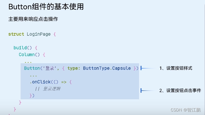
2.0控件-按钮
2.1.控件-文本框

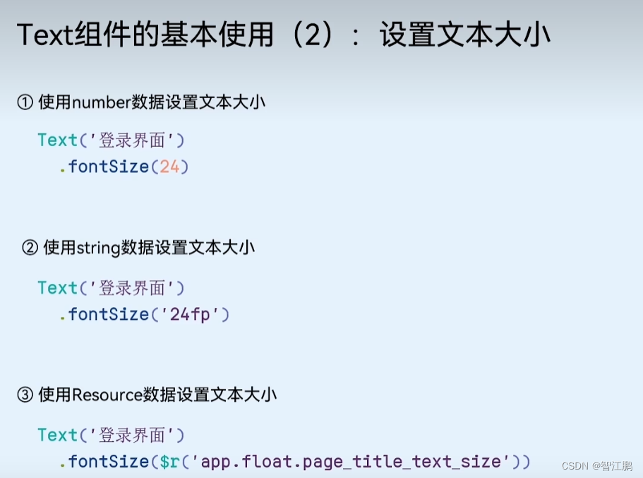
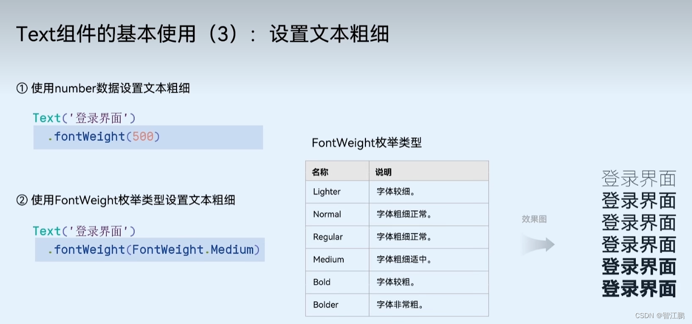
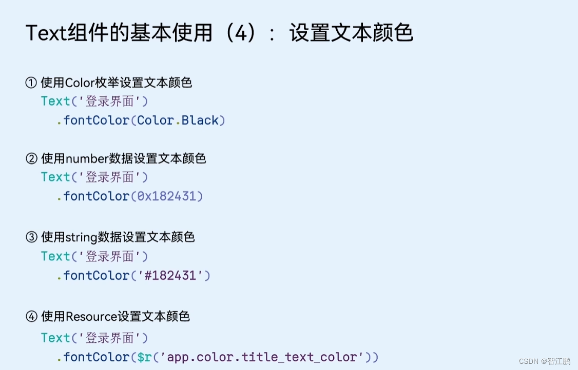
        Text(this.message).fontSize(40) // 设置文本的文字大小.fontWeight(FontWeight.Bolder) // 设置文本的粗细.fontColor(Color.Red) // 设置文本的颜色-------------------------------------------------------------------------
//设置边框Text('待完善').fontColor(Color.Red).padding(5).border({width: 1, // 宽度(必须)color: Color.Red, // 颜色style: BorderStyle.Dashed // 样式(实线、虚线、点线)}).margin({ bottom: 20 })
-------------------------------------------------------------------------
//设置单边框Text('单边框').padding(5)// 单边框,可以通过 left right bottom top 配置四个方向边框.border({width: { left: 1, right: 2 },color: { left: Color.Red, right: Color.Green },style: {left: BorderStyle.Dashed,right: BorderStyle.Dotted}})
---------------------------------------------------------------------// 添加圆角:// 1. .borderRadius(数值) 四个角圆角相同// 2. .borderRadius({ 方位词: 值 }) 单独给某个角设置圆角Text('添加圆角').width(100).height(60).backgroundColor(Color.Orange)// .borderRadius(15) // 通过不同数值,可以设置不同大小的圆角// .borderRadius({//   topLeft: 10,//   topRight: 20,//   bottomRight: 30,//   bottomLeft: 40// }).borderRadius({topLeft: 20,bottomRight: 20})
---------------------------------------------------------------------
//添加背景图片
Text('我是内容文本').fontColor(Color.White).width(300).height(200).backgroundColor(Color.Pink)// backgroundImage(加载的背景图片, 是否平铺ImageRepeat枚举).backgroundImage($r('app.media.flower'), ImageRepeat.XY )
--------------------------------------------------------------------
//设置背景图片的位置// backgroundImagePosition// 1. 传入对象, 设置位置坐标,背景图片的左顶点//    { x: 坐标值, y: 坐标值 }//    注意:坐标值的单位,和宽高的默认单位不同的,显示出来大小会不同//// 2. Alignment 枚举,设置一些特殊的位置(中央、左顶点...)//    Center  TopStart左顶点 TopEnd右顶点 BottomEnd右下...Column() {Text().width(300).height(200).backgroundColor(Color.Pink).backgroundImage($r('app.media.flower')).backgroundImagePosition({x: 400,y: 300}).backgroundImagePosition(Alignment.BottomEnd)}.padding(20)}
------------------------------------------------------
//设置图片位置vp转pxText().width('300vp').height('200vp').backgroundColor(Color.Pink).backgroundImage($r('app.media.flower')).backgroundImagePosition({x: vp2px(150),y: vp2px(100)})
---------------------------------------------------------
//设置背景图是否缩放Text().width(330).height(200).backgroundColor(Color.Pink).backgroundImage($r('app.media.jd_bg')).backgroundImagePosition(Alignment.Center).backgroundImageSize(ImageSize.Cover)// 1. 直接写 宽高尺寸 对象// .backgroundImageSize({//   width: 150,//   // height: 100// })// 2. 设置 背景尺寸 的枚举 ImageSize// (1) Contain: 等比例缩放,展示整张图片,可能会留白// (2) Cover: 等比例缩放,让图片铺满整个容器,不会留白,但是有可能会有部分内容显示不全
2.2 控件-行和列
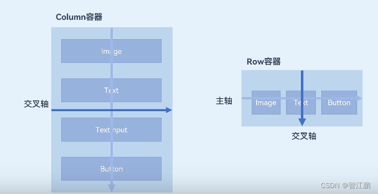
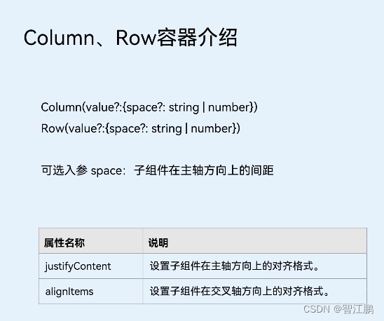
//列 Column() {}.width('100%').height('100%').backgroundColor('#ffe8eeee')//行Row() {}.justifyContent(FlexAlign.SpaceEvenly).width('90%').height(30).onClick(() => {router.pushUrl({url: "pages/LanguageChoice"})})
-------------------------------------------------------------------// 控制组件间的距离,可以给 Column 设置 { space: 间隙大小 }Column({ space: 15 }) {}---------------------------------------------------------------
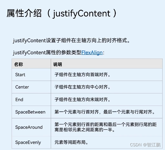
// 设置排布主方向的对齐方式(主轴)// 1. Start (排布主方向)主轴起始位置对齐// 2. Center 主轴居中对齐// 3. End 主轴结束位置对齐// 4. SpaceBetween 贴边显示,中间的元素均匀分布间隙// 5. SpaceAround 间隙环绕 0.5 1 1 1 0.5 的间隙分布,靠边只有一半的间隙// 6. SpaceEvenly 间隙均匀环绕,靠边也是完整的一份间隙// justifyContent(枚举FlexAlign) ctrl+p cmd+p// .justifyContent(FlexAlign.Center)// .justifyContent(FlexAlign.SpaceBetween)// .justifyContent(FlexAlign.SpaceAround).justifyContent(FlexAlign.SpaceEvenly)2.3控件-输入框
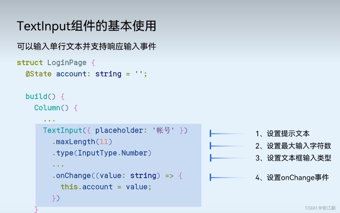
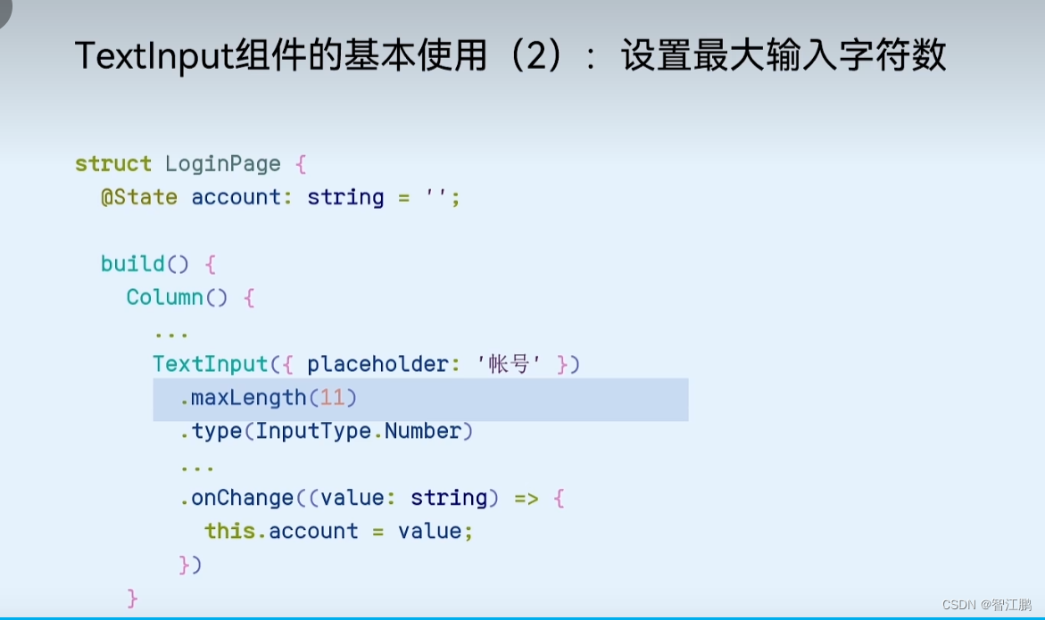
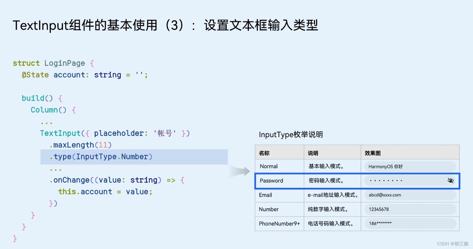
TextInput({placeholder: '请输入密码'}).type(InputType.Password)2.4控件控制-权重
// // layoutWeight 自适应伸缩: 按照[份数权重],分配[剩余空间]Text('左侧').layoutWeight(1).height(40).backgroundColor(Color.Pink)Text('右侧固定').width(80).height(40).backgroundColor(Color.Orange)2.5控件-图片显示
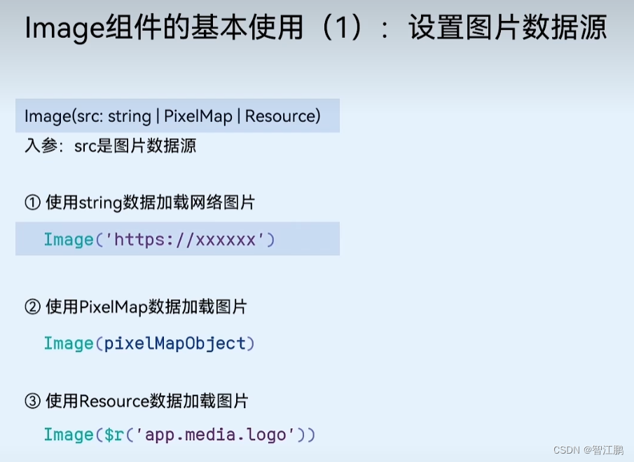
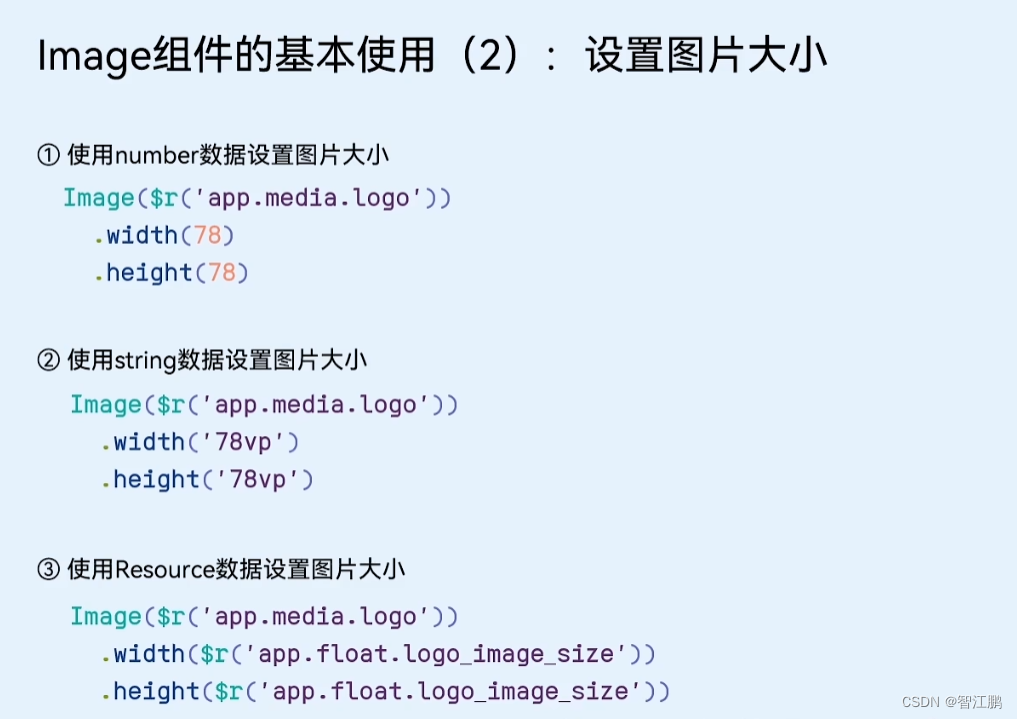
      Image($r('app.media.ic_like')).width(12).fillColor('#999')
----------------------------------------------Image($r('app.media.position_earphone')).width(20).backgroundColor('#55b7f4').borderRadius(10).padding(3).fillColor(Color.White).margin({ left: 6, right: 6 })
2.6控件-角标
Badge({count: 1,position: BadgePosition.RightTop,style: {fontSize: 14,badgeSize: 20,badgeColor: '#fa2a2d'}}) {Image($r('app.media.bg_01')).width(100)}2.7 控件-绝对定位
// position绝对定位:可以控制组件位置,可以实现层叠效果// 语法:// .position({// x: 50,// y: 50// })// 特点:// 1. 相对于父组件左顶点进行偏移(调整位置)// 2. 原本的位置不占了,且可以任意调整位置,不影响其他元素// 后面的组件明显层次更高,会盖住前面的组件// 需求:不动结构的情况下,调整组件的层级 .zIndex(数字)Column() {Text('大儿子').width(80).height(80).backgroundColor(Color.Green).zIndex(3)Text('二儿子定位').width(80).height(80).backgroundColor(Color.Yellow).position({x: 50,y: 50}).zIndex(4)Text('三儿子').width(80).height(80).backgroundColor(Color.Orange).zIndex(2)}.width(300).height(300).backgroundColor(Color.Pink)2.8 控件-AlertDialog
AlertDialog.show({message: '最小值为1, 不能再减了'})2.9 控件设置-设置字符串,颜色,图片等
//设置文字
$r('app.string.EntryAbility_label')
//设置颜色
$r('app.color.main_text')
2.10 控件-Swiper
// Swiper 轮播组件的基本使用// 1. Swiper 包内容// 2. Swiper 设尺寸Swiper() {Image($r('app.media.ic_swiper_xmyp01'))Image($r('app.media.ic_swiper_xmyp02'))Image($r('app.media.ic_swiper_xmyp03'))Image($r('app.media.ic_swiper_xmyp04'))}.width('100%').height(150).loop(true) // 开启循环.autoPlay(true) // 自动播放.interval(5000) // 自动播放间隔.vertical(true) // 纵向---------------------------定制小圆点--------------------------------// Swiper 轮播组件的基本使用// 1. Swiper 包内容// 2. Swiper 设尺寸Swiper() {Text('1').backgroundColor(Color.Orange)Text('2').backgroundColor(Color.Yellow)Text('3').backgroundColor(Color.Brown)}.width('100%').height(200)// 常用属性.loop(true) // 开启循环.autoPlay(true) // 自动播放.interval(5000) // 自动播放间隔.vertical(false) // 横向/纵向// 定制小圆点// .indicator(false).indicator(Indicator.dot().itemWidth(20).itemHeight(20).color(Color.Black).selectedItemWidth(25).selectedItemHeight(25).selectedColor(Color.White))---------------------轮播案例------------------------// 1. Swiper轮播容器 (填入内容)Swiper() {Image($r('app.media.1')).objectFit(ImageFit.Cover)Image($r('app.media.2')).objectFit(ImageFit.Cover)Image($r('app.media.3')).objectFit(ImageFit.Cover)Image($r('app.media.4')).objectFit(ImageFit.Cover)Image($r('app.media.5')).objectFit(ImageFit.Cover)}// 2. 设置尺寸.width('100%').height('100%')// 3. 定制方向和小圆点.vertical(true) // 纵向轮播.indicator(Indicator.dot() // 小圆点样式.color(Color.White).selectedColor(Color.Orange))
2.11控件-Scroll
   // 如果希望内容溢出, 能够滚动Scroll() {Column({ space: 10 }) {ForEach(Array.from({ length: 10 }), (item: string, index) => {Text('测试文本' + (index + 1)).width('100%').height(100).textAlign(TextAlign.Center).backgroundColor(Color.Orange).fontSize(20).fontColor(Color.White).borderRadius(10)})}.padding(10).width('100%')}.width('100%').height(400).scrollable(ScrollDirection.Vertical)-------------------------------常用属性----------------------------------// 如果希望内容溢出, 能够滚动Scroll() {Column({ space: 10 }) {ForEach(Array.from({ length: 10 }), (item: string, index) => {Text('测试文本' + (index + 1)).width('100%').height(100).textAlign(TextAlign.Center).backgroundColor(Color.Orange).fontSize(20).fontColor(Color.White).borderRadius(10)})}.padding(10).width('100%')}.width('100%').height(400).scrollable(ScrollDirection.Vertical) // 设置滚动方向.scrollBar(BarState.Auto) // On一直显示 Off一直隐藏 Auto滑动显示.scrollBarColor(Color.Blue) // 滚动条颜色.scrollBarWidth(5) // 滚动条宽度.edgeEffect(EdgeEffect.Spring) // 滑动效果.onScroll((x, y) => {console.log('已经滑动的距离:', this.myScroll.currentOffset().yOffset)})
----------------------------控制器------------------------------------
Button('控制滚动条位置').margin(20).onClick(() => {
//划到某位置this.myScroll.scrollEdge(Edge.End)})Button('获取已经滚动的距离').onClick(() => {//当前滑动的位置const y = this.myScroll.currentOffset().yOffsetAlertDialog.show({message: `y: ${y}`})})
2.12 控件-Tabs


//基础用法
Tabs() {TabContent() {Text('首页内容') // 有且只能一个子组件}.tabBar('首页') // 配置导航TabContent() {Text('推荐内容') // 有且只能一个子组件}.tabBar('推荐')TabContent() {Text('发现内容') // 有且只能一个子组件}.tabBar('发现')TabContent() {Text('我的内容') // 有且只能一个子组件}.tabBar('我的')}-----------------------------常用属性---------------------------Tabs({ barPosition: BarPosition.Start }) {TabContent() {Text('首页内容') // 有且只能一个子组件}.tabBar('首页') // 配置导航TabContent() {Text('推荐内容') // 有且只能一个子组件}.tabBar('推荐')TabContent() {Text('发现内容') // 有且只能一个子组件}.tabBar('发现')TabContent() {Text('我的内容') // 有且只能一个子组件}.tabBar('我的')}.vertical(false) // 调整导航水平或垂直.scrollable(false) // 是否开启手势滑动.animationDuration(0) // 点击滑动的动画时间
----------------------------基础导航栏-----------------------------
@Entry
@Component
struct Index {// 准备状态, 存储激活的索引@State selectedIndex: number = 0@BuildermyBuilder (itemIndex: number, title: string, img: ResourceStr, selImg: ResourceStr) {// 如果激活的是自己, 图片/文本 都需要调整样式 → 需要区分不同的 tabBarColumn() {Image(itemIndex == this.selectedIndex ? selImg : img).width(30)Text(title).fontColor(itemIndex == this.selectedIndex ? Color.Red : Color.Black)}}build() {Tabs({ barPosition: BarPosition.End }) {TabContent() {Text('购物车内容')}.tabBar(this.myBuilder(0, '购物车', $r('app.media.ic_tabbar_icon_2'), $r('app.media.ic_tabbar_icon_2_selected')))TabContent() {Text('我的内容')}.tabBar(this.myBuilder(1, '我的', $r('app.media.ic_tabbar_icon_3'), $r('app.media.ic_tabbar_icon_3_selected')))}.onChange((index: number) => {// console.log('激活的索引', index)this.selectedIndex = index}).animationDuration(0).scrollable(false)}
}
-----------------------小米中间有个图片导航栏---------------------------------
@Entry
@Component
struct Index {// 准备状态, 存储激活的索引@State selectedIndex: number = 0@BuildermyBuilder (itemIndex: number, title: string, img: ResourceStr, selImg: ResourceStr) {// 如果激活的是自己, 图片/文本 都需要调整样式 → 需要区分不同的 tabBarColumn() {Image(itemIndex == this.selectedIndex ? selImg : img).width(30)Text(title).fontColor(itemIndex == this.selectedIndex ? Color.Red : Color.Black)}}@BuildercenterBuilder () {Image($r('app.media.ic_reuse_02')).width(40).margin({ bottom: 10 })}build() {Tabs({ barPosition: BarPosition.End }) {TabContent() {Text('首页内容')}.tabBar(this.myBuilder(0, '首页', $r('app.media.ic_tabbar_icon_0'), $r('app.media.ic_tabbar_icon_0_selected')))TabContent() {Text('分类内容')}.tabBar(this.myBuilder(1, '分类', $r('app.media.ic_tabbar_icon_1'), $r('app.media.ic_tabbar_icon_1_selected')))// 特殊形状的TabTabContent() {Text('活动内容')}.tabBar(this.centerBuilder())TabContent() {Text('购物车内容')}.tabBar(this.myBuilder(3, '购物车', $r('app.media.ic_tabbar_icon_2'), $r('app.media.ic_tabbar_icon_2_selected')))TabContent() {Text('我的内容')}.tabBar(this.myBuilder(4, '我的', $r('app.media.ic_tabbar_icon_3'), $r('app.media.ic_tabbar_icon_3_selected')))}.onChange((index: number) => {// console.log('激活的索引', index)this.selectedIndex = index}).animationDuration(0).scrollable(false)}
}
2.13控件-List
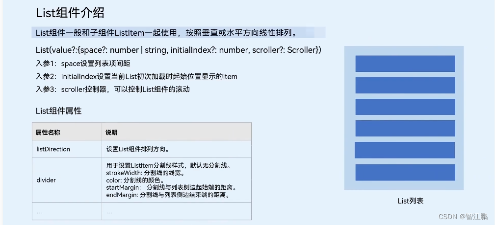


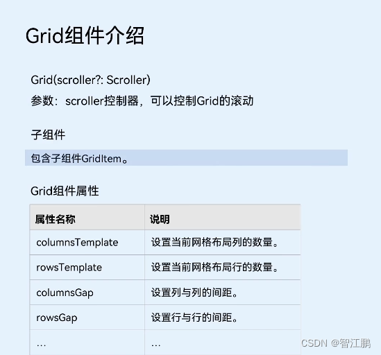
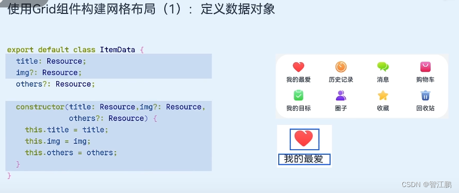
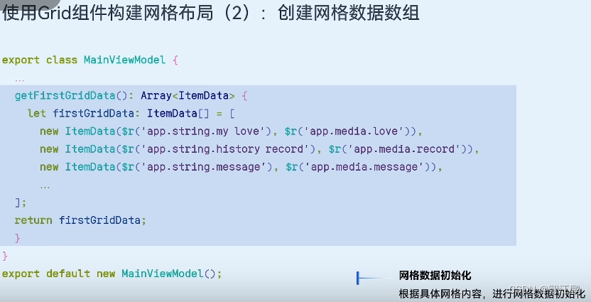
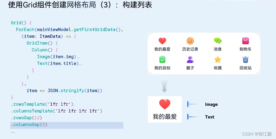
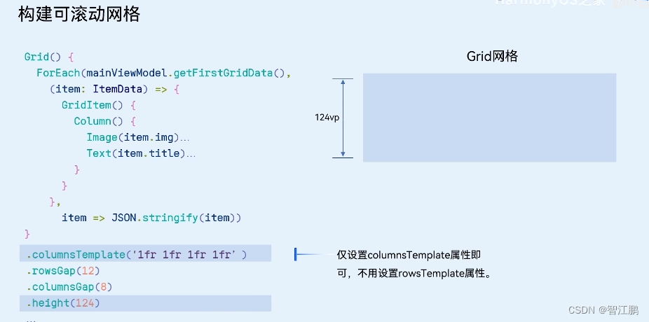
// 中间List() {ForEach(Array.from({ length: 20 }), () => {ListItem() {Row(){}.width('100%').height(100).backgroundColor(Color.Brown)}.padding(10)})}.width('100%').layoutWeight(1) // 让容器高度自适应.backgroundColor(Color.Orange).listDirection(Axis.Vertical) // 调整主轴方向(横向纵向).lanes(3, 5) // 调整 列数 和 间距.alignListItem(ListItemAlign.Center) // 列对齐方式.scrollBar(BarState.Auto) // Auto按需自动显示滚动条// .divider({// strokeWidth: 3, // 线宽// color: Color.Blue, // 颜色// startMargin: 10, // 左边线距离边缘的间隙// endMargin: 10 // 右边线距离边缘的间隙// })2.14控件-Grid
// 1. 定义接口 (每个列表项的数据结构)
interface ImageCount {url: stringcount: number
}@Entry
@Component
struct Index {// 2. 基于接口, 准备数据@State images: ImageCount[] = [{ url: 'app.media.bg_00', count: 0 },{ url: 'app.media.bg_01', count: 1 },{ url: 'app.media.bg_02', count: 2 },{ url: 'app.media.bg_03', count: 3 },{ url: 'app.media.bg_04', count: 4 },{ url: 'app.media.bg_05', count: 5 }]build() {Column() {Grid() {ForEach(this.images, (item: ImageCount, index: number) => {GridItem() {Badge({count: item.count,position: BadgePosition.RightTop,style: {fontSize: 14,badgeSize: 20,badgeColor: '#fa2a2d'}}) {Image($r(item.url)).width(80)}}})}.columnsTemplate('1fr 1fr 1fr').rowsTemplate('1fr 1fr').width('100%').height(300).margin({ top: 100 })Button('立即抽卡').width(200).backgroundColor('#ed5b8c').margin({ top: 50 })}}
}
2.14控件-Video


2.15控件-弹窗


2.16控件-web浏览器


3.3点击事件
Button('点我,显示对话框').onClick(() => {// console.log('消息:', '你好点击事件')// 弹个框AlertDialog.show({message: '你好~ 这是个弹框'})})