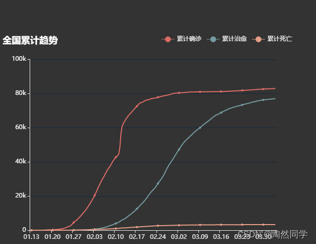
效果:
代码:
<<template><div><div id="left1" style = "height:800px;width:100%"></div></div>
</template><script>
//疫情数据//export default {data() {return {data:{//疫情数据太多 放不下 要的滴滴我}};},mounted() {//初始化echartsvar left1Chart = this.$echarts.init(document.getElementById('left1'))//配置项var option = {//标题title:{text:"全国累计趋势",textStyle:{color:'blue'},left:'left'},//触发类型(就是鼠标移上去 能够显示信息 不配置默认没有)tooltip:{trigger:'axis',axisPointer:{type:'line',                    //坐标轴触发,主要在柱状图,折线图等会使用类目轴的图表中使用。lineStyle:{color:'#7171C6'}}},//图例组件legend:{data:["累计确诊","累计治愈","累计死亡"],left:"right"},//图形位置(就是图例组件的位置)grid:{left:'4%',right:'6%',bottom:'4%',top:50,containLabel:true},//x轴(横)xAxis:[{type:'category',data:[]}],//y轴(竖)yAxis:[{type:'value',//坐标轴刻度标签的相关设置。axisLabel:{color:'blue',fontSize:12,//对y轴数据格式进行处理formatter:function(value){if(value >= 1000){value = value / 1000 + 'k'}return value;}},//y轴线设置显示 默认显示y轴axisLine:{show:true},//与x轴平行的线样式splitLine:{show:true,                  //是否显示分割线lineStyle:{                 //分割线样式color:'#17273B',width:1,type:'solid',}}}],series:[{name:'累计确诊',         //要与图例名字对应type:'line',            //折线图smooth:true,            //平滑曲线显示  data:[]                 //数据区域},{name:"累计治愈",type:'line',smooth:true,data:[]},{name:"累计死亡",type:'line',smooth:true,data:[]}]};//获得疫情数据var chinaDayList = this.data.chinaDayList//遍历每一天的数据for(var day of chinaDayList){console.info(day)//x轴 时间option.xAxis[0].data.push(day.date)//累计确诊option.series[0].data.push(day.confirm)//累计治愈option.series[1].data.push(day.heal)//累计死亡option.series[2].data.push(day.dead)}//使用刚指定的配置项和数据显示图标left1Chart.setOption(option);},methods: {},
};
</script><style lang="scss" scoped></style>