一,效果

二,代码
1,搭个框架
添加一张背景图片,在图片中显示一行文字。
<!DOCTYPE html>
<html lang="en">
<head><meta charset="UTF-8"><meta name="viewport" content="width=device-width, initial-scale=1.0"><title>文字适配背景效果</title><style>.banner {height: 230px;background-image: url(banner.png);background-repeat: no-repeat;background-size: 100% 230px;line-height: 230px;text-align: center;}.title {margin: 0;color: #fff;font-size: 50px;}</style>
</head>
<body>
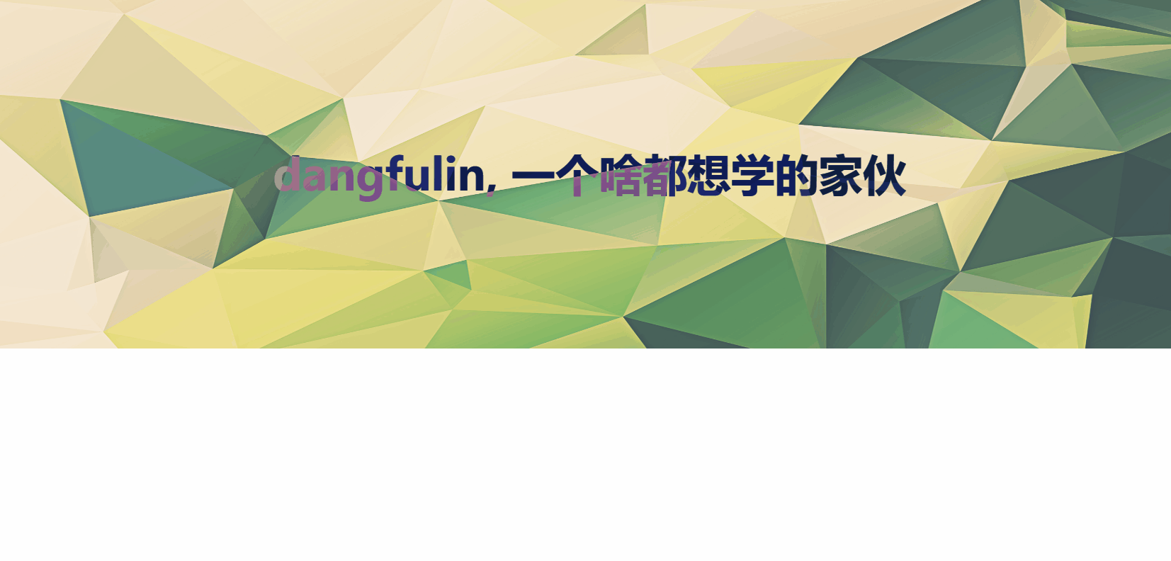
<div class="banner"><h1 class="title">dangfulin, 一个啥都想学的家伙</h1>
</div>
</body>
</html>
- 用
background-image添加了一张图片。 - 然后结合
background-repeat: no-repeat;设置了图片的展示方式。 - 通过
background-size: 100% 230px;简单拉伸图片,让它充满元素。
效果如下:

2,添加动画
鼠标移入后,文字产生偏移动画。
<!DOCTYPE html>
<html lang="en">
<head><meta charset="UTF-8"><meta name="viewport" content="width=device-width, initial-scale=1.0"><title>文字适配背景效果</title><style>.banner {height: 230px;background-image: url(banner.png);background-repeat: no-repeat;background-size: 100% 230px;line-height: 230px;text-align: center;}.title {margin: 0;color: #fff;font-size: 50px;transition: .5s;}.banner:hover .title {transform: translateX(-250px);}</style>
</head>
<body>
<div class="banner"><h1 class="title">dangfulin, 一个啥都想学的家伙</h1>
</div>
</body>
</html>
- 用
transform指定一个平移效果。 - 然后用
transition为动画效果添加一个简单的平滑过度。
效果:

3,产生色差
这里的“文字适配背景”就是让蚊子本身的颜色与背景图片中的颜色产生反差,只需要使用 mix-blend-mode 属性。
<!DOCTYPE html>
<html lang="en">
<head><meta charset="UTF-8"><meta name="viewport" content="width=device-width, initial-scale=1.0"><title>文字智能适配背景效果</title><style>.banner {height: 230px;/*background-image: url(banner.png);*//*background-image: url(banner1.jpg);*//*background-image: url(banner2.jpg);*//*background-image: url(banner3.jpg);*/background-image: url(banner4.jpg);background-repeat: no-repeat;background-size: 100% 230px;line-height: 230px;text-align: center;}.title {margin: 0;color: #fff;font-size: 50px;transition: .5s;mix-blend-mode: difference;}.banner:hover .title {transform: translateX(-250px);}</style>
</head>
<body>
<div class="banner"><h1 class="title">dangfulin, 一个啥都想学的家伙</h1>
</div>
</body>
</html>
通过 mix-blend-mode: difference; 指定元素的内容与元素的直系父元素的内容和元素的背景在混合时产生反差。
三,优化
1,用 js 优化交互:向鼠标移入方向偏移。
<!DOCTYPE html>
<html lang="en">
<head><meta charset="UTF-8"><meta name="viewport" content="width=device-width, initial-scale=1.0"><title>文字智能适配背景效果</title><style>.banner {height: 100%;background-image: url(banner.png);background-repeat: no-repeat;background-size: 100% 90vh;line-height: 400px;text-align: center;position: relative;overflow: hidden;}.title {margin: 0;color: #fff;font-size: 50px;transition: transform .5s;position: relative;mix-blend-mode: difference;}</style>
</head>
<body>
<div class="banner"><h1 class="title">dangfulin, 一个啥都想学的家伙</h1>
</div><script>const banner = document.querySelector('.banner');const title = document.querySelector('.title');const moveDistance = 250; // 移动的固定距离banner.addEventListener('mouseenter', function (event) {const rect = banner.getBoundingClientRect();const centerX = rect.left + rect.width / 2;// const centerY = rect.top + rect.height / 2;const mouseX = event.clientX;// const mouseY = event.clientY;const deltaX = mouseX - centerX;// const deltaY = mouseY - centerY;if (deltaX > 0) {// 向右移动title.style.transform = `translateX(${moveDistance}px)`;} else {// 向左移动title.style.transform = `translateX(-${moveDistance}px)`;}// if (Math.abs(deltaX) > Math.abs(deltaY)) {//     // 水平移动//     if (deltaX > 0) {//         // 向右移动//         title.style.transform = `translateX(${moveDistance}px)`;//     } else {//         // 向左移动//         title.style.transform = `translateX(-${moveDistance}px)`;//     }// } else {//     // 垂直移动//     if (deltaY > 0) {//         // 向下移动//         title.style.transform = `translateY(${moveDistance}px)`;//     } else {//         // 向上移动//         title.style.transform = `translateY(-${moveDistance}px)`;//     }// }});banner.addEventListener('mouseleave', function () {// 鼠标离开时复位title.style.transform = 'translate(0, 0)';});
</script>
</body>
</html>
效果:
2,代码简化:
<!DOCTYPE html>
<html lang="zh-CN">
<head><meta charset="UTF-8"><meta name="viewport" content="width=device-width, initial-scale=1.0"><title>文字适配背景效果</title><style>body {margin: 0;padding: 0;}.banner {height: 230px;background: url(banner.png) no-repeat center/cover;display: flex;justify-content: center;align-items: center;}.title {color: #fff;font-size: 2.5rem;transition: transform 0.5s ease;mix-blend-mode: difference;}.banner:hover .title {transform: translateX(-250px);}@media (max-width: 768px) {.title {font-size: 1.5rem;}.banner:hover .title {transform: translateX(-100px);}}</style>
</head>
<body>
<div class="banner"><h1 class="title">dangfulin, 一个啥都想学的家伙</h1>
</div>
</body>
</html>
1,将 lang 属性改为 “zh-CN”,因为内容是中文的。
2,在 <style> 中:
- 添加了 body { margin: 0; padding: 0; } 来移除默认边距。
- 优化了 .banner 的背景设置,使用 background: url(banner.png) no-repeat center/cover; 使背景图片居中并自适应。
- 使用 Flexbox 布局来居中标题:display: flex; justify-content: center; align-items: center;。
- 移除了 line-height 属性,因为现在使用 Flexbox 居中。
- 在 .title 中使用相对单位 rem 替代固定像素值,提高响应性。
- 优化过渡效果:transition: transform 0.5s ease;。
3,添加了媒体查询 @media (max-width: 768px) 来提高移动设备上的响应性:
- 在小屏幕上减小字体大小。
- 减小悬停时的位移距离。
4,在 HTML 结构中,移除了 <h1> 标签上不必要的 margin: 0;,因为我们已经在 CSS 中设置了。