文章目录
- PatternLock
- Progress
- QRCode
- Radio
- Rating
- RichText
- ScollBar
- Search
- Select
- Slide
- Span
- Stepper和StepperItem
- Text
- TextArea
- TextClock
- TextInput
- TextPicker
- TextTimer
- TimePicker
- Toggle
- Web
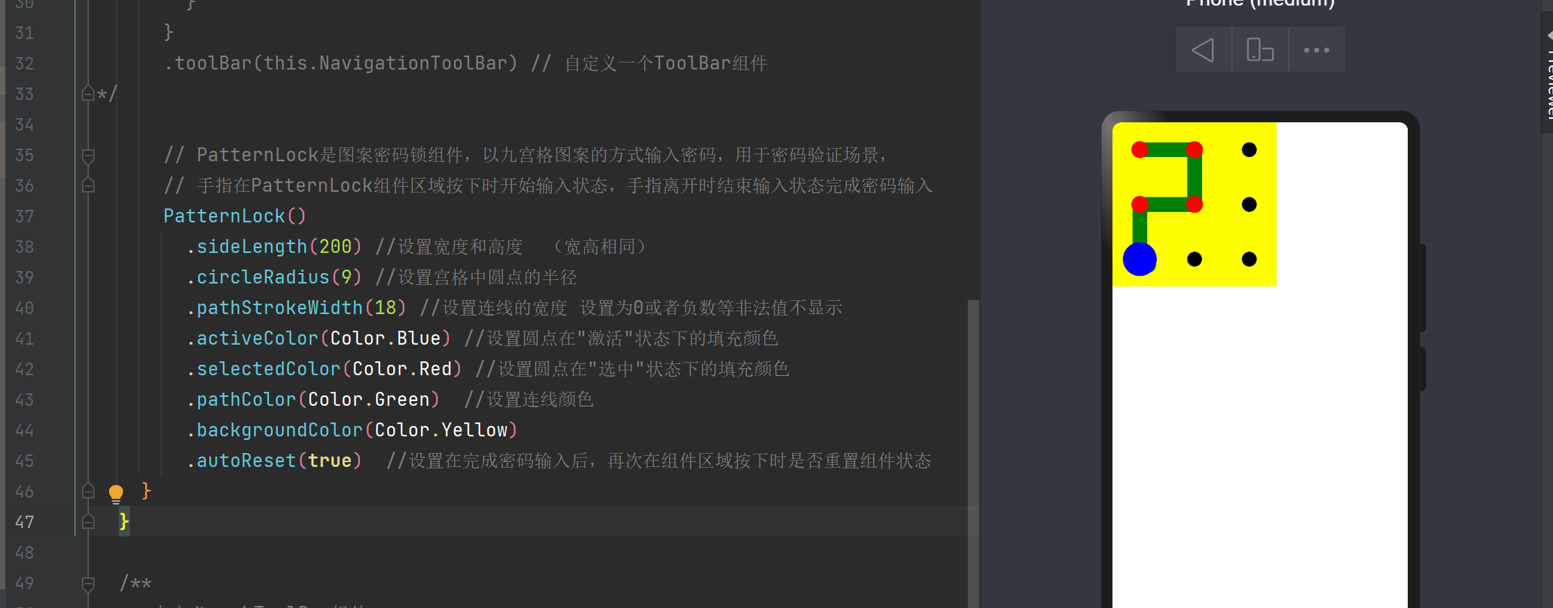
PatternLock
PatternLock是图案密码锁组件,以九宫格图案的方式输入密码,用于密码验证场景,指在PatternLock组件区域按下时开始输入状态,手指离开时结束输入状态完成密码输入
PatternLock().sideLength(200) //设置宽度和高度 (宽高相同).circleRadius(9) //设置宫格中圆点的半径.pathStrokeWidth(18) //设置连线的宽度 设置为0或者负数等非法值不显示.activeColor(Color.Blue) //设置圆点在"激活"状态下的填充颜色.selectedColor(Color.Red) //设置圆点在"选中"状态下的填充颜色.pathColor(Color.Green) //设置连线颜色.backgroundColor(Color.Yellow).autoReset(true) //设置在完成密码输入后,再次在组件区域按下时是否重置组件状态
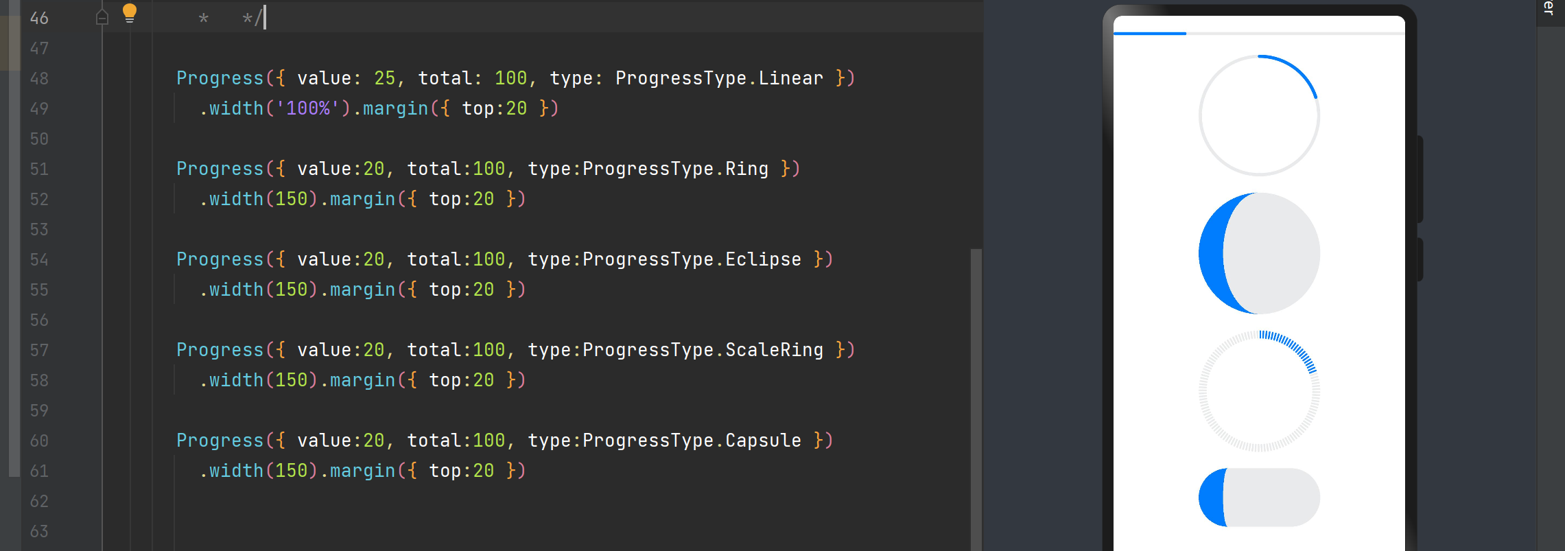
Progress
Progress 进度条组件用于显示内容加载或者操作进度
- value: 当前进度值
- total:总的进度值
- type:样式
ProgressType有五种
- Linear:线性
- Ring:环形无刻度,环形圆环逐渐显示至完全填充效果
- Eclipse:圆形样式,类似于月圆月缺的效果
- ScaleRing:环形带有刻度
- Capsule:胶囊型
Progress({ value: 25, total: 100, type: ProgressType.Linear }).width('100%').margin({ top:20 })Progress({ value:20, total:100, type:ProgressType.Ring }).width(150).margin({ top:20 })Progress({ value:20, total:100, type:ProgressType.Eclipse }).width(150).margin({ top:20 })Progress({ value:20, total:100, type:ProgressType.ScaleRing }).width(150).margin({ top:20 })Progress({ value:20, total:100, type:ProgressType.Capsule }).width(150).margin({ top:20 })
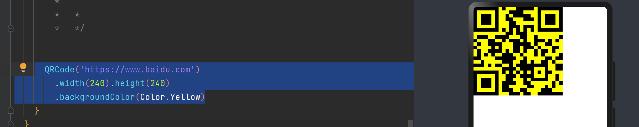
QRCode
QRCode会自动将URL连接转为二维码的图片
QRCode('https://www.baidu.com').width(240).height(240).backgroundColor(Color.Yellow)
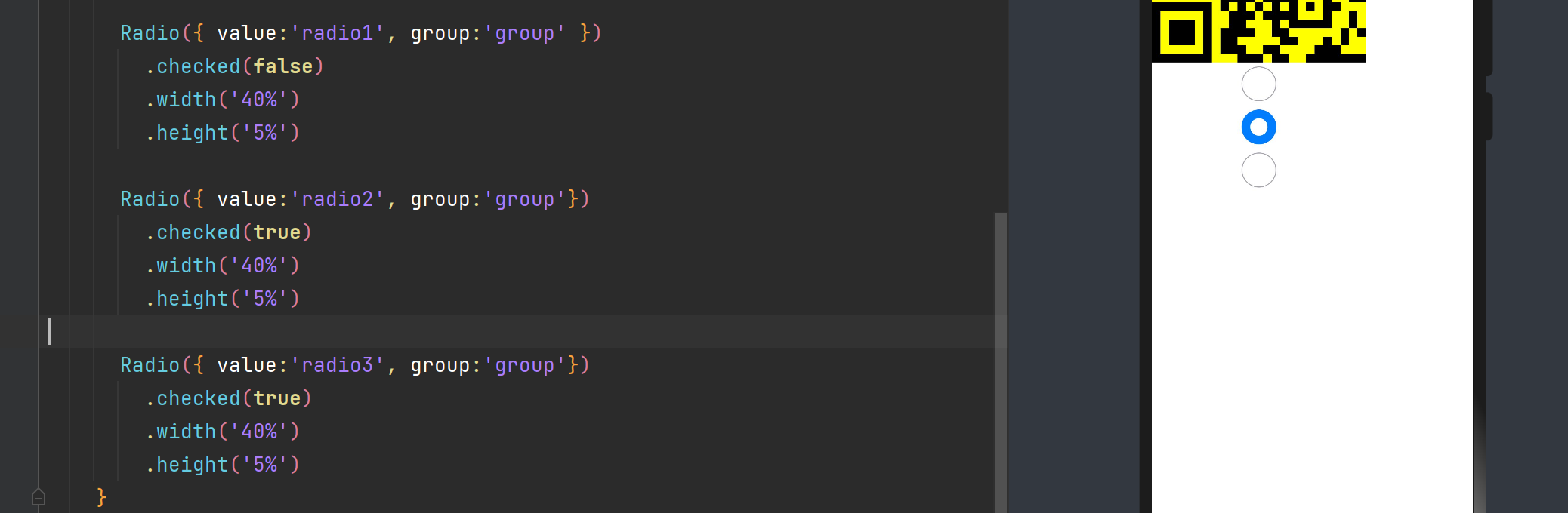
Radio
Radio单选框,提供相应的用户选择项,当前单选框所属的群组名称,相同的group的Radio只能有一个选中
Radio({ value:'radio1', group:'group' }).checked(false).width('40%').height('5%')Radio({ value:'radio2', group:'group'}).checked(true).width('40%').height('5%')Radio({ value:'radio3', group:'group'}).checked(true).width('40%').height('5%')
Rating
Rating({rating:1,indicator:false}) //rating 初始星数 indicator:是否仅作为指示器使用.stars(5).stepSize(0.5).onChange((value:number) => {console.log("number->"+value)})
RichText
RichText是富文本组件,可以解析并显示HTML格式文本。
//RichText  富文本组件
RichText('<h1>Hello World</h1>')
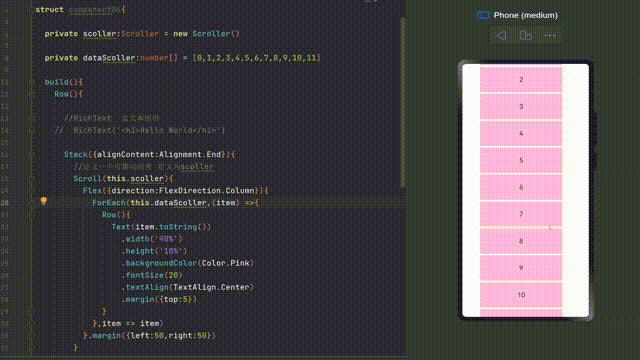
ScollBar
ScollBar用于配合可滚动组件使用,如List、Grid、Scoll等
ScollBar实例化构造函数为ScollBar(value:{scoller:Scoller,direction?:ScollBarDirection,state?:BarState})
- Scoller:可滚动组件的控制器,用于与可滚动组件进行绑定
- ScollBarDirection:滚动条的方向,控制可滚动组件对应方向的滚动。默认值是ScollBarDirection.Vertical
- BarState:滚动条状态,默认值是BarState.Auto
@Component
@Entrystruct compenent06{private scoller:Scroller = new Scroller()private dataScoller:number[] = [0,1,2,3,4,5,6,7,8,9,10,11]build(){Row(){//RichText  富文本组件//  RichText('<h1>Hello World</h1>')Stack({alignContent:Alignment.End}){//定义一个可滚动组件 定义为scollerScroll(this.scoller){Flex({direction:FlexDirection.Column}){ForEach(this.dataScoller,(item) =>{Row(){Text(item.toString()).width('90%').height('10%').backgroundColor(Color.Pink).fontSize(20).textAlign(TextAlign.Center).margin({top:5})}},item => item)}.margin({left:50,right:50})}.scrollBar(BarState.Off).scrollable(ScrollDirection.Vertical)}//通过scoller进行绑定 绑定scollerScrollBar({scroller:this.scoller,direction:ScrollBarDirection.Vertical,state:BarState.Auto}){Text().width(30).height(100).borderRadius(20).backgroundColor(Color.Red)}.width(80).backgroundColor(Color.Gray)}}
}
Search
Search({placeholder:'输入内容...'}).searchButton('搜索') //搜索按钮的文字.width('100%').height('5%').placeholderColor(Color.Red) // 提示文本样式.placeholderFont({size:18,weight:200}) // 提示文字字体大小.textFont({size:18,weight:200}) // 搜索框文本字体大小.onSubmit((value:String) => { // 单机搜索图标、搜索按钮或者按下软键盘搜索按钮时触发的回调}).onChange((value: String) => { // 输入内容发生改变时触发的回调})
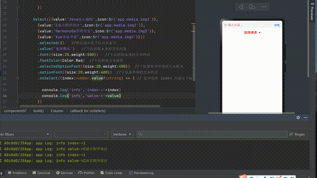
Select
下拉选择菜单
Select([{ value: 'Java核心编程', icon: $r('app.media.img1') },{ value: 'C语言程序设计', icon: $r('app.media.img2') },{ value: 'HarmonyOs应用开发', icon: $r('app.media.img3') },{ value: 'Vue全站开发', icon: $r('app.media.img4') }]).selected(2) //默认选中的下拉列表索引.value('选择课本') //下拉按钮本身的文本内容.font({ size: 20, weight: 500 }) //下拉按钮本身的文本样式.fontColor(Color.Red) //下拉按钮文本颜色.selectedOptionFont({ size: 20, weight: 400 }) //下拉菜单项中项的文本样式.optionFont({ size: 20, weight: 400 }) //下拉菜单项的文本样式.onSelect((index: number, value?: string) => { // 选中监听 index 为索引下标 value是选中值console.log('info', 'index->' + index)console.log('info', 'value->' + value)})
Slide
Slide滑动条组件,用于快速调节设置值,如音量调节,亮度调节
Slider({value: 40,step: 5,style: SliderStyle.InSet, //滑块在滑轨上direction: Axis.Vertical //方向
}).showSteps(true).height('50%').onChange((value: number, mode: SliderChangeMode) => {})Slider({value:40,min:0,max:100,step:5,style:SliderStyle.OutSet,  //滑块在轨道内direction:Axis.Horizontal
}).blockColor(Color.Red)  // 设置滑块的颜色.trackColor(Color.Blue) //滑轨的背景色.selectedColor(Color.Green) // 已经滑动的颜色.showTips(true) //设置气泡提示.showSteps(true) // 是否显示步长刻度值.trackThickness(4)  //设置滑轨粗细.width('80%')
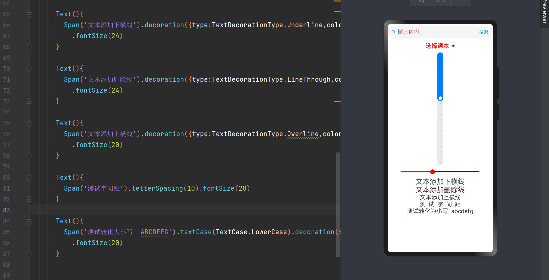
Span
- 作为Text组件的子组件,用于显示行内文本
- 主要属性
- decoration:设置文本装饰线样式及其颜色
- letterSpacing:设置文本字符间间距
- textCase:设置文本大小写
Text(){Span('文本添加下横线').decoration({type:TextDecorationType.Underline,color:Color.Green}).fontSize(24)
}Text(){Span('文本添加删除线').decoration({type:TextDecorationType.LineThrough,color:Color.Red}).fontSize(24)
}Text(){Span('文本添加上横线').decoration({type:TextDecorationType.Overline,color:Color.Red}).fontSize(20)
}Text(){Span('测试字间距').letterSpacing(10).fontSize(20)
}Text(){Span('测试转化为小写  ABCDEFG').textCase(TextCase.LowerCase).decoration({type:TextDecorationType.None}).fontSize(20)
}
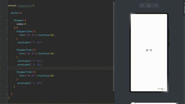
Stepper和StepperItem
Stepper是步骤导航器组件,适用于引导用户按照步骤完成任务的导航场景,StepperItem是Stepper组件的页面子组件。
Stepper({index:0
}){StepperItem(){Text('第一页').fontSize(20)}.nextLabel('下一页')StepperItem(){Text('第二页').fontSize(20)}.nextLabel('下一页').prevLabel('上一页')StepperItem(){Text('第三页').fontSize(20)}.prevLabel('上一页')
}
Text
| textAlign | 设置文本在水平方向的对齐方式(TextAlign.Center/ TextAlign.Start /TextAlign.End ) |
|---|---|
| textOverflow | 设置文本超长时的显示方式。默认值是TextOverflow.Clip |
| maxLines | 设置文本的最大行数,默认值是Infinity |
| lineHeight | 设置文本的行高,设置值不大于0时,不限制文本行高,自适应字体大小, |
| decoration | 设置文本装饰线样式以及颜色 |
| baselineOffset | 设置文本基线的偏移量,默认值为0 |
| letterSpacing | 设置文本字符间间距 |
| minFontSize | 设置文本最小显示字号,需要配合maxFontSize,maxline或布局大小限制使用,单独设置不生效 |
| maxFontSize | 设置文本最大显示字号,需要配合minFontSize,maxline或布局大小限制使用,单独设置不生效 |
| textCase | 设置文本大小写,默认为TextCase.Normal |
| copyOption | 组件支持设置文本是否可粘贴复制 |
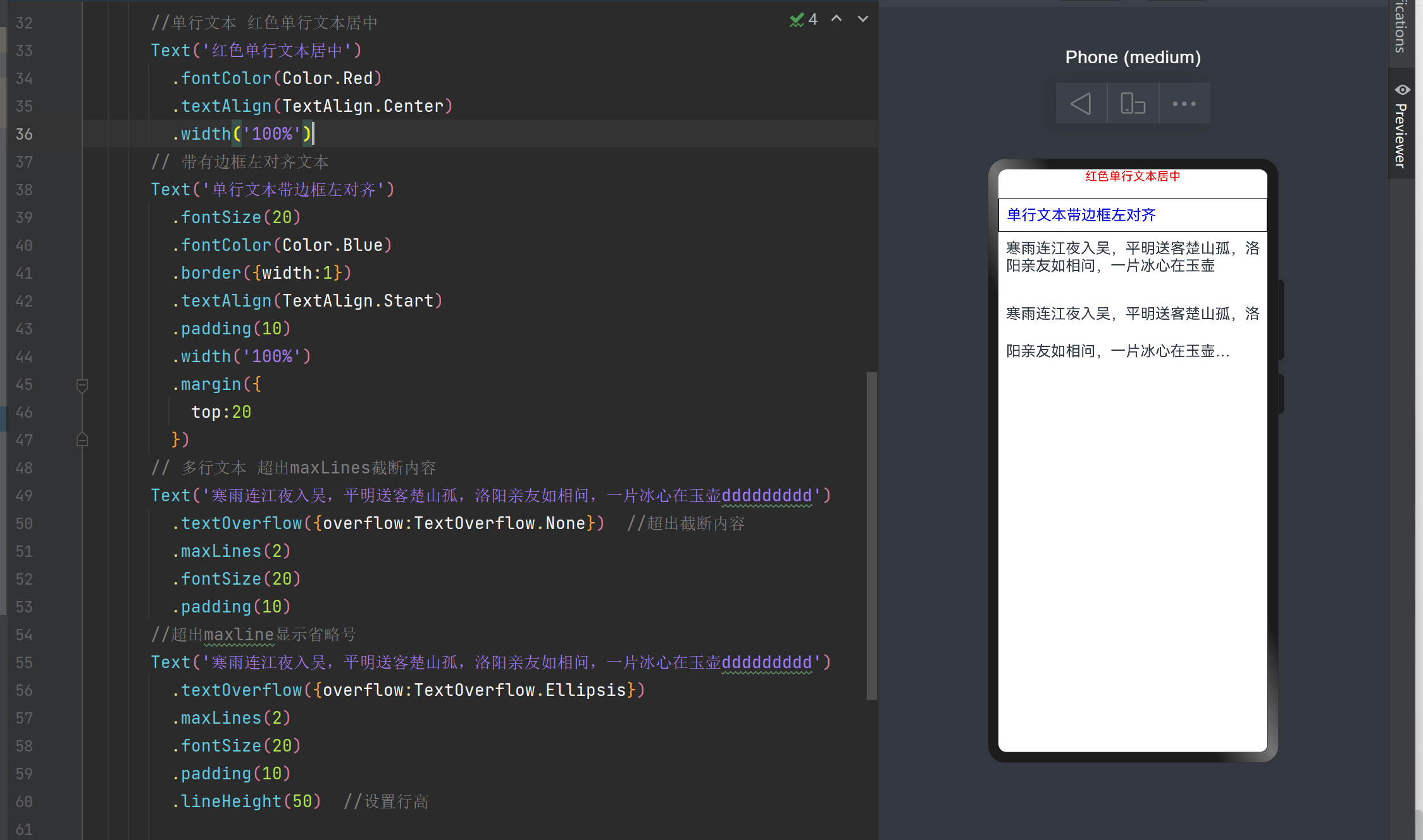
//单行文本 红色单行文本居中
Text('红色单行文本居中').fontColor(Color.Red).textAlign(TextAlign.Center).width('100%')// 带有边框左对齐文本
Text('单行文本带边框左对齐').fontSize(20).fontColor(Color.Blue).border({width:1}).textAlign(TextAlign.Start).padding(10).width('100%').margin({top:20})// 多行文本 超出maxLines截断内容
Text('寒雨连江夜入吴,平明送客楚山孤,洛阳亲友如相问,一片冰心在玉壶ddddddddd').textOverflow({overflow:TextOverflow.None})  //超出截断内容.maxLines(2).fontSize(20).padding(10)//超出maxline显示省略号
Text('寒雨连江夜入吴,平明送客楚山孤,洛阳亲友如相问,一片冰心在玉壶ddddddddd').textOverflow({overflow:TextOverflow.Ellipsis}).maxLines(2).fontSize(20).padding(10).lineHeight(50)  //设置行高
TextArea
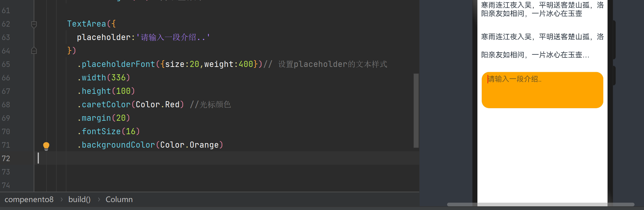
TextArea是多行文本输入框组件,当输入的内容超过组件宽度会自动换行显示。
| placeHolderColor | 设置placeholder文本颜色 |
|---|---|
| placeholderFont | 设置placeholder文本样式 |
| textAlign | 输入框的水平对齐方式 |
| caretColor | 输入框光标颜色 |
| inputFilter | 通过正则表达式设置输入过滤器,匹配表达式的输入允许条件显示,不匹配的则过滤 |
| copyOption | 设置输入的文本是否可复制 |
TextArea({placeholder:'请输入一段介绍..'
}).placeholderFont({size:20,weight:400})// 设置placeholder的文本样式.width(336).height(100).caretColor(Color.Red) //光标颜色.margin(20).fontSize(16).backgroundColor(Color.Orange)
TextClock
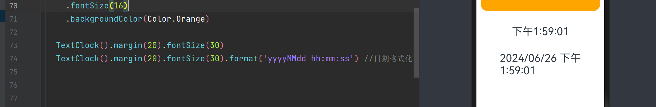
TextClock().margin(20).fontSize(30)
TextClock().margin(20).fontSize(30).format('yyyyMMdd hh:mm:ss') //日期格式化
TextInput
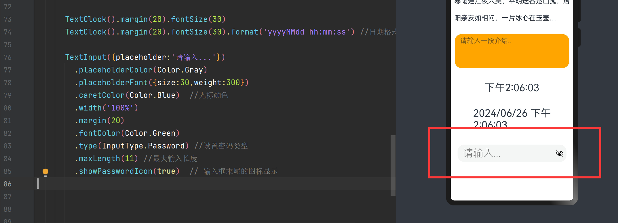
单行文本输入框组件
| type | 设置输入框类型,默认值是InputType.Normal |
|---|---|
| placeholderColor | 默认值文本颜色 |
| placeholderFont | 默认值文本样式 |
| entryKeyType | 设置输入法回车键类型,目前仅支持默认类型显示 |
| caretColor | 设置光标颜色 |
| maxLength | 设置最大长度 |
| showPasswordIcon | 在密码输入模式下,是否展示输入框末尾的图标 |
TextInput({placeholder:'请输入...'}).placeholderColor(Color.Gray).placeholderFont({size:30,weight:300}).caretColor(Color.Blue) //光标颜色.width('100%').margin(20).fontColor(Color.Green).type(InputType.Password) //设置密码类型.maxLength(11) //最大输入长度.showPasswordIcon(true) // 输入框末尾的图标显示
TextPicker
TextPicker是滑动选择文本内容的组件
TextPicker({range:['Java 核心编程','Android 第一行代码','HarmonyOS入门','Vue 全站开发'],selected:1}).width('100%').defaultPickerItemHeight(30) //默认Pick各项的高度
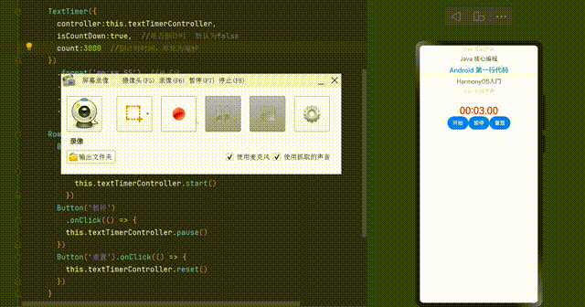
TextTimer
TextTimer是通过文本显示计时信息并控制其计时器状态的组件,TextTimer组件支持绑定一个TextTimeController来控制文本计时器。
private textTimerController: TextTimerController = new TextTimerController()
TextTimer({controller:this.textTimerController,isCountDown:true,  //是否倒计时  默认为falsecount:3000  //倒计时时间,单位为毫秒
}).format('mm:ss.SS')  //格式化.fontColor(Color.Red).margin({top:30}).fontSize(30)Row(){Button('开始').type(ButtonType.Capsule).onClick(() => {this.textTimerController.start()})Button('暂停').onClick(() => {this.textTimerController.pause()})Button('重置').onClick(() => {this.textTimerController.reset()})
}
TimePicker
TimePicker是滑动选择时间的组件
TimePicker().useMilitaryTime(true) // 是否设置为24小时制.onChange((value: TimePickerResult) => { //选择监听})
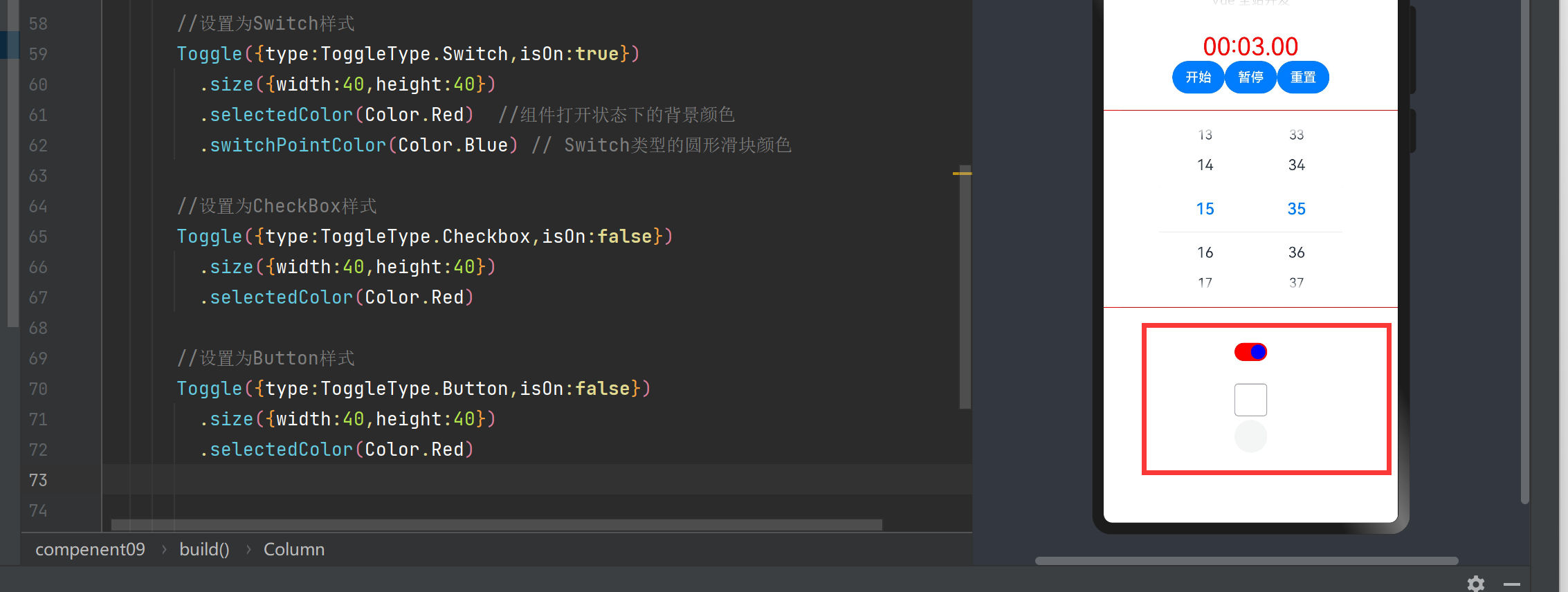
Toggle
Toggle组件提供复选框样式,状态按钮样式以及开关样式,仅当ToggleType为Button时可包含子组件。
Toggle组件的构造函数参数主要有两个:
type:开关类型,可以是Checkbox,Button,Switch
isOn:开关是否打开,设置Switch类型的圆形滑块颜色
Toggle组件还可以设置一下属性
selectedColor:设置组件打开状态的背景颜色
switchPointColor: 设置Switch类型的圆形滑块颜色
//设置为Switch样式
Toggle({type:ToggleType.Switch,isOn:true}).size({width:40,height:40}).selectedColor(Color.Red)  //组件打开状态下的背景颜色.switchPointColor(Color.Blue) // Switch类型的圆形滑块颜色//设置为CheckBox样式
Toggle({type:ToggleType.Checkbox,isOn:false}).size({width:40,height:40}).selectedColor(Color.Red)//设置为Button样式
Toggle({type:ToggleType.Button,isOn:false}).size({width:40,height:40}).selectedColor(Color.Red)
Web
用于展示网页的组件,需要加上网络权限
import webview from '@ohos.web.webview';private webviewController:webview.WebviewController = new webview.WebviewController()Web({src:"https://www.baidu.com",controller:this.webviewController})