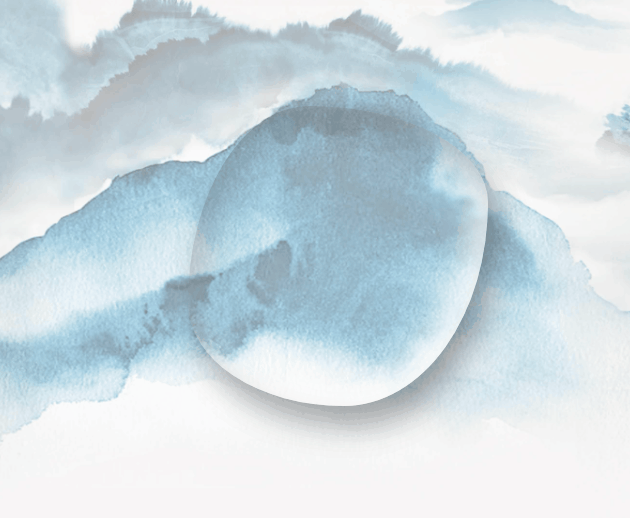
效果图:
<template><div style="width: 100%;height:500px;padding:20px;"><div class="water"></div></div>
</template>
<script>
export default {data() {return {};},watch: {},created() {},methods: {},
};
</script>
<style lang='less' scoped>
.water {width: 300px;height: 300px;box-shadow: 10px 20px 30px 0px rgba(0, 0, 0, 0.2) inset,10px 20px 30px rgba(0,0,0,0.3),15px 15px 30px rgba(0,0,0,0.05),-15px -15px 30px rgba(255,255,255,0.8) inset;border-radius: 59% 41% 71% 29% / 54% 43% 57% 46% ;margin: 0 auto;margin-top:300px;/**box-sizing 用于控制元素的盒模型,决定了元素的宽度和高度是如何计算的;默认值是content-box, 元素的宽度和高度只包含内容区域,border-box , 元素的宽度和高度包含内容区域,内边距,边框;*/box-sizing: border-box;animation: action 3s linear infinite;
}
@keyframes action {0%{border-radius: 59% 41% 71% 29% / 54% 43% 57% 46% ;}25%{border-radius:43% 57% 55% 45% / 63% 37% 63% 37% ;}50%{border-radius:37% 63% 39% 61% / 69% 26% 74% 31% ;}75%{border-radius:53% 47% 44% 56% / 50% 58% 42% 50%  ;}100%{border-radius: 59% 41% 71% 29% / 54% 43% 57% 46% ;}
}
</style>