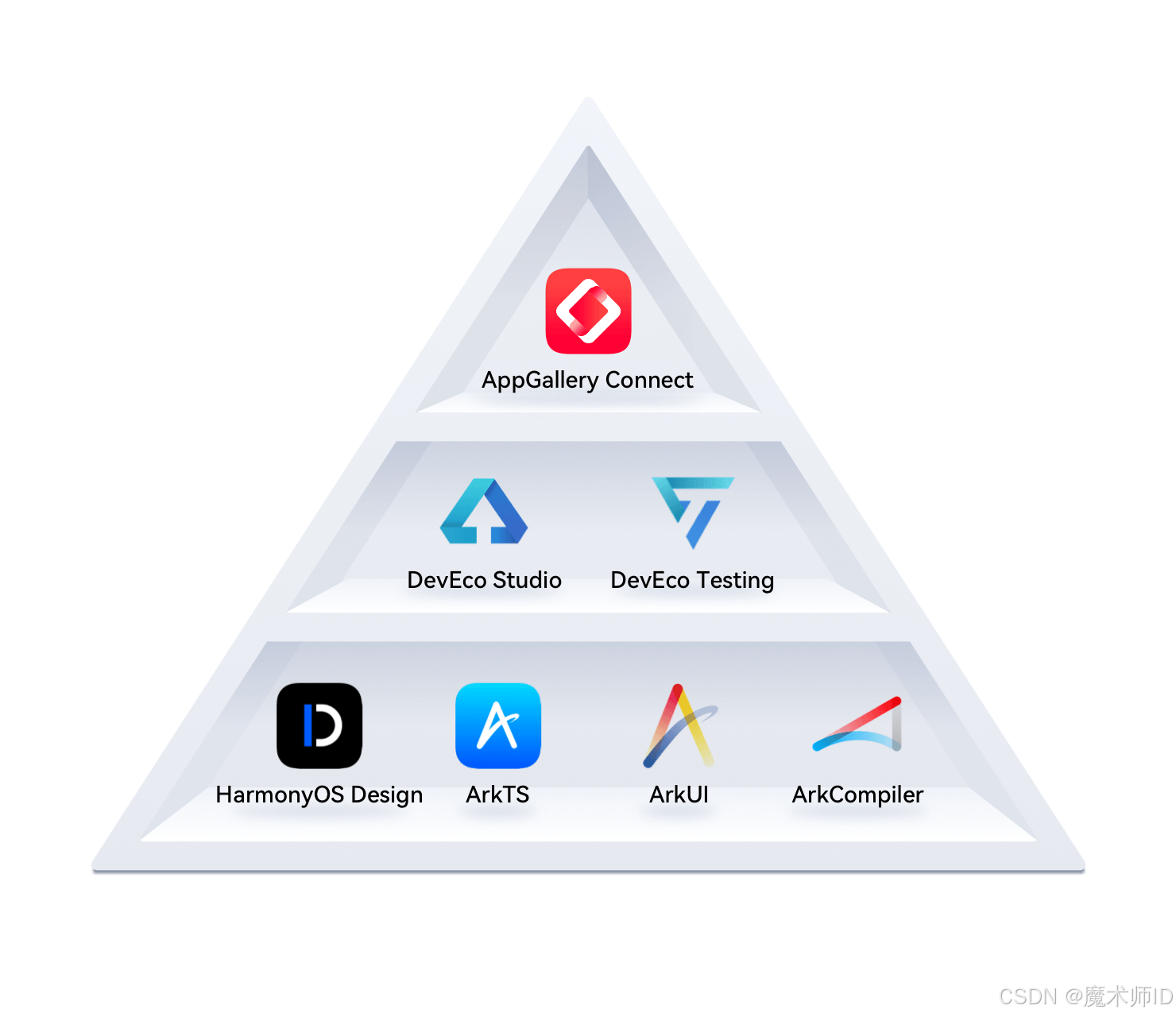
1. 组件基础
开发环境
1. 起步-鸿蒙简介
介绍:
HarmonyOS是新一代的智能终端操作系统,为不同设备的智能化、互联与协同提供了统一的语言。带来简洁,流畅,连续,安全可靠的全场景交互体验。
历程:
| 时间 | 事件 |
|---|---|
| 2019 | HarmonyOS 1.0,华为在东莞举行华为开发者大会,正式发布操作系统鸿蒙 OS,主要用于物联网 |
| 2020 | HarmonyOS 2.0,基于开源项目 OpenHarmony 开发的面向多种全场景智能设备的商用版本 |
| 2021 | HarmonyOS 3.0,先后优化游戏流畅度、地图三维体验、系统安全,另外系统的稳定性也得到了增强 |
| 2023.2 | HarmonyOS 3.1,系统纯净能力进一步提升,对后台弹窗、 隐藏应用、后台跳转等情况 |
| 2023.7 | 华为 Mate 50 系列手机获推 HarmonyOS 4.0 |
| 2024 | HarmonyOS Next 即将发布,将不在兼容安卓应用 |
2. 起步-DevEco Studio
安装 DevEco Studio 编辑器
-
下载:https://developer.harmonyos.com/cn/develop/deveco-studio#download
- Windows(64-bit)
- Mac(X86)
- Mac(ARM)
-
安装:DevEco Studio → 一路 Next
运行:
基础安装:Node.js >= 16.9.1 + Install ohpm 鸿蒙包管理器
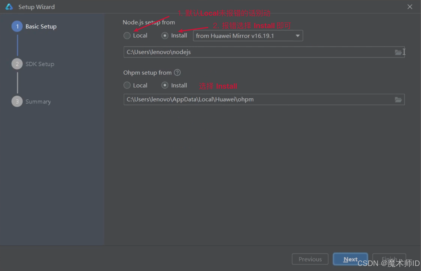
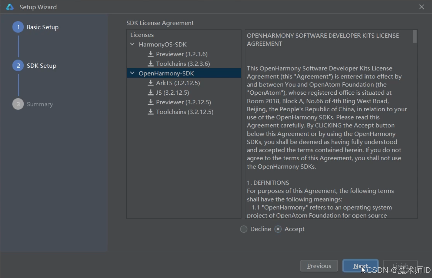
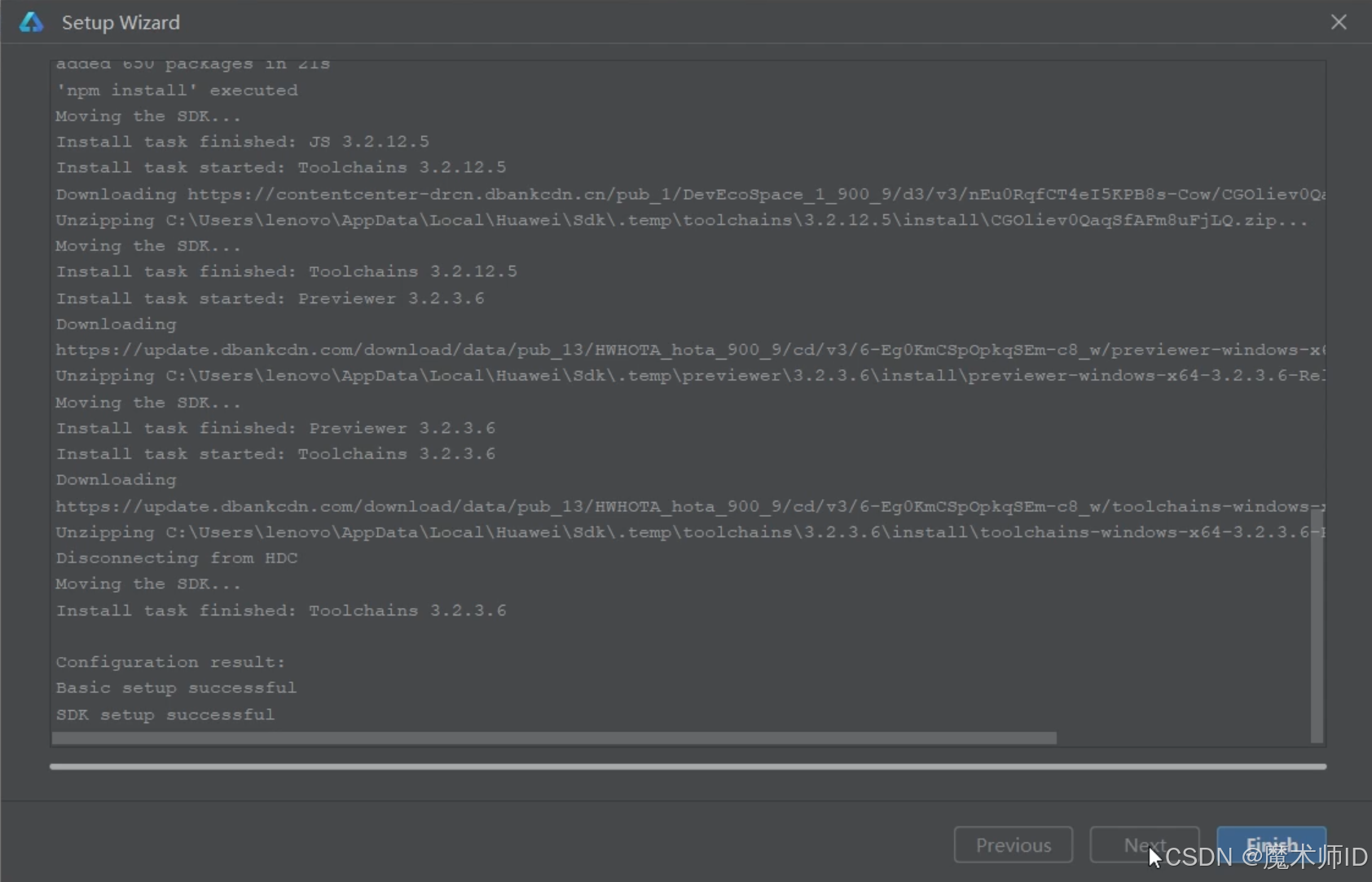
SDK 安装
安装完毕
3. 起步-HelloWorld
创建一个空项目
-
新建-新建项目
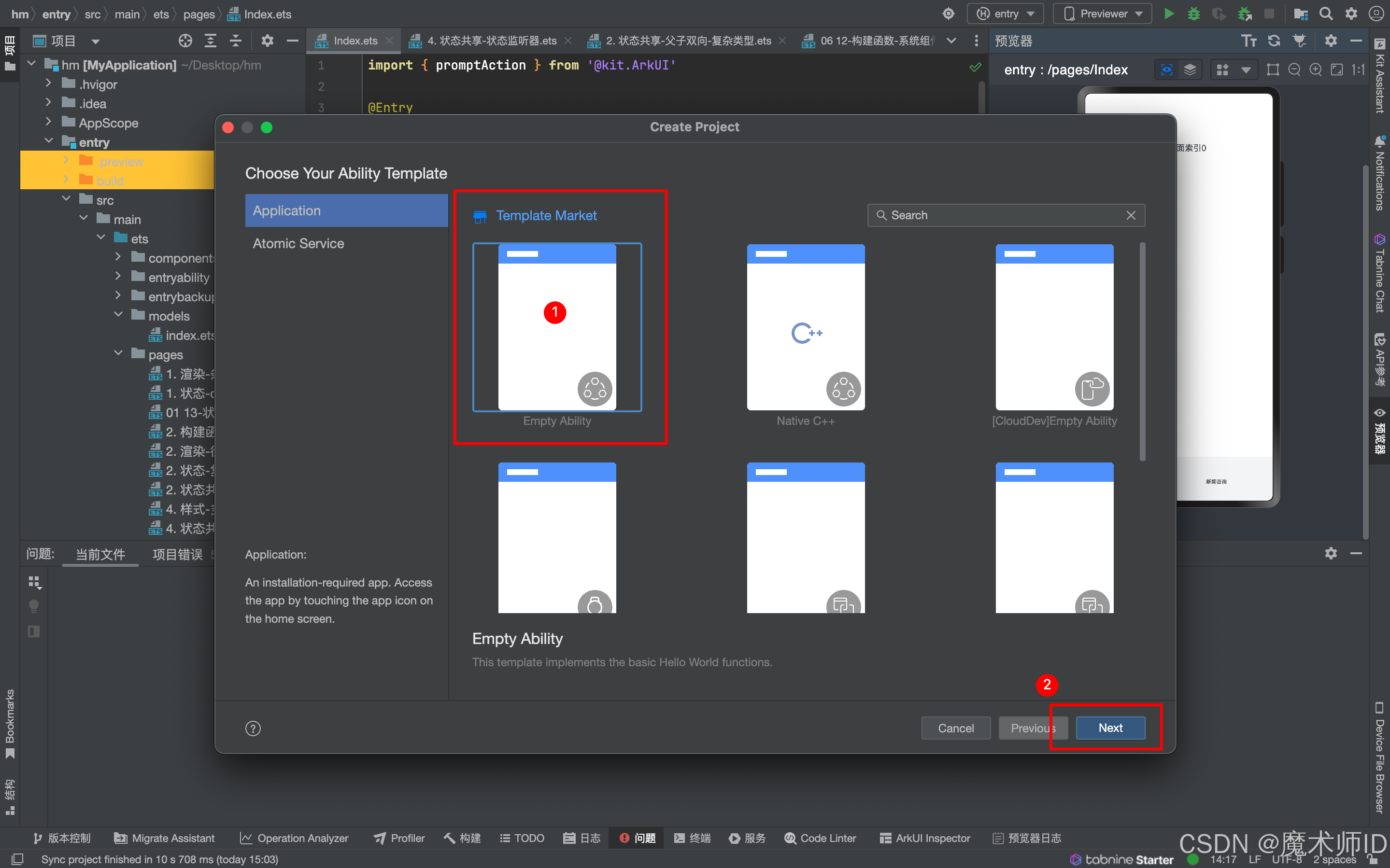
-
选择项目模板
-
填写项目信息
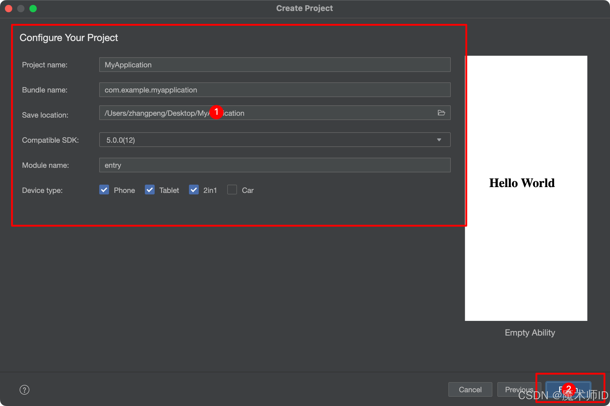
-
Finish
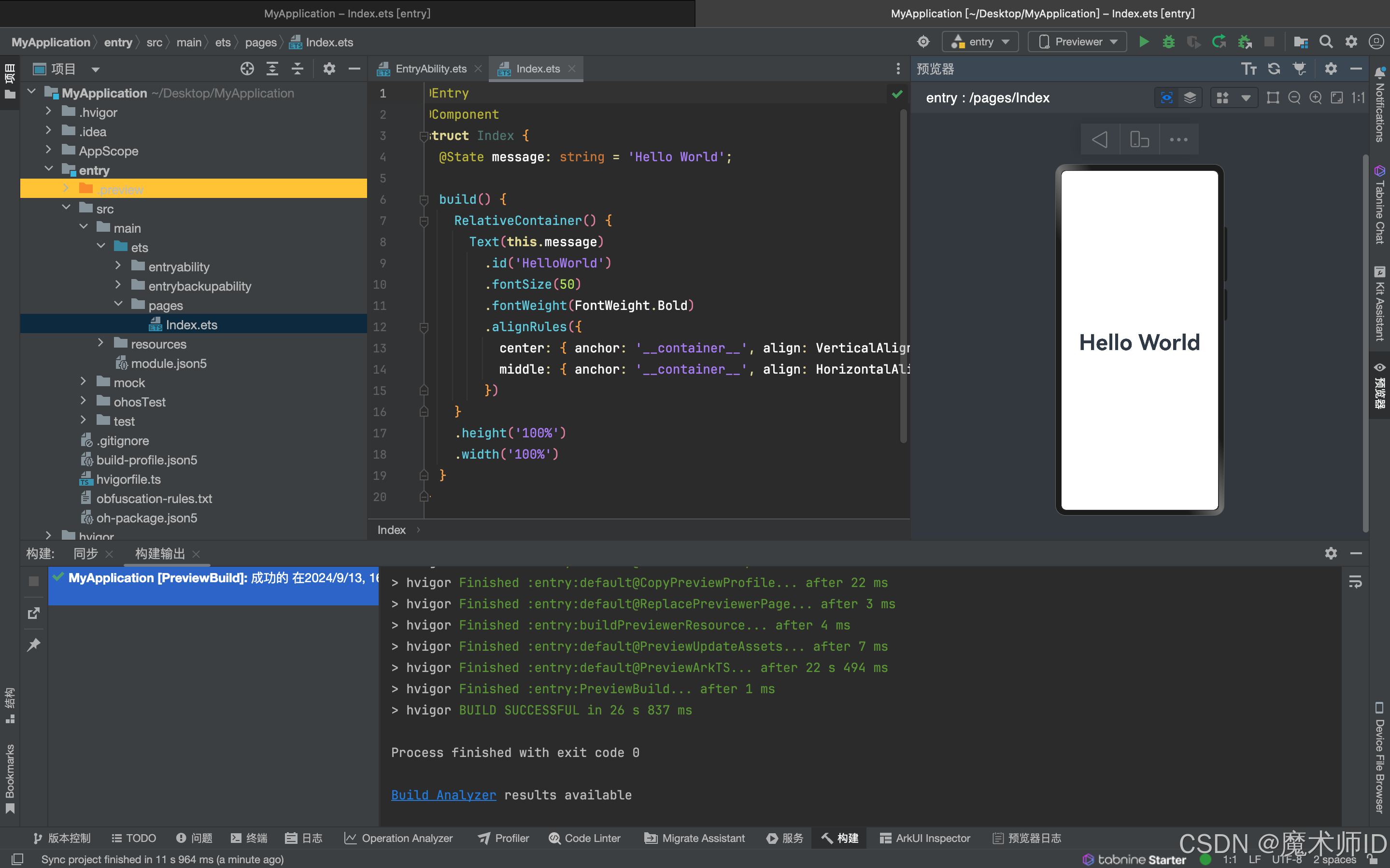
4. 起步-效果预览
- Previewer 预览
场景:静态页面(没有组件间数据通信、不涉及到网络请求)
条件:有 @Entry 或 @Preview 装饰器页面 - Local Emulator 本地模拟器
场景:动态页面(几乎全场景,一些无法模拟的硬件功能)
- Remote Emulator 远程模拟器
- Remote Device 远程真机
- Local Device 本地真机
5. 起步-工程结构
我们在哪里写代码?
| 目录 | 作用 |
|---|---|
entry | 是一个 Module 应用包 |
entryability | 是一个 UIAbility 包含用户界面的应用组件 |
pages | 页面 |
components | 组件 |
组件基础
1. 组件-什么是ArkTS
ArkTS是HarmonyOS优选的主力应用开发语言。
ArkTS围绕应用开发在TypeScript(简称TS)生态基础上做了进一步扩展,继承了TS的所有特性,是TS的超集。
2. 基础-组件结构
ArkTS通过装饰器 @Component 和 @Entry 装饰 struct 关键字声明的数据结构,构成一个自定义组件。
自定义组件中提供了一个 build 函数,开发者需在该函数内以链式调用的方式进行基本的 UI 描述,UI 描述的方法请参考 UI 描述规范。
页面组件
@Entry
@Component
struct Index {// 工程默认显示 `Index` 页面组件// build 是声明UI的位置build() {Text('页面组件')}
}
自定义组件
// 定义 `Footer` 组件
@Component
struct Footer {build() {Text('自定义组件')}
}@Entry
@Component
struct Index {build() {Column(){// 使用 `Footer` 组件Footer()}}
}
注意: 为了更好维护,自定义组件通常会新建一个文件 Footer.ets,通过模块化语法导出导入(默认|按需)使用。
3. 基础-系统组件(ArkUI)
常用系统组件 Text Column Row Button TextInput 更多组件
- Text 文本组件
- Column 列组件,纵向排列,Flex布局主轴是Y
- Row 行组件,横向向排列,Flex布局主轴是X
- Button 按钮组件
- InputText 输入框组件
实现一个简易登录界面:
@Entry
@Component
struct Index {@Statephone:string = '18852638009'yzm:string= 'ws34'build() {Column(){// 手机号Row(){Text('手机号:')TextInput({text:this.phone, placeholder: '请输入手机号'}).placeholderColor('red')}// 验证码Row(){Text('验证码:')TextInput({text:this.yzm, placeholder: '请输入验证码'}).maxLength(4)}// 验证码Row(){Text('忘记密码').fontColor('#FF2B71F3')}// 登录,注册按钮Row(){Button('注册').backgroundColor('#c3c4c5').onClick(()=>{console.log('注册')})Button('登录').onClick(()=>{console.log('登录')})}}.width('100%').height('100%').backgroundColor('#ffececec')}}
注意: ArkUI 组件一般都是 Flex 模式,大部分布局可以由行和列组成。
4. 基础-组件状态
如何使用 @State 定义一个状态变量?
组件变量,不具备驱动UI更新能力。
@Entry
@Component
struct Index {count = 100build() {Text(this.count.toString()).onClick(() => this.count++)}
}
状态变量,指驱动UI更新的数据,加上 @State 装饰器即可,注意:加上类型和初始值。
@Entry
@Component
struct Index {@Statecount: number = 100
//状态变量不可设置的类型有:any undefined null 与复杂类型的联合类型build() {Text(this.count.toString()).onClick(() => this.count++)}
}
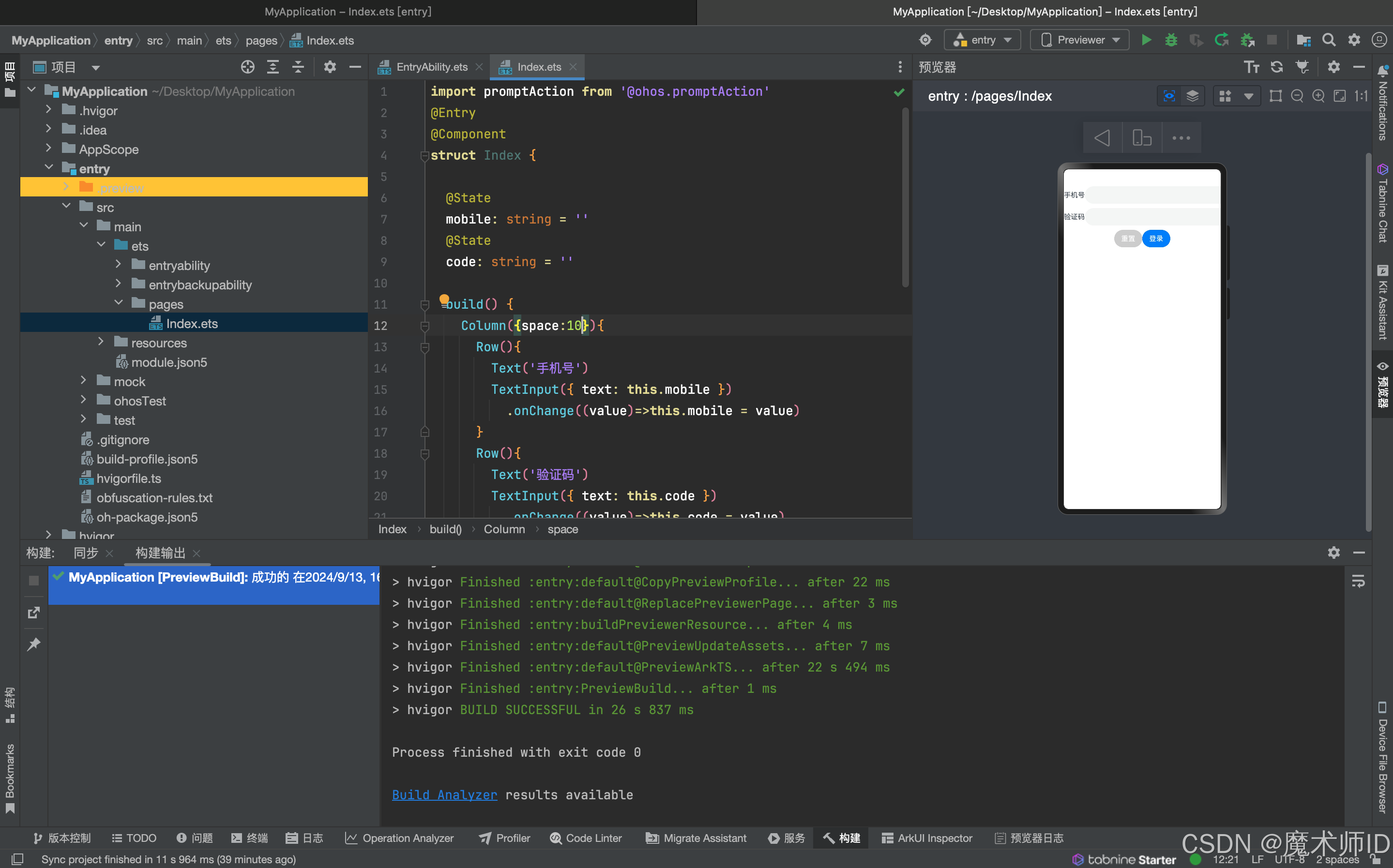
5. 练习案例
实现登录表单数据收集、重置、模拟提交。
import promptAction from '@ohos.promptAction'
@Entry
@Component
struct Index {@Statemobile: string = ''@Statecode: string = ''build() {Column(){Row(){Text('手机号')TextInput({ text: this.mobile }).onChange((value)=>this.mobile = value)}Row(){Text('验证码')TextInput({ text: this.code }).onChange((value)=>this.code = value)}Row(){Button('重置').backgroundColor('#ccc').onClick(()=>{this.mobile = ''this.code = ''})Button('登录').onClick(()=>{if (this.mobile && this.code) {promptAction.showToast({ message: `${this.mobile} 登录成功` })} else {promptAction.showToast({ message: `请输入手机号或验证码` })}})}}}
}
样式布局
1. 基础布局
用途:用于实现垂直或水平排列的简单布局,适用于需要线性排列的场景(如导航栏、列表等)。
- Column:纵向排列(从上到下)。
- Row:横向排列(从左到右)。
关键属性
| 属性 | 描述 |
|---|---|
| space | 子组件之间的间距(单位:px)。 |
| direction | (Row/Column的父容器)设置主轴方向(Row为水平,Column为垂直)。 |
| width/height | 容器的尺寸(支持百分比或固定值)。 |
- 纵向布局(Column)案例:
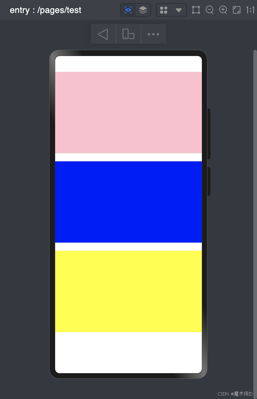
@Entry
@Component
struct Test{build() {Column(){// 纵向布局(Column)Column({ space: 20 }) {Row().width('100%').height(200).backgroundColor(Color.Pink)Row().width('100%').height(200).backgroundColor(Color.Blue)Row().width('100%').height(200).backgroundColor(Color.Yellow)}.width('100%').height('100%')// // 横向布局(Row)// Row({ space: 20 }) {//   Column().width(100).height('100%').backgroundColor(Color.Pink)//   Column().width(100).height('100%').backgroundColor(Color.Blue)//   Column().width(100).height('100%').backgroundColor(Color.Yellow)// }.width('100%').height('100%')}.width('100%').height('100%')}
}
- 横向布局(Row)案例:
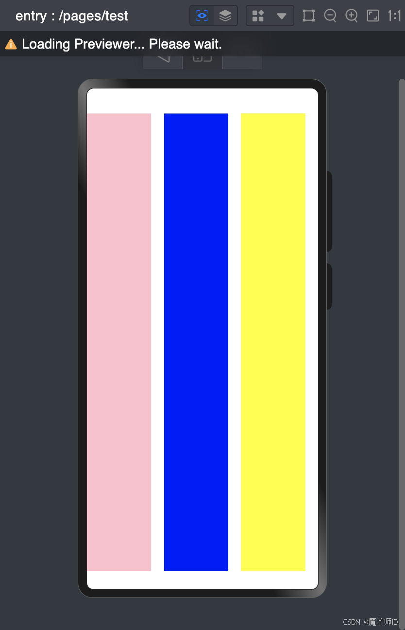
@Entry
@Component
struct Test{build() {Column(){// 横向布局(Row)Row({ space: 20 }) {Column().width(100).height('100%').backgroundColor(Color.Pink)Column().width(100).height('100%').backgroundColor(Color.Blue)Column().width(100).height('100%').backgroundColor(Color.Yellow)}.width('100%').height('100%')}.width('100%').height('100%')}
}
Row 和Column的布局方式成为线性布局- 不是横向排列就是纵向排列
● 线性布局中永远不会产生换行
● 均不支持出现滚动条
● 横向排列的垂直居中,总行排列的水平居中
● 主轴-排列方向的轴
● 侧轴-排列方向垂直的轴
2. 堆叠布局(Stack)
用途:用于实现层叠效果,后添加的组件会覆盖前一个组件,适合需要重叠的复杂布局(如弹窗、图层叠加)。
关键属性
| 属性 | 描述 |
|---|---|
| alignContent | 设置子组件的对齐方式(如 Alignment.TopEnd)。 |
| width/height | 容器的尺寸(必须显式设置)。 |
Stack的参数 可以设置子组件的排列方式alignContent
-
Top(顶部)
-
TopStart(左上角)
-
TopEnd(右上角)
-
Start(左侧)
-
End(右侧)
-
Center(中间)
-
Bottom(底部)
-
BottomStart(左下角)
-
BottomEnd(右下角)
-
案例:
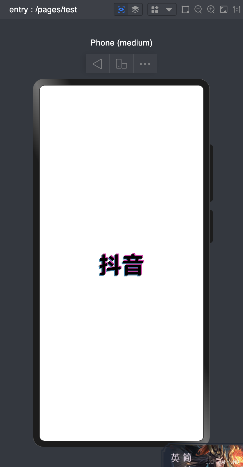
@Entry
@Component
struct Test {build() {Row() {Stack() {Text('抖音').fontSize(50).fontWeight(FontWeight.Bold).fontColor('#ff2d83b3').translate({x:-2,y:2}).zIndex(1)Text('抖音').fontSize(50).fontWeight(FontWeight.Bold).fontColor('#ffe31fa9').translate({x:2,y:-2}).zIndex(2)Text('抖音').fontSize(50).fontWeight(FontWeight.Bold).fontColor('#ff030000').translate({x:0,y:0}).zIndex(3)}.width('100%')}.height('100%')}
}
3. 弹性布局
用途:通过灵活的主轴和交叉轴对齐,适配不同屏幕尺寸和动态内容(如自适应导航栏、卡片布局)。
关键属性
| 属性 | 描述 |
|---|---|
| direction | 主轴方向(FlexDirection.Row 或 FlexDirection.Column)。 |
| justifyContent | 主轴对齐方式(如 FlexAlign.SpaceBetween)。 |
| alignItems | 交叉轴对齐方式(如 ItemAlign.Center)。 |
| flexGrow | 子组件的拉伸权重(值越大,占据空间越多)。 |
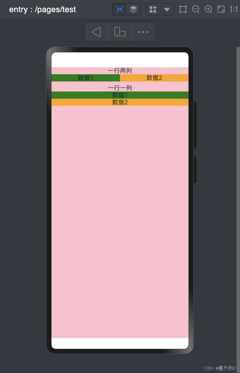
案例:
@Entry
@Component
struct Test {build() {Flex({ direction: FlexDirection.Column }){Column(){Text('一行两列')Flex(){Text('数据1').width('50%').backgroundColor(Color.Green).textAlign(TextAlign.Center)Text('数据2').width('50%').backgroundColor(Color.Orange).textAlign(TextAlign.Center)}}Column(){Text('一行一列')Flex({direction:FlexDirection.Column}){Text('数据1').width('100%').backgroundColor(Color.Green).textAlign(TextAlign.Center)Text('数据2').width('100%').backgroundColor(Color.Orange).textAlign(TextAlign.Center)}}.margin({top:'10'})}.width('100%').height('100%').backgroundColor(Color.Pink)}
}
4. 网格布局
用途:通过行列划分实现复杂布局(如商品列表、仪表盘),支持响应式设计。
关键属性
| 属性 | 描述 |
|---|---|
| columnsTemplate | 定义列模板(如 1fr 1fr 表示两列等分)。 |
| rowsTemplate | 定义行模板(如 auto 100px)。 |
| span | 子组件跨的列数或行数(如 GridColSpan(2))。 |
| gutte | 列与列之间的间距(如 { x: 8, y: 12 })。 |
案例:
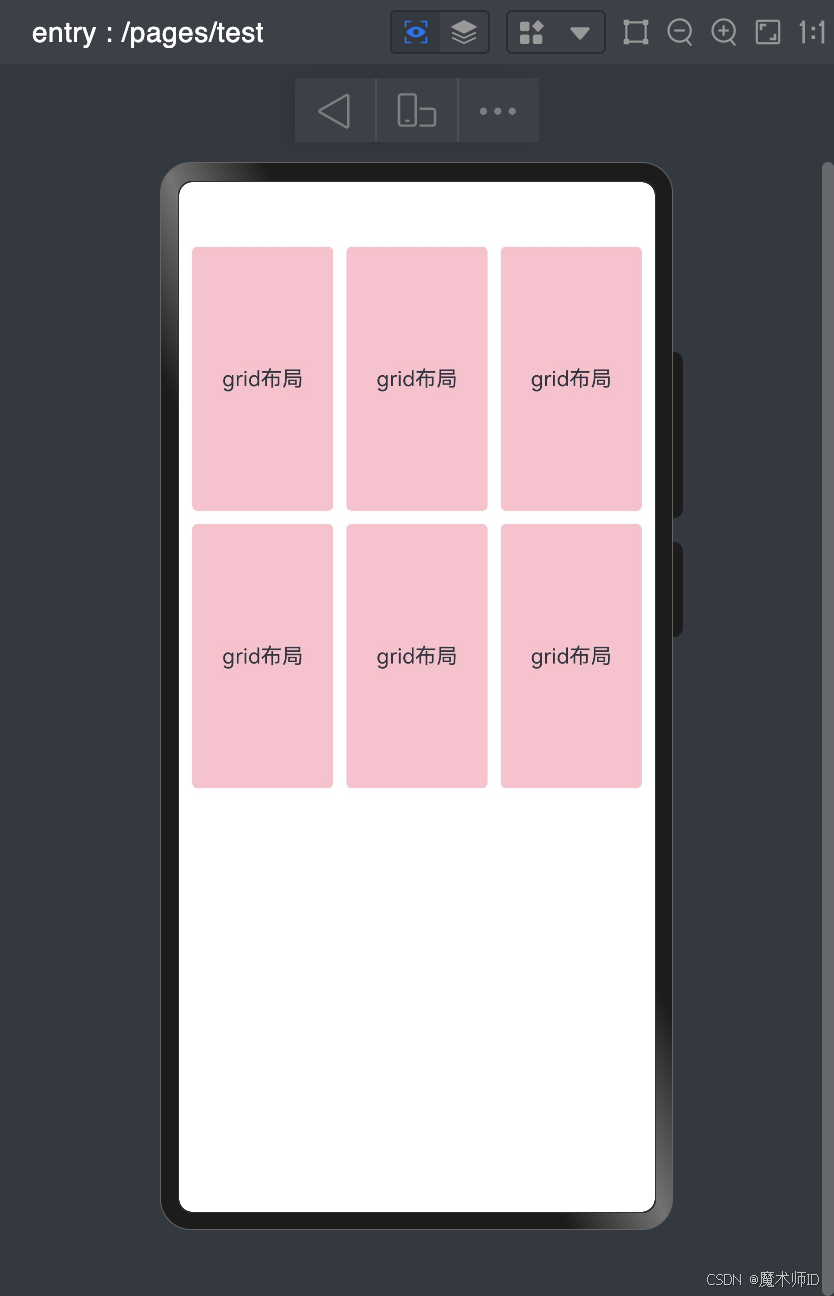
@Entry
@Component
struct Test {build() {Grid() {GridItemCases()GridItemCases()GridItemCases()GridItemCases()GridItemCases()GridItemCases()}.width("100%").height("100%").columnsTemplate("1fr 1fr 1fr").columnsGap(10).rowsGap(10).padding(10)}
}@Component
struct GridItemCases {build() {GridItem() {Row() {Column() {Text("grid布局")}.width('100%')}.height(200).borderRadius(4).backgroundColor(Color.Pink)}}
}
5. 相对布局(RelativeContainer)
用途:通过锚点规则实现精准的相对定位,适合需要动态调整位置的场景(如动态弹窗、自定义表单)。
关键属性
| 属性 | 描述 |
|---|---|
| alignRules | 定义子组件的锚点对齐规则(需配合 id 使用)。 |
| id | 子组件的唯一标识(必须设置)。 |
| container | 参与相对布局的容器内组件若被设备锚点,需要设置id,否则不显示 |
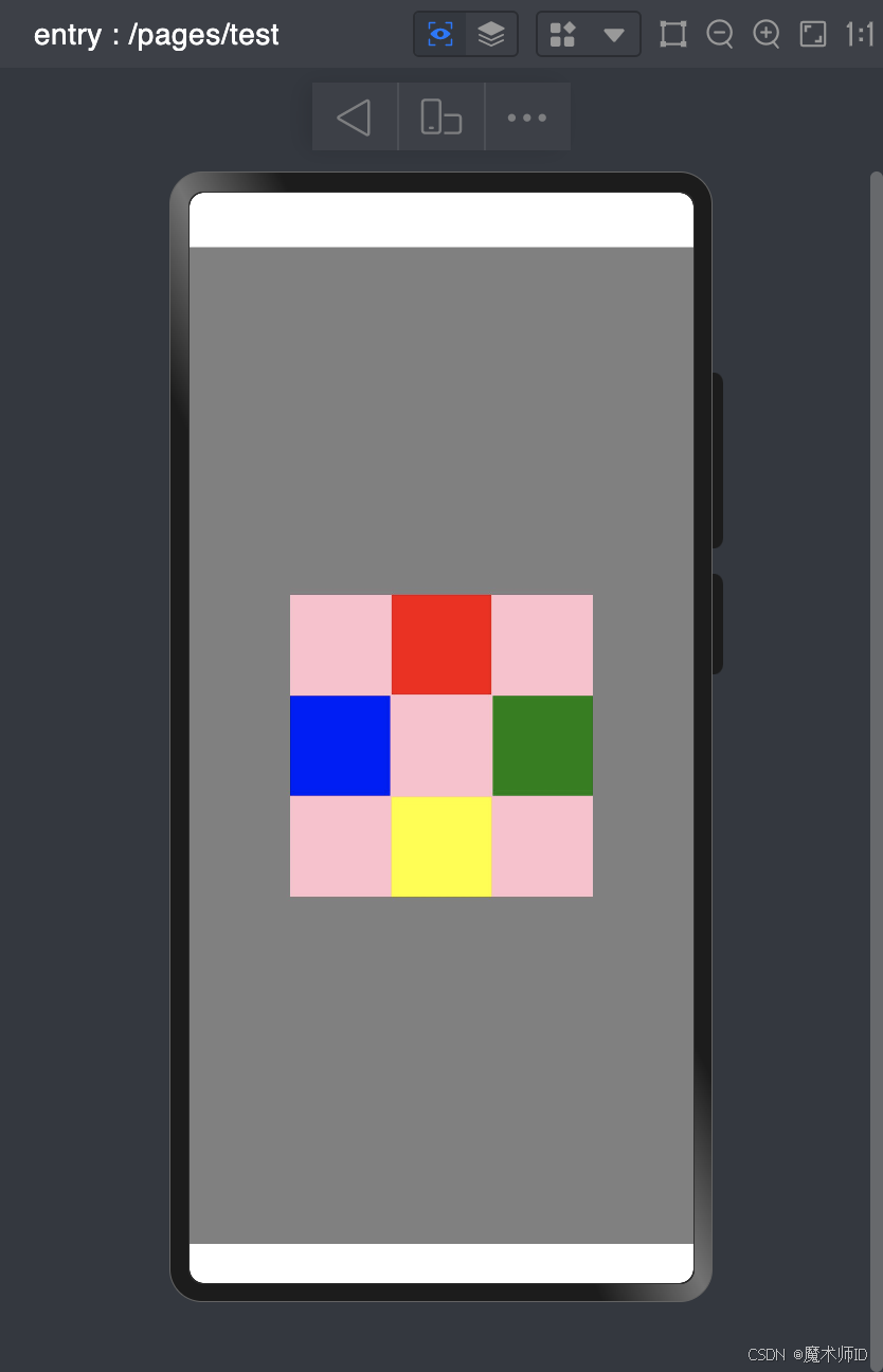
案例:
@Entry
@Component
struct Test {build() {RelativeContainer() {RelativeContainer() {Row(){}.width('33%').aspectRatio(1).alignRules({top: { anchor: '__container__', align: VerticalAlign.Top },middle: { anchor: '__container__', align: HorizontalAlign.Center }}).backgroundColor(Color.Red)Row(){}.width('33%').aspectRatio(1).alignRules({bottom: { anchor: '__container__', align: VerticalAlign.Bottom },middle: { anchor: '__container__', align: HorizontalAlign.Center }}).backgroundColor(Color.Yellow)Row(){}.width('33%').aspectRatio(1).alignRules({center: { anchor: '__container__', align: VerticalAlign.Center },left: { anchor: '__container__', align: HorizontalAlign.Start }}).backgroundColor(Color.Blue).zIndex(2)Row(){}.width('33%').aspectRatio(1).alignRules({center: { anchor: '__container__', align: VerticalAlign.Center },right: { anchor: '__container__', align: HorizontalAlign.End }}).backgroundColor(Color.Green)}.width('60%').aspectRatio(1).backgroundColor(Color.Pink).alignRules({center: { anchor: '__container__', align: VerticalAlign.Center },middle: { anchor: '__container__', align: HorizontalAlign.Center }})}.height('100%').width('100%').id('firstContainer').backgroundColor(Color.Gray)}
}
6. 滚动条说明(Scroll)
用途:实现可滚动区域,适用于内容超出容器大小的场景(如长列表、图文详情页)。
关键属性
| 属性 | 描述 |
|---|---|
| scrollDirection | 滚动方向(ScrollDirection.Vertical 或 ScrollDirection.Horizontal)。 |
| bounce | 是否允许弹性回弹(默认 true)。 |
| overscroll | 是否允许滚动超出边界时的阴影效果(默认 true)。 |
样式处理
1. 样式-语法(链式&枚举)
ArkTS以声明方式组合和扩展组件来描述应用程序的UI;
同时还提供了基本的属性、事件和子组件配置方法,帮助开发者实现应用交互逻辑。
样式相关属性通过链式函数的方式进行设置
如果类型是枚举的,通过枚举传入对应的值
样式属性
- 属性方法以
.链式调用的方式配置系统组件的样式和其他属性,建议每个属性方法单独写一行。
@Entry
@Component
struct Index {build() {Text('演示').backgroundColor('red').fontSize(50).width('100%').height(100)}
}
枚举值
- 对于系统组件,ArkUI还为其属性预定义了一些枚举类型。文档链接
@Entry
@Component
struct Index {build() {Text('演示').fontSize(50).width('100%').height(100).backgroundColor(Color.Blue).textAlign(TextAlign.Center).fontColor(Color.White)}
}
2. 样式-单位vp和适配
vp (virtual pixel)是什么?
- 屏幕密度相关像素,根据屏幕像素密度转换为屏幕物理像素,当数值不带单位时,默认单位 vp;
- 在实际宽度为1440物理像素的屏幕上,1vp 约等于 3px(物理像素)
不同的设备屏幕的宽度 vp 是不一致的,那怎么适配呢?
- 采用:伸缩布局,网格系统,栅格系统进行布局适配。
- 伸缩 layoutWeight(flex: number) 占剩余空间多少份,可以理解成CSS的 flex: 1
@Entry
@Component
struct Index {build() {Row(){Text('left').layoutWeight(1).backgroundColor('red')Text('right').layoutWeight(2).backgroundColor('green')}.width('100%')}
}
- 等比例,设置元素宽高比 aspectRatio(ratio: number)
@Entry
@Component
struct Index {build() {Text('left').width('50%')// 宽高比例.aspectRatio(1).backgroundColor('red')}
}
3. 样式-@Styles 复用
在开发过程中会出现大量代码在进行重复样式设置,@Styles 可以帮我们进行样式复用
// 全局
@Styles
function functionName() { ... }@Entry
@Component
sturt Index{// 组件内@Styles functionName() { ... }build() {Text('Text').functionName()}
}
4. 样式-@Extends 复用
@Extend 用于扩展原生组件样式,通过传参提供更灵活的样式复用
- 使用 @Extend 装饰器修饰的函数只能是 全局
- 函数可以进行 传参,如果参数是状态变量,状态更新后会刷新UI
- 且参数可以是一个函数,实现复用事件且可处理不同逻辑
// 全局  原生组件                     参数
//  ↓     ↓                          ↓
@Extend(Text) function functionName(w: number) { .width(w)
}
需求:把 Text 改成按钮样式,且绑定 click 事件执行不同逻辑
import promptAction from '@ohos.promptAction'@Extend(Text) function myClick(color: string, cb: () => void) {.backgroundColor(color).width(100).height(50).textAlign(TextAlign.Center).borderRadius(25).onClick(() => cb())
}@Entry
@Component
struct Other {@Statecolor: string = '#ccc'build() {Column({ space: 20 }) {Text('Text1').myClick(this.color, () => {this.color = '#069'})Text('Text2').myClick('green', () => {promptAction.showToast({ message: '做其他事~' })})}.width('100%').height('100%').justifyContent(FlexAlign.Center)}
}
5. 样式-多态
stateStyles() 可以依据组件的内部状态的不同,快速设置不同样式。
- focused:获焦态。
- normal:正常态。
- pressed:按压态。
- disabled:不可用态。
import promptAction from '@ohos.promptAction'// 胶囊按钮
@Extend(Text)
function capsule(){.height(40).borderRadius(20).backgroundColor(Color.Gray).padding({ left: 15, right: 15 }).margin({ bottom: 15 })
}@Entry
@Component
struct Index {@Statedisabled: boolean = false@Statefocused: boolean = falsebuild() {Column() {// Button TextInput 默认开启获取焦点,页面中默认第一个这样的元素获取焦点// Button 比较多限制,一个是默认开启获取焦点能看,二是禁用状态下样式无法修改// Button('Button').focusable(false)Text('toggle disabled:' + this.disabled).capsule().onClick(()=>{this.disabled = !this.disabled})Text('toggle focused:' + this.focused).capsule().onClick(()=>{this.focused = !this.focused})Text('clickMe').capsule().enabled(!this.disabled).focusable(this.focused).onClick(() => {promptAction.showToast({ message: 'click' })}).fontColor('#fff').stateStyles({normal: {.backgroundColor(Color.Blue)},focused: {.backgroundColor(Color.Red)},disabled: {.backgroundColor(Color.Black)},pressed: {.backgroundColor(Color.Orange)}})}}
}
组件进阶
1. 组件-事件监听
事件监听用于响应用户与组件的交互(如点击、输入、按键等),并执行相应的逻辑。
关键属性/方法
| 事件类型 | 用途 | 绑定方式 |
|---|---|---|
onClick | 点击按钮或区域时触发。 | Button().onClick(() => { ... }) |
onChange | 输入框内容变化时触发(如 TextInput)。 | TextInput().onChange((value) => { ... }) |
onSubmit | 输入框内容提交时触发(如回车键)。 | TextInput().onSubmit(() => { ... }) |
onKeyEvent | 监听物理按键(如音量键、电源键)。 | Button().onKeyEvent((event) => { ... }) |
onKeyPreIme | 优先级更高的按键监听(可拦截事件传递)。 | Search().onKeyPreIme((event) => { ... }) |
示例代码
- 示例1:输入框与按钮事件
import { promptAction } from '@kit.ArkUI'@Entry
@Component
struct Test {@State username: string = ''build() {Column() {// 输入框内容变化监听TextInput({ placeholder: '输入用户名' }).onChange((value: string) => {this.username = value})// 输入框提交监听(如回车键).onSubmit(() => {console.info('提交的用户名:' + this.username)})// 按钮点击监听Button('提交').onClick(() => {if (this.username) {// promptAction.showToast({ message: '用户名:' + this.username })promptAction.showToast({ message: '用户名:' + this.username })}})}}
}
- 示例2:物理按键监听(音量键)
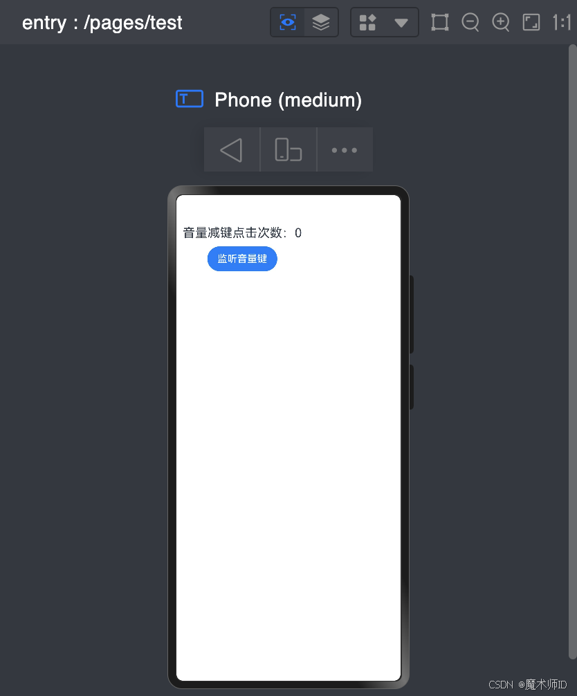
import { KeyCode } from '@kit.InputKit'@Entry
@Component
struct Test {@State volumeDownCount: number = 0build() {Column() {Text(`音量减键点击次数:${this.volumeDownCount}`).fontSize(20).padding(10)// 绑定按钮的onKeyEvent监听Button('监听音量键').defaultFocus(true) // 获取焦点才能触发事件.onKeyEvent((event: KeyEvent) => {if (event.keyCode === KeyCode.KEYCODE_BRIGHTNESS_DOWN) {this.volumeDownCount++}})}}
}
2. 基础-组件状态
用途:通过状态管理实现UI与数据的动态绑定,状态变化时自动触发UI更新。
关键装饰器
| 装饰器 | 用途 | 适用场景 |
|---|---|---|
@State | 定义组件内部的私有状态变量。 | 组件内部数据管理(如表单输入、计数器) |
@LocalStorage | 页面级临时存储(页面关闭后可能保留)。 | 表单草稿保存、页面数据缓存 |
@AppStorage | 应用级全局状态(应用生命周期内有效)。 | 用户登录Token、主题配置 |
示例代码
- 示例1:@State 简单数据
import { promptAction } from '@kit.ArkUI'@Entry
@Component
struct Test {// 1.数据需要声明后才能使用,声明时需要标注类型// 2.数据改变后需要响应式更新到页面上,需要给数据添加@State修饰符@State username: string = ''@State password: string = ''build() {Column({space:10}) {// 用户名输入框TextInput({ placeholder: '用户名', text: this.username }).onChange((value: string) => {this.username = value // 更新状态})// 密码输入框TextInput({ placeholder: '密码', text: this.password}).onChange((value: string) => {this.password = value})// 登录按钮Button('登录').onClick(() => {if (this.username === 'admin' && this.password === '123') {promptAction.showToast({ message: '登录成功!' })} else {promptAction.showToast({ message: '用户名或密码错误!' })}}).width('100%')}.padding(10).width('100%')}
}
数据结构说明
| 类型分类 | 类型名称 | 示例 | 描述 | 备注 |
|---|---|---|---|---|
| 基本数据类型 | string | @State name: string = "张三" | 字符串类型 | 支持单引号、双引号、模板字符串 |
number | @State age: number = 25; | 数字类型 | 不区分整型和浮点型 | |
boolean | @State isActive: boolean = true; | 布尔类型 | 只有 true/false 两个值 | |
null | @State empty: null = null; | 空值类型 | 需显式声明类型 | |
undefined | @State data: undefined = undefined; | 未定义类型 | 通常用于未初始化的变量 | |
| 引用数据类型 | Object | @State user: object = { name: "李四" } | 对象类型 | 不推荐直接使用 object,建议用接口约束 |
Array | @State names: Array<string> = [] | 数组类型 | 支持泛型语法 Array | |
Function | @State handler: () => void = () => {}; | 函数类型 | 支持箭头函数类型注解 | |
| 自定义类型 | Interface | typescript<br>interface Person {<br> name: string;<br> age?: number;<br>}<br> | 接口(约束对象结构) | ? 表示可选属性,支持继承和联合类型 |
Class | typescript<br>class Student {<br> name: string = "未知";<br> study() {}<br>}<br> | 类(包含属性和方法) | 支持继承、静态成员、访问修饰符(public/private) | |
| 特殊类型 | any | let dynamicData: any = "可赋任意值"; | 动态类型(绕过类型检查) | 慎用,会失去类型安全 |
void | function log(): void { console.log('...'); } | 无返回值类型 | 常用于函数返回值 | |
union | let id: string I number = "1001"; | 联合类型(多类型组合) | 通过 I 符号组合 | |
enum | typescript<br>enum Color {<br> Red,<br> Green = 2<br>}<br> | 枚举类型 | 支持数字/字符串枚举 |
3. 组件-双向绑定
界面渲染
1. 渲染-条件渲染
条件渲染可根据应用的不同状态,使用if、else和else if渲染对应状态下的UI内容。
@Entry
@Component
struct Index {@Stateloading: boolean = falsebuild() {Column({ space: 20 }){if (this.loading) {LoadingProgress().width(100).height(100)} else  {Text('后台数据')Text('后台数据')Text('后台数据')}Button('更新数据').onClick(() => {this.loading = truesetTimeout(() => {this.loading = false}, 2000)})}.width('100%').height('100%').justifyContent(FlexAlign.Center)}
}
2. 渲染-循环渲染
ForEach接口基于数组类型数据来进行循环渲染,需要与容器组件配合使用。
语法:
ForEach(// 数据源arr: Array,// 组件生成函数itemGenerator: (item: Array, index?: number) => void,// 键值生成函数keyGenerator?: (item: Array, index?: number): string => string
)
应用:
class User {id: stringname: stringage: number
}@Entry
@Component
struct Index {@StateuserList: User[] = []build() {Scroll() {Column({ space: 20 }) {// 循环渲染ForEach(// 1. 数据源this.userList,// 2. 组件生成函数(item: User) => {// 内容Text(`${item.name} 今年 ${item.age} 岁`)},// 3. 键值生成函数item => item.id)Button('加载更多').onClick(() => {const arr: User[] = []for (let index = 0; index < 10; index++) {arr.push({ id: Math.random().toString(), name: 'jack', age: Math.ceil(Math.random() * 100) })}this.userList.push(...arr)})}}.width('100%')}
}