文章目录
- 前言
- Select组件
- 1. 功能分析
- 2. 代码+详细注释说明
- 3. 使用方式
- 4. 效果展示
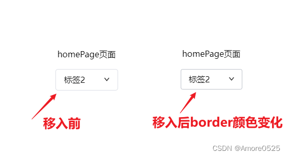
- (1)鼠标移入效果
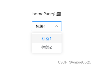
- (2)下拉框打开效果
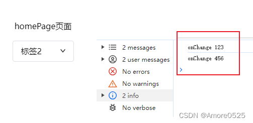
- (3)回调输出
- 总结
前言
今天这篇主要讲全局select组件封装,可根据UI设计师要求自定义修改。
Select组件
1. 功能分析
(1)鼠标移入,选中时,选择框样式处理
(2)定义Option和props的类型,用于表示组件的相关属性
(3)添加onChange属性,用于定义选中选项时的回调函数
(4)添加defaultValue属性,用于定义默认选中的选项
(5)添加placeholder属性,用于定义选项为空时的占位符文本
(6)添加className属性,用于定义组件的自定义类名
(7)使用react-outside-click-handler插件,实现点击外部区域时收起下拉框的功能
2. 代码+详细注释说明
// @/components/Select/index.tsx
import { useState, FC } from "react";
import OutsideClickHandler from "react-outside-click-handler";
import classNames from "classnames";
import styles from "./index.module.scss";
import Arrow from "@/assets/arrowDown.png";
// 定义Option的类型,用于表示选项的属性
type Option = {label: string; // 选项的显示文本value: string; // 选项的值
};// 定义Props的类型,用于表示组件的属性
type Props = {options: Option[]; // 选项数组onChange: (value: string) => void; // 选中选项时的回调函数defaultValue?: string; // 默认选中的选项值placeholder?: string; // 选项为空时的占位符文本className?: string; // 组件的自定义类名
};// 定义Select的组件,用于实现下拉选择框的功能
const Select: FC<Props> = (props) => {// 解构组件的属性const { options, onChange, defaultValue, placeholder, className } = props;// 获取默认选中的选项的显示文本const defaultLabel = options.find((option) => option.value === defaultValue)?.label;// 定义状态变量const [isExpanded, setIsExpanded] = useState(false); // 是否展开下拉框const [value, setValue] = useState(defaultLabel); // 当前选中的选项的显示文本const [currentIndex, setCurrentIndex] = useState(1); // 当前选中的选项的索引// 切换下拉框的展开状态const toggleExpand = () => {setIsExpanded(!isExpanded);};// option选项点击事件const handlerOptionClick = (option: Option, index: number) => {setValue(option.label); // 更新当前选中的选项的显示文本onChange(option.value); // 调用回调函数,通知父组件选中的选项值setCurrentIndex(index); // 更新当前选中的选项的索引toggleExpand(); // 切换下拉框的展开状态};return (// 使用OutsideClickHandler组件包裹根元素,用于处理点击外部区域的事件<OutsideClickHandler onOutsideClick={() => setIsExpanded(false)}><div className={classNames(styles.outsideContainer, className)}><div className={classNames(styles.selectContainer, isExpanded && styles.isFocused)} onClick={toggleExpand}><div className={classNames(styles.selectValue)}><div className={classNames(styles.selectText)}>{value ?? placeholder}</div></div><img src={Arrow} alt="" data-is-flipped={isExpanded} /></div>{isExpanded && (// 如果下拉框展开,则渲染选项列表<ul className={classNames(styles.selectOption)}>{options.map((option, index) => (<li className={classNames(styles.selectOptionItem, index === currentIndex && styles.selected)} key={option.value} onClick={() => handlerOptionClick(option, index)}><span className={classNames(styles.optionValue)}>{option.label}</span></li>))}</ul>)}</div></OutsideClickHandler>);
};export default Select;
------------------------------------------------------------------------------
// @/components/Button/index.module.scss
.outsideContainer {position: relative;
}.selectContainer {display: flex;align-items: center;justify-content: space-between;padding: 8px 16px;min-height: 40px;border-radius: var(--cd-border-radius-base);background-color: var(--cd-fill-color-blank);transition: var(--cd-transition-duration);box-shadow: 0 0 0 1px var(--cd-border-color);cursor: pointer;user-select: none;position: relative;&.isFocused {box-shadow: 0 0 0 1px var(--cd-shadow-color) inset;}&:hover:not(.isFocused) {box-shadow: 0 0 0 1px var(--cd-border-color-hover) inset;}.selectValue {display: flex;flex-wrap: wrap;align-items: center;flex: 1;min-width: 0;position: relative;.selectText {position: absolute;top: 50%;transform: translateY(-50%);width: 100%;text-align: left;overflow: hidden;text-overflow: ellipsis;white-space: nowrap;}}img {width: 10px;transform: rotate(0);transition: var(--cd-transition-duration);&[data-is-flipped="true"] {transform: rotateX(180deg);}}
}
.selectOption {min-width: fill-available;padding: 6px 0;margin-top: 5px;border-radius: 4px;list-style: none;background-color: #ffffff;border: 1px solid #e4e7ed;box-shadow: 0px 0px 12px rgba(0, 0, 0, 0.12);position: absolute;.selectOptionItem {font-size: 14px;padding: 0 20px;position: relative;white-space: nowrap;overflow: hidden;text-overflow: ellipsis;color: #606266;height: 34px;line-height: 34px;box-sizing: border-box;cursor: pointer;&:hover {background-color: #f5f7fa;}&.selected {color: var(--cd-shadow-color);}}
}
3. 使用方式
import { useState } from "react";
// 引入组件
import Select from "@/components/Select";
// 使用方式
const [options] = useState([{label: "标签1",value: "123",},{label: "标签2",value: "456",},
]);
const defaltValue = options[1].value
<Select options={options} onChange={onChange} defaultValue={defaltValue} placeholder="请选择"></Select>// 选择变化
const onChange = (value: string) => {console.log("onChange", value);
};
4. 效果展示
(1)鼠标移入效果
(2)下拉框打开效果
(3)回调输出
总结
下一篇讲【全局常用组件模态框Modal封装】。关注本栏目,将实时更新。