作为本系列的第一篇文章,不会过于的繁杂,并且前期的组件都会是比较简单的基础组件!但是不要忽视这些基础组件,因为纵观elementui、elementplus还是其他的流行组件库,组件库的封装都是套娃式的,很多复杂组件会用到基础组件,所以我们要打好基础,做好基础组件的封装,才能为后期的难度大的组件做好准备。
组件之GfTag
tag组件,类似于按钮组件,功能比按钮的少,可以说是精简版的按钮
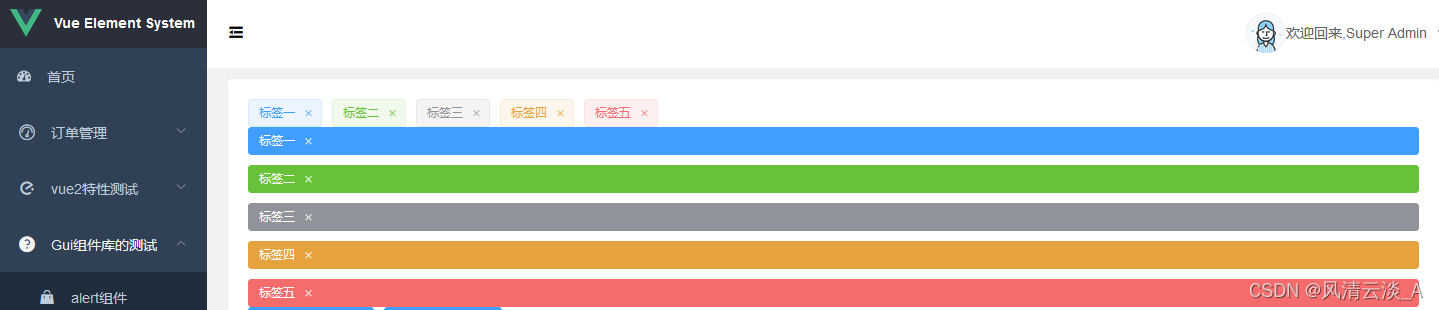
效果预览
属性
| 参数 | 类型 | 说明 | 可选值 | 默认值 |
|---|---|---|---|---|
| text | String | 标签的内容 | - | - |
| closable | Boolean | 是否可关闭 | true/false | false |
| hit | Boolean | 是否有边框描边 | true/false | false |
| disableTransitions | Boolean | 是否禁用渐变动画 | true/false | false |
| color | String | 背景色 | any | |
| size | String | 标签的内容 | medium / small / mini | — |
| effect | String | 标签的内容 | dark / light / plain | light |
代码实现
这里我们使用了function组件来实现tag组件,比较简洁灵活
<script>
export default {//组件的名字,我们在注册的时候使用name: "GfTag",props: {text: String,closable: Boolean,type: String,hit: Boolean,disableTransitions: {type: Boolean,default: true,},color: String,size: String,effect: {type: String,default: "light",validator(val) {return ["dark", "light", "plain"].indexOf(val) !== -1;},},},computed: {tagSize() {//this.$ELEMENT是挂在在Vue.prototype.$ELEMENT上的属性return this.size || (this.$ELEMENT || {}).size;},},methods: {//点击标签抛出的回调事件handleClick(e) {this.$emit("click", e);},//关闭标签抛出的回调事件handleClose(e) {e.stopPropagation();this.$emit("close", e);},},render(h) {const { type, tagSize, hit, effect } = this;const classes = ["el-tag",type ? `el-tag--${type}` : "",tagSize ? `el-tag--${tagSize}` : "",hit && "is-hit",effect && `el-tag--${effect}`,];const tagEle = (<spanclass={classes}style={{ backgroundColor: this.color }}onClick={this.handleClick}>{this.$slots.default ? this.$slots.default : this.text}{this.closable && (<i class="el-tag__close el-icon-close" onClick={this.handleClose}></i>)}</span>);return this.disableTransitions ? (tagEle) : (<transitions name="el-zoom-in-center">{tagEle}</transitions>);},
};
</script>
样式文件可以参考elementui的实现,后面会写一篇文章详细分析组件库的样式怎么去写的文章,敬请关注
使用
<Gf-space flex gap="10"><gf-tagclosable@close="handleTagClose"v-for="item in tags":key="item.name":type="item.type">{{ item.name }}</gf-tag></Gf-space><Gf-space flex gap="10" direction="column"><gf-tagclosableeffect="dark"@close="handleTagClose"v-for="item in tags":key="item.name":type="item.type">{{ item.name }}</gf-tag></Gf-space>

这样,我们就实现了自己的tag组件