文章目录
- 1、案例效果
- 1、按钮分类
- 2、E类按钮功能实现与封装
- 1.文件创建与代码实现
- 2、样式引用与封装
- 3、F类按钮功能实现与封装
- 1、文件创建与代码实现
- 2、样式引用与封装
- 3、按钮案例演示
- 1、页面实现与文件创建
- 2、运行效果如下
- 4、源代码获取
1、案例效果
1、按钮分类
在WPF开发中,最常见的就是按钮的使用,这里我们总结以下大概的按钮种类,然后分别实现对应的按钮。
A【纯文字按钮】 只有文字,但是会根据根据操作改变颜色
B【纯图片按钮 】只有图片,但是会有图片旋转或者变色特效
C【文字图片按钮】图片在左,文字在右边,有部分特效
D【文字图片按钮】图片在右,文字在左边,有部分特效
E【文字图片按钮】图片在上,文字在下,有部分特效
F【文字图片按钮】图片在下,文字在上,有部分特效
2、E类按钮功能实现与封装
1.文件创建与代码实现
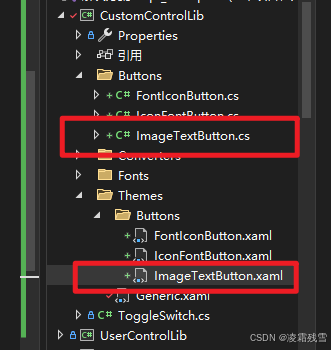
打开 Wpf_Examples 项目,在自定义按钮类库中创建 ImageTextButton.cs 文件 和 ImageTextButton.xaml 资源样式文件。完成后如下图所示:
ImageTextButton.cs 代码如下所示:
using System;
using System.Collections.Generic;
using System.Linq;
using System.Text;
using System.Threading.Tasks;
using System.Windows;
using System.Windows.Controls;
using System.Windows.Media;namespace CustomControlLib.Buttons
{public class ImageTextButton : Button{public static readonly DependencyProperty ImageSourceProperty =DependencyProperty.Register("ImageSource", typeof(ImageSource), typeof(ImageTextButton));public ImageSource ImageSource{get => (ImageSource)GetValue(ImageSourceProperty);set => SetValue(ImageSourceProperty, value);}public static readonly DependencyProperty TextProperty =DependencyProperty.Register("Text", typeof(string), typeof(ImageTextButton));public string Text{get => (string)GetValue(TextProperty);set => SetValue(TextProperty, value);}public static readonly DependencyProperty IsDashedBorderProperty =DependencyProperty.Register("IsDashedBorder", typeof(bool), typeof(ImageTextButton), new PropertyMetadata(false, OnIsDashedBorderChanged));public bool IsDashedBorder{get => (bool)GetValue(IsDashedBorderProperty);set => SetValue(IsDashedBorderProperty, value);}private static void OnIsDashedBorderChanged(DependencyObject d, DependencyPropertyChangedEventArgs e){((ImageTextButton)d).InvalidateVisual();}public ImageTextButton(){DefaultStyleKey = typeof(ImageTextButton);}}
}
ImageTextButton.xaml 样式代码如下:
<ResourceDictionary xmlns="http://schemas.microsoft.com/winfx/2006/xaml/presentation"xmlns:x="http://schemas.microsoft.com/winfx/2006/xaml"xmlns:local="clr-namespace:CustomControlLib.Buttons"><Style TargetType="{x:Type local:ImageTextButton}"><Setter Property="Width" Value="60"/><Setter Property="Height" Value="60"/><Setter Property="Template"><Setter.Value><ControlTemplate TargetType="{x:Type local:ImageTextButton}"><Border x:Name="Border"BorderBrush="Gray"BorderThickness="1"CornerRadius="8"Background="Transparent"SnapsToDevicePixels="true" Opacity="1" Width="{TemplateBinding Width}" Height="{TemplateBinding Height}"><Grid><Grid.RowDefinitions><RowDefinition Height="65*"/><RowDefinition Height="35*"/></Grid.RowDefinitions><Image x:Name="Image" Grid.Row="0"Source="{TemplateBinding ImageSource}"HorizontalAlignment="Center"VerticalAlignment="Center" Margin="0 5 0 0" Opacity="1"/><TextBlock x:Name="TextBlock" Grid.Row="1"Text="{TemplateBinding Text}"HorizontalAlignment="Center"VerticalAlignment="Center"FontSize="14"Foreground="Black" Opacity="1"/></Grid></Border><ControlTemplate.Triggers><Trigger Property="IsMouseOver" Value="True"><Setter Property="Background" Value="LightGray" TargetName="Border"/><Setter Property="BorderThickness" Value="0" TargetName="Border"/></Trigger><Trigger Property="IsPressed" Value="True"><Setter Property="Background" Value="DarkGray" TargetName="Border"/></Trigger><Trigger Property="IsEnabled" Value="True"><Setter Property="Background" Value="DarkGray" TargetName="Border"/></Trigger><Trigger Property="IsEnabled" Value="False"><Setter Property="Foreground" Value="Gray"/><Setter Property="Background" Value="LightGray" TargetName="Border"/></Trigger><Trigger Property="IsDashedBorder" Value="True"><Setter Property="IsEnabled" Value="false"/><Setter Property="Opacity" Value="0.6" TargetName="Border"/><Setter Property="Opacity" Value="0.6" TargetName="Image"/><Setter Property="Opacity" Value="0.6" TargetName="TextBlock"/><Setter Property="Foreground" Value="Gray"/><Setter Property="BorderBrush" TargetName="Border"><Setter.Value><VisualBrush Stretch="Fill" TileMode="Tile"><VisualBrush.Visual><Rectangle StrokeDashArray="2 1" Stroke="Gray" StrokeThickness="1" Width="50" Height="50"/></VisualBrush.Visual></VisualBrush></Setter.Value></Setter></Trigger></ControlTemplate.Triggers></ControlTemplate></Setter.Value></Setter></Style></ResourceDictionary>
2、样式引用与封装
完成按钮样式后,只需要在 Generic.xaml 文件中引用 按钮样式即完成整个按钮的封装了,这样只要项目引用 自定义按钮库即可使用该自定义按钮了。
<ResourceDictionary.MergedDictionaries><ResourceDictionary Source="pack://application:,,,/CustomControlLib;component/Themes/Buttons/IconFontButton.xaml" /><ResourceDictionary Source="pack://application:,,,/CustomControlLib;component/Themes/Buttons/FontIconButton.xaml" /><ResourceDictionary Source="pack://application:,,,/CustomControlLib;component/Themes/Buttons/ImageTextButton.xaml" />
</ResourceDictionary.MergedDictionaries>
3、F类按钮功能实现与封装
1、文件创建与代码实现
F类功能按钮其实就是E类按钮样式中图片与文本的交换,和CD类似。
在自定义控件库中新建 TextImageButton.cs 和样式文件 TextImageButton.xaml 。如下所示:

TextImageButton.cs 代码如下所示:
using System;
using System.Collections.Generic;
using System.Linq;
using System.Text;
using System.Threading.Tasks;
using System.Windows;
using System.Windows.Controls;
using System.Windows.Media;namespace CustomControlLib.Buttons
{public class TextImageButton : Button{public static readonly DependencyProperty ImageSourceProperty =DependencyProperty.Register("ImageSource", typeof(ImageSource), typeof(TextImageButton));public ImageSource ImageSource{get => (ImageSource)GetValue(ImageSourceProperty);set => SetValue(ImageSourceProperty, value);}public static readonly DependencyProperty TextProperty =DependencyProperty.Register("Text", typeof(string), typeof(TextImageButton));public string Text{get => (string)GetValue(TextProperty);set => SetValue(TextProperty, value);}public static readonly DependencyProperty IsDashedBorderProperty =DependencyProperty.Register("IsDashedBorder", typeof(bool), typeof(TextImageButton), new PropertyMetadata(false, OnIsDashedBorderChanged));public bool IsDashedBorder{get => (bool)GetValue(IsDashedBorderProperty);set => SetValue(IsDashedBorderProperty, value);}private static void OnIsDashedBorderChanged(DependencyObject d, DependencyPropertyChangedEventArgs e){((TextImageButton)d).InvalidateVisual();}public TextImageButton(){DefaultStyleKey = typeof(TextImageButton);}}
}
TextImageButton.xaml 代码实现如下:
<ResourceDictionary xmlns="http://schemas.microsoft.com/winfx/2006/xaml/presentation"xmlns:x="http://schemas.microsoft.com/winfx/2006/xaml"xmlns:local="clr-namespace:CustomControlLib.Buttons"><Style TargetType="{x:Type local:TextImageButton}"><Setter Property="Width" Value="60"/><Setter Property="Height" Value="60"/><Setter Property="Template"><Setter.Value><ControlTemplate TargetType="{x:Type local:TextImageButton}"><Border x:Name="Border"BorderBrush="Gray"BorderThickness="1"CornerRadius="8"Background="Transparent"SnapsToDevicePixels="true" Opacity="1" Width="{TemplateBinding Width}" Height="{TemplateBinding Height}"><Grid><Grid.RowDefinitions><RowDefinition Height="35*"/><RowDefinition Height="65*"/></Grid.RowDefinitions><TextBlock x:Name="TextBlock" Grid.Row="0" Text="{TemplateBinding Text}" HorizontalAlignment="Center" VerticalAlignment="Center" FontSize="14" Foreground="Black" Opacity="1"/><Image x:Name="Image" Grid.Row="1"Source="{TemplateBinding ImageSource}"HorizontalAlignment="Center"VerticalAlignment="Center" Margin="0 5 0 0" Opacity="1"/></Grid></Border><ControlTemplate.Triggers><Trigger Property="IsMouseOver" Value="True"><Setter Property="Background" Value="LightGray" TargetName="Border"/><Setter Property="BorderThickness" Value="0" TargetName="Border"/></Trigger><Trigger Property="IsPressed" Value="True"><Setter Property="Background" Value="DarkGray" TargetName="Border"/></Trigger><Trigger Property="IsEnabled" Value="False"><Setter Property="Foreground" Value="Gray"/><Setter Property="Background" Value="LightGray" TargetName="Border"/></Trigger><Trigger Property="IsDashedBorder" Value="True"><Setter Property="IsEnabled" Value="false"/><Setter Property="Opacity" Value="0.6" TargetName="Border"/><Setter Property="Opacity" Value="0.6" TargetName="Image"/><Setter Property="Opacity" Value="0.6" TargetName="TextBlock"/><Setter Property="Foreground" Value="Gray"/><Setter Property="BorderBrush" TargetName="Border"><Setter.Value><VisualBrush Stretch="Fill" TileMode="Tile"><VisualBrush.Visual><Rectangle StrokeDashArray="2 1" Stroke="Gray" StrokeThickness="1" Width="50" Height="50"/></VisualBrush.Visual></VisualBrush></Setter.Value></Setter></Trigger></ControlTemplate.Triggers></ControlTemplate></Setter.Value></Setter></Style>
</ResourceDictionary>
2、样式引用与封装
<ResourceDictionary.MergedDictionaries><ResourceDictionary Source="pack://application:,,,/CustomControlLib;component/Themes/Buttons/IconFontButton.xaml" /><ResourceDictionary Source="pack://application:,,,/CustomControlLib;component/Themes/Buttons/FontIconButton.xaml" /><ResourceDictionary Source="pack://application:,,,/CustomControlLib;component/Themes/Buttons/ImageTextButton.xaml" /><ResourceDictionary Source="pack://application:,,,/CustomControlLib;component/Themes/Buttons/TextImageButton.xaml" /></ResourceDictionary.MergedDictionaries>
完成按钮样式后,只需要在 Generic.xaml 文件中引用 按钮样式即完成整个按钮的封装了,这样只要项目引用 自定义按钮库即可使用该自定义按钮了。
3、按钮案例演示
1、页面实现与文件创建
这里我们继续在上一节的按钮文件界面上增加样式布局即可,如下所示:
<Border Background="White" Grid.Row="2"><Grid ><Grid.ColumnDefinitions><ColumnDefinition/><ColumnDefinition/></Grid.ColumnDefinitions><Grid><Grid.RowDefinitions><RowDefinition/><RowDefinition/></Grid.RowDefinitions><StackPanel Orientation="Horizontal" VerticalAlignment="Center" HorizontalAlignment="Right"><TextBlock Text="双按钮状态控制,边框同时虚线实线切换" FontSize="15" VerticalAlignment="Center" HorizontalAlignment="Center" Margin="0 0 10 0"/><cc:ImageTextButton Text="开始生产" ToolTip="开始生产" IsDashedBorder="{Binding SystemStatus}" Command="{Binding ButtonClickCmd}" CommandParameter="{Binding RelativeSource={RelativeSource Mode=Self},Path=ToolTip}" Width="70" Height="70" Margin="0,0,5,0" ImageSource="pack://application:,,,/Wpf_Examples;component/Assets/Images/Start.png"/><cc:ImageTextButton Text="停止生产" ToolTip="停止生产" IsDashedBorder="{Binding SystemStatus,Converter={StaticResource InverseBooleanConverter}}" Command="{Binding ButtonClickCmd}" CommandParameter="{Binding RelativeSource={RelativeSource Mode=Self},Path=ToolTip}" Width="70" Height="70" Margin="0,0,5,0" ImageSource="pack://application:,,,/Wpf_Examples;component/Assets/Images/Stop.png"/></StackPanel><StackPanel Orientation="Horizontal" VerticalAlignment="Center" HorizontalAlignment="Right" Grid.Row="1"><TextBlock Text="单按钮状态控制,切换背景图片和文本" FontSize="15" VerticalAlignment="Center" HorizontalAlignment="Center" Margin="0 0 10 0"/><cc:ImageTextButton Text="{Binding ButtonName}" Command="{Binding SingleButtonClickCmd}" ImageSource="{Binding ImageSource}" CommandParameter="{Binding RelativeSource={RelativeSource Mode=Self},Path=Text}" Width="70" Height="70" Margin="0,0,5,0" /></StackPanel></Grid><Grid Grid.Column="1"><Grid.RowDefinitions><RowDefinition/><RowDefinition/></Grid.RowDefinitions><StackPanel Orientation="Horizontal" VerticalAlignment="Center" HorizontalAlignment="Right"><TextBlock Text="双按钮状态控制,边框同时虚线实线切换" FontSize="15" VerticalAlignment="Center" HorizontalAlignment="Center" Margin="0 0 10 0"/><cc:TextImageButton Text="开始生产" ToolTip="开始生产" IsDashedBorder="{Binding SystemStatus}" Command="{Binding ButtonClickCmd}" CommandParameter="{Binding RelativeSource={RelativeSource Mode=Self},Path=ToolTip}" Width="70" Height="70" Margin="0,0,5,0" ImageSource="pack://application:,,,/Wpf_Examples;component/Assets/Images/Start.png"/><cc:TextImageButton Text="停止生产" ToolTip="停止生产" IsDashedBorder="{Binding SystemStatus,Converter={StaticResource InverseBooleanConverter}}" Command="{Binding ButtonClickCmd}" CommandParameter="{Binding RelativeSource={RelativeSource Mode=Self},Path=ToolTip}" Width="70" Height="70" Margin="0,0,5,0" ImageSource="pack://application:,,,/Wpf_Examples;component/Assets/Images/Stop.png"/></StackPanel><StackPanel Orientation="Horizontal" VerticalAlignment="Center" HorizontalAlignment="Right" Grid.Row="1"><TextBlock Text="单按钮状态控制,切换背景图片和文本" FontSize="15" VerticalAlignment="Center" HorizontalAlignment="Center" Margin="0 0 10 0"/><cc:TextImageButton Text="{Binding ButtonName}" Command="{Binding SingleButtonClickCmd}" ImageSource="{Binding ImageSource}" CommandParameter="{Binding RelativeSource={RelativeSource Mode=Self},Path=Text}" Width="70" Height="70" Margin="0,0,5,0" /></StackPanel></Grid></Grid></Border>
ButtonViewModel.cs 后台功能代码实现如下:
using CommunityToolkit.Mvvm.ComponentModel;
using CommunityToolkit.Mvvm.Input;
using System;
using System.Collections.Generic;
using System.Linq;
using System.Text;
using System.Threading.Tasks;
using System.Windows;
using System.Windows.Media.Imaging;
using Wpf_Examples.Views;namespace Wpf_Examples.ViewModels
{public class ButtonViewModel:ObservableObject{/// <summary>/// 生产状态按钮名称/// </summary>private string buttonName;public string ButtonName{get { return buttonName; }set { SetProperty(ref buttonName, value); }}/// <summary>/// 系统运行状态/// </summary>private bool systemStatus = false;public bool SystemStatus{get { return systemStatus; }set { SetProperty(ref systemStatus, value); }}/// <summary>/// 产线状态/// </summary>private bool productStatus = false;public bool ProductStatus{get { return productStatus; }set { SetProperty(ref productStatus, value); }}/// <summary>/// 生产状态背景图/// </summary>private BitmapImage imageSource;public BitmapImage ImageSource{get { return imageSource; }set { SetProperty(ref imageSource, value); }}public RelayCommand<string> ButtonClickCmd { get; set; }public RelayCommand SingleButtonClickCmd { get; set; }public ButtonViewModel() {ButtonClickCmd = new RelayCommand<string>(BtnFun);SingleButtonClickCmd = new RelayCommand(StatusChange);StatusChange();}private void BtnFun(string obj){switch (obj){case "播放":MessageBox.Show("播放按钮是假的,不能播放,哈哈哈哈.....","提示",MessageBoxButton.OK);break;case "错误":MessageBox.Show("系统报错了,别怕,假的啦,哈哈哈哈.....", "提示", MessageBoxButton.OK);break;case "删除":MessageBox.Show("想要删除我,那是不可能的,哈哈哈哈.....", "提示", MessageBoxButton.OK);break;case "开始生产":SystemStatus = true;break;case "停止生产":SystemStatus = false;break;}}private void StatusChange(){if (!ProductStatus){ButtonName = "开始生产";ImageSource = new BitmapImage(new Uri("pack://application:,,,/Wpf_Examples;component/Assets/Images/Start.png"));ProductStatus = true;}else{ButtonName = "停止生产";ImageSource = new BitmapImage(new Uri("pack://application:,,,/Wpf_Examples;component/Assets/Images/Stop.png"));ProductStatus = false;}}}
}
2、运行效果如下

4、源代码获取
源代码是整个按钮系类的全部代码。下载后可直接运行,按钮时独立封装在自定义控件类库中,任何项目只需要拷贝这个自定义控件库引用即可使用。
CSDN 源代码下载链接:多种类型的自定义按钮控件实现与封装