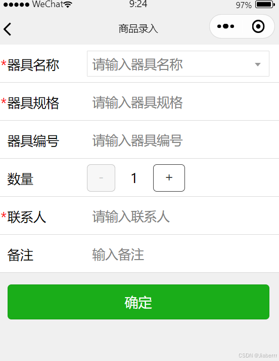
在uniapp开发过程中,表单组件的使用场景非常广泛。为了提高开发效率,我们可以将常用的表单组件进行封装。本文将带你了解如何在uniapp中封装一个表单组件,让你只需要通过属性配置轻松实现各种表单,效果图如下:
一、准备工作
在开始封装表单组件之前,请确保你已经掌握了以下知识:
1、uniapp基础知识
2、Vue.js基础知识
3、组件通信与传值
二、分析需求
在封装表单组件之前,我们需要明确以下需求:
1、支持多种表单元素(如:输入框、可下拉选择输入框、时间选择器、数字加减器、图片上传、下拉框等)
2、支持自定义确认和取消按钮
3、支持表单验证
4、支持添加插槽
5、支持表单数据提交
三、封装步骤
1、在uniapp项目的components目录下,创建一个名为customForm的文件夹,并在该文件夹下创建index.vue文件,文件代码如下:
<template><view><form @submit="formSubmit" @reset="formReset"><view v-for="(item, idx) in formConfig" :key="item.name"class="flex w-p-100 align-center row fz-17 relative"><view v-if="item.label" class="w-p-30">{{item.label}}</view><view v-if="item.require" class="inline-block absolute t-15 l-9 fz-18 text-red">*</view><!-- 输入框 --><input class="flex1 form-input" v-if="item.type=='input'" :placeholder="item.placeholder" :name="idx"v-model="data[idx]" :disabled="item.disabled" :type="item.inputType || 'text'"><!-- 下拉选择框 --><picker v-else-if="item.type=='picker'" @change="bindPickerChange" :data-index="idx":value="item.selectedIndex" :range="item.arrayData" :range-key="item.rangeKey" :name="idx"><input :value="item.rangeKey ? item.arrayData[item.selectedIndex]&&item.arrayData[item.selectedIndex][item.rangeKey] : item.arrayData[item.selectedIndex]"  disabled :placeholder="item.placeholder" class="uni-input" /></picker><!-- 时间选择 --><datePicker v-else-if="item.type=='datePicker'" :timeFormat="item.timeFormat"@datetimeChange="e => datetimeChange(e,idx)"></datePicker><!-- 图片上传 --><view v-else-if="item.type=='upLoad'" class="file-picker"><uni-file-picker :limit="item.limit" @select="e => handleSelect(e, item, idx)" @delete="e => deletePictrue(e, idx)":autoUpload="false" :value="data[idx]?[{url:data[idx]}]:''"></uni-file-picker></view><!-- 可下拉选择输入框 --><input-select class="flex1 fz-18" v-else-if="item.type == 'inputSelect'" :placeholder="item.placeholder":options="item.options" :value="data[idx]" @change="e => inputSelectChange(e, idx)"></input-select><!-- 数字加减器 --><view class="flex1 h-p-100 flex align-center" v-else-if="item.type == 'numberBox'"><uni-number-box @change="e => bindNumberChange(e, idx)" class="uni-number-box" :min="1"v-model="data[idx]" /></view><!-- 插槽 --><slot v-else-if="item.type == 'slot'" :name="item.slotName"></slot></view><view class="p-15"><button form-type="submit" type="primary">{{submitTxet}}</button><button v-if="reset" form-type="reset">{{resetText}}</button></view></form></view>
</template><script setup>import datePicker from '../datePicker/datePicker.vue';import {reactive,ref,watch,toRefs} from 'vue'import * as utils from '@/utils/index.js'const props = defineProps({reset: {type: Boolean,default: false},resetTxet: {type: String,default: '重置'},submitTxet: {type: String,default: '提交'},formConfig: {type: Object,required: true,default: () => {return {}}},resultData: {type: Object,default: () => {return {}}}})let data = reactive(props.resultData)// const pickerValue = ref('')const bindPickerChange = (e) => {let index = e.detail.value,idx = e.target.dataset.index,item = props.formConfig[idx]item.selectedIndex = indexdata[idx] = item.rangeKey ? item.arrayData[index][item.key || 'id'] : item.arrayData[index]}const handleSelect = (e, item, idx) => {if (item.success) {item.success(e, idx)} else {uploadSuccess(e, idx)}}const uploadSuccess = (e, idx) => {data[idx] = e.tempFilePaths[0]}const deletePictrue = (e, idx) => {data[idx] = ''}const datetimeChange = (e, idx) => {data[idx] = e.detail.valueStr}const inputSelectChange = (e, idx) => {data[idx] = e.detail.value}const bindNumberChange = (e, idx) => {data[idx] = e}const emit = defineEmits(['formSubmit'])const formSubmit = (e) => {let bool = utils.formVerify(data, props.formConfig)bool && emit('formSubmit', data)}
</script><style>.row {min-height: 90rpx;padding: 0 0 0 40rpx;box-sizing: border-box;border-bottom: 1px solid #ccc;}.file-picker {width: 264rpx;}.form-input {height: 90rpx;}
</style>
2、在父组件中使用:
父组件.vue文件中:
<template><view><customForm :formConfig="fromConfigRef" :resultData="resultData" submitTxet="确定" @formSubmit="formSubmit"></customForm></view>
</template><script setup>import {ref,reactive} from 'vue'import {fromConfig} from './fromConfig';
import {onLoad} from '@dcloudio/uni-app'import API from '@/api/index.js'const fromConfigRef = reactive(fromConfig)const resultData = reactive({})let statusIndex = nullonLoad(async(options) => {if(options.resultData) {let data = JSON.parse(decodeURIComponent(options.resultData)) // 更新响应式对象resultData的属性for (const key in data) {resultData[key] = data[key];}}statusIndex = options.statusIndexlet res = await API.SiteOrder.pullDownInstrumentName()fromConfigRef['factoryName'].options = res// console.log(fromConfigRef)})const formSubmit = (data) => {if(!data.number) {data.number = 1}const backData = {statusIndex,data}uni.navigateBack({delta: 1,success: () => {uni.$emit('pushData', backData)}})}
</script><style></style>
fromConfigRef.js配置文件:
export const fromConfig = {'factoryName':{label:'器具名称',type: 'inputSelect',placeholder: '请输入器具名称',options:[],require: true},'factoryFormat':{label:'器具规格',type: 'input',placeholder: '请输入器具规格',require: true},'factoryNo':{label:'器具编号',type: 'input',placeholder: '请输入器具编号'},'number':{label:'数量',type: 'numberBox'},'person':{label:'联系人',type: 'input',placeholder: '请输入联系人',require: true},'marks':{label:'备注',type: 'input',placeholder: '请输入备注',},
}
3、关于customForm组件的index.vue文件,有以下几点需要注意:
1、class样式
我采用了原子化css样式,所以在这个文件style中并没有太多的 样式 ,而是直接用了原子化css里面的class名,比如:class="flex",表示display:flex。原子化css文件已给出。
2、自定义组件
组件中datePicker、input-select为另外封装的自定义组件,主要实现了日期时间选择和可输入可选择下拉框。
datePicker.vue组件文件如下,如需要可自取:
<template><view style="height: 100%"><picker mode="multiSelector" :value="dateTime" @change="changeDateTime" @columnchange="changeDateTimeColumn" :range="dateTimeArray"><view class="weui-input"><block v-if="timeFormat == 'YYYY-MM-DD HH:mm'">{{ dateTimeArray && dateTimeArray[0][dateTime[0]] }}-{{ dateTimeArray && dateTimeArray[1][dateTime[1]] }}-{{ dateTimeArray && dateTimeArray[2][dateTime[2]] }} {{ dateTimeArray && dateTimeArray[3][dateTime[3]] }}:{{dateTimeArray && dateTimeArray[4][dateTime[4]]}}</block><block v-else>{{ dateTimeArray && dateTimeArray[0][dateTime[0]] }}-{{ dateTimeArray && dateTimeArray[1][dateTime[1]] }}-{{ dateTimeArray && dateTimeArray[2][dateTime[2]] }} {{ dateTimeArray && dateTimeArray[3][dateTime[3]] }}:{{dateTimeArray && dateTimeArray[4][dateTime[4]]}}:{{ dateTimeArray && dateTimeArray[5][dateTime[5]] }}</block></view></picker></view>
</template><script>
import * as utils from '@/utils/index.js'
export default {name:'datePicker',data() {return {dateTimeArray: null,//时间年月日时分秒数组dateTime: null,//选中的年月日时分秒每个数组的下标startYear: 1900,//起始年份endYear: 2200 //结束年份};},/*** 组件的属性列表*/props: {value: {type: String,default: ''},//默认值,不传为当前时间timeFormat: {type: String,default: 'YYYY-MM-DD HH:mm:ss'} //时间格式 YYYY-MM-DD HH:mm:ss 和 YYYY-MM-DD HH:mm两种},/*** 组件的方法列表*/methods: {attached() {//初始化var obj = utils.dateTimePicker(this.startYear, this.endYear, this.value);if (this.timeFormat == 'YYYY-MM-DD HH:mm') {//如果是精准到分,则去掉分的数据obj.dateTimeArray.pop();}this.dateTime = obj.dateTime;this.dateTimeArray = obj.dateTimeArray//将初始化后的时间值返回给绑定的valuelet dateTime = '';let dateTimeStr = '';if (this.timeFormat == 'YYYY-MM-DD HH:mm') {dateTime =this.dateTimeArray[0][this.dateTime[0]] +'-' +this.dateTimeArray[1][this.dateTime[1]] +'-' +this.dateTimeArray[2][this.dateTime[2]] +' ' +this.dateTimeArray[3][this.dateTime[3]] +':' +this.dateTimeArray[4][this.dateTime[4]];dateTimeStr =this.dateTimeArray[0][this.dateTime[0]] +'-' +this.dateTimeArray[1][this.dateTime[1]] +'-' +this.dateTimeArray[2][this.dateTime[2]] +'T' +this.dateTimeArray[3][this.dateTime[3]] +':' +this.dateTimeArray[4][this.dateTime[4]] +':00.000Z';} else {dateTime =this.dateTimeArray[0][this.dateTime[0]] +'-' +this.dateTimeArray[1][this.dateTime[1]] +'-' +this.dateTimeArray[2][this.dateTime[2]] +' ' +this.dateTimeArray[3][this.dateTime[3]] +':' +this.dateTimeArray[4][this.dateTime[4]] +':' +this.dateTimeArray[5][this.dateTime[5]];dateTimeStr =this.dateTimeArray[0][this.dateTime[0]] +'-' +this.dateTimeArray[1][this.dateTime[1]] +'-' +this.dateTimeArray[2][this.dateTime[2]] +'T' +this.dateTimeArray[3][this.dateTime[3]] +':' +this.dateTimeArray[4][this.dateTime[4]] +':' +this.dateTimeArray[5][this.dateTime[5]] +'.000Z';}this.$emit('datetimeChange', {detail: {value: dateTime,valueStr: dateTimeStr}});},changeDateTime(e) {this.dateTime = e.detail.valuelet dateTime = '';let dateTimeStr = '';if (this.timeFormat == 'YYYY-MM-DD HH:mm') {dateTime =this.dateTimeArray[0][this.dateTime[0]] +'-' +this.dateTimeArray[1][this.dateTime[1]] +'-' +this.dateTimeArray[2][this.dateTime[2]] +' ' +this.dateTimeArray[3][this.dateTime[3]] +':' +this.dateTimeArray[4][this.dateTime[4]];dateTimeStr =this.dateTimeArray[0][this.dateTime[0]] +'-' +this.dateTimeArray[1][this.dateTime[1]] +'-' +this.dateTimeArray[2][this.dateTime[2]] +'T' +this.dateTimeArray[3][this.dateTime[3]] +':' +this.dateTimeArray[4][this.dateTime[4]] +':00.000Z';} else {dateTime =this.dateTimeArray[0][this.dateTime[0]] +'-' +this.dateTimeArray[1][this.dateTime[1]] +'-' +this.dateTimeArray[2][this.dateTime[2]] +' ' +this.dateTimeArray[3][this.dateTime[3]] +':' +this.dateTimeArray[4][this.dateTime[4]] +':' +this.dateTimeArray[5][this.dateTime[5]];dateTimeStr =this.dateTimeArray[0][this.dateTime[0]] +'-' +this.dateTimeArray[1][this.dateTime[1]] +'-' +this.dateTimeArray[2][this.dateTime[2]] +'T' +this.dateTimeArray[3][this.dateTime[3]] +':' +this.dateTimeArray[4][this.dateTime[4]] +':' +this.dateTimeArray[5][this.dateTime[5]] +'.000Z';}this.$emit('datetimeChange', {detail: {value: dateTime,valueStr: dateTimeStr}});},changeDateTimeColumn(e) {var arr = this.dateTime;var dateArr = this.dateTimeArray;arr[e.detail.column] = e.detail.value;dateArr[2] = utils.getMonthDay(dateArr[0][arr[0]], dateArr[1][arr[1]]);this.dateTimeArray = dateArrthis.dateTime = arr}},mounted() {// 处理小程序 attached 生命周期this.attached();},created: function () {}
};
</script>
<style>
.icon-box-img {position: absolute;left: 5px;top: 8px;height: 10px;color: #ddd;
}
.weui-input {width: 200px;height: 2.5em;min-height: 2.5em;line-height: 2.5em;position: relative;border-radius: 3px;
}
</style>
input-select.vue组件代码如下,如需要可自取:
<template><view class="select-box"><view :class="isShow ? 'select-current-open' : 'select-current'" @tap.stop.prevent="openClose"><input @input="bindinput"  @blur="inputBlur" class="current-name" :placeholder="placeholder" v-model="inputValue" /></view><view class="option-list" v-if="isShow" @tap.stop.prevent="optionTap" style="overflow-y: auto; overflow-x: hidden; max-height: 200px"><text :data-index="index" :class="'option ' + (item.selection ? 'selection' : '')" v-for="(item, index) in result" :key="item.id">{{ item[label] }}</text></view></view>
</template><script>
export default {data() {return {result: [],//转换后的候选项数据selection: 'selection',//选中样式inputValue: '',//输入框的值isShow: false,index: null,// 选中的下标inputFocus: false //输入框是否有焦点};},props: {options: {type: Array,default: () => []},label: {type: String,default: 'name'},value: {type: String,default: ''},placeholder: {type: String,default: '请选择'}},watch: {//监听数据变化inputValue: function (value) {},options: function (value) {this.result = value},value: {handler(newValue, oldVal) {this.inputValue = newValue},immediate: true}},methods: {attached() {// 属性名称转换, 如果不是 { id: '', name:'' } 格式,则转为 { id: '', name:'' } 格式let result = [];if (this.key !== 'id' || this.text !== 'name' || this.text !== 'yes') {for (let item of this.options) {let { [this.key]: id, [this.text]: name, [this.selection]: selection } = item;result.push({id,name,selection});}}this.result = result},optionTap(e) {let that = this;let resuleObj = {flag: true}; //传递父组件的值.flag 表示是否是新增的 . true是新增,false不是新增this.index = e.target.dataset.index;this.inputValue = that.result[that.index][that.label]//选中的idvar id = this.result[this.index].id;for (var i = 0; i < this.options.length; i++) {if (this.options[i].id == id) {this.options[i].selection = true;resuleObj.id = this.options[i].id;resuleObj.flag = false;} else {this.options[i].selection = false;}}this.isShow = falsethis.result = this.optionsresuleObj.value = that.inputValue;//调用父组件方法,并传参this.$emit('change', {detail: resuleObj});},openClose() {//如果是获取到焦点的状况下,就不关闭下拉选项if (this.inputFocusFun && this.isShow) {return;}var that = this;this.isShow = !that.isShowif (!this.isShow) {this.closeSetInputValue();}//只要操作当前项,就是获取到当前项的焦点this.$emit('focus', {detail: {value: true}});},// 此方法供父组件调用close() {this.isShow = falsethis.closeSetInputValue();},closeSetInputValue() {//通过close和openClose方法隐藏选项时,设置inputValue的值let that = this;let inputValue = this.inputValue;//如果为空,直接返回if (!inputValue) {return;}//返回的数据结构let resuleObj = {flag: true};for (let i = 0; i < this.options.length; i++) {if (this.options[i][this.label] == inputValue) {this.options[i].selection = true;resuleObj.id = this.options[i].id;resuleObj.flag = false;} else {this.options[i].selection = false;}}resuleObj.value = that.inputValue;//调用父组件方法,并传参this.$emit('change', {detail: resuleObj});},inputFocusFun() {this.inputFocus = true},inputBlur() {this.inputFocus = false},bindinput(e) {var keyWord = e.detail.value;this.inputValue = e.detail.value;var tempresult = [];if (keyWord) {var obj = {id: -1};obj[this.label] = keyWord;tempresult.push(obj);}for (var i = 0; i < this.options.length; i++) {if (this.options[i][this.label] == keyWord) {this.options[i].selection = true;tempresult.push(this.options[i]);tempresult.splice(0, 1);continue;}if (this.options[i][this.label].indexOf(keyWord) != -1) {this.options[i].selection = false;tempresult.push(this.options[i]);}}this.result = tempresult}},mounted() {// 处理小程序 attached 生命周期this.attached();},created: function () {}
};
</script>
<style>
.select-box {position: relative;width: 100%;font-size: 17px;
}.select-current {position: relative;width: 100%;padding: 0 20px 0 6px;border: 1rpx solid #ddd;border-radius: 1px;box-sizing: border-box;line-height: 32px;
}.select-current::after {position: absolute;display: block;right: 10px;top: 15px;content: '';width: 0;height: 0;border: 4px solid transparent;border-top: 5px solid #999;
}.select-current-open {position: relative;width: 100%;padding: 0 20px 0 6px;border: 1rpx solid #ddd;border-radius: 1px;box-sizing: border-box;line-height: 32px;
}.select-current-open::after {position: absolute;display: block;right: 10px;top: 10px;content: '';width: 0;height: 0;border: 4px solid transparent;border-bottom: 5px solid #999;
}.selection {color: #00bbff;
}.current-name {display: block;width: 85%;height: 32px;word-wrap: normal;overflow: hidden;
}.option-list {position: absolute;font-size: 14px;left: 0;width: 100%;border-radius: 6rpx;box-sizing: border-box;z-index: 99;border: 1px solid #ddd;border-top: none;background-color: #fff;
}.option {display: block;width: 100%;line-height: 32px;height: 32px;border-bottom: 1px solid #eee;padding: 0 6px;
}.option:last-child {border-bottom: none;padding-bottom: 0;
}</style>
总结:
在实际项目中,你可以根据需求进一步完善组件功能,如添加自定义子组件、自定义样式等。掌握组件封装技巧,将有助于提高你的uniapp开发效率。