在本次开发中,我们将实现一个 Vue 组件,用于展示和切换标签页。
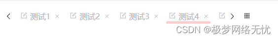
背景有移动动画效果

该组件将具有以下功能:
- 标签页左右滚动
- 点击标签页切换内容
- 关闭指定标签页
- 支持多种标签页风格
以下是实现该组件的具体步骤:
-
创建 Vue 组件
<template><!-- tag-items-smooth 圆润 .tag-items-card 卡片 .tag-items-smart 灵动的 --><div class="tacscontainerwidth tag-items-smart" :style="{ width: tabconf.tacscontainerwidth }"><!-- 左箭头按钮 --><el-icon @click="scrollLeft"><ArrowLeft /></el-icon><!-- 标签滚动条容器 --><div class="tacspage" :style="{ width: tabconf.tacspagewidth }" ref="scrollbarRef"><!-- 标签内容容器 --><div class="tag-items" :style="{ transform: `translateX(` + tabconf.translateX + `px)` }" ref="innerRef"><!-- 标签项 --><div v-for="(item, index) in tabconf.tacsitems":class="index === tabconf.activeIndex ? 'basistag basis-tag-item active' : 'basistag basis-tag-item'"style="z-index:99;width: max-content;" ref="tabsRefs" @click="tagitemchange(index)"><!-- 标签内容 --><div style="width: max-content;"><!-- 标签图标 --><component :is="item.icon" style="width: 15px;margin-right: 5px;" /><!-- 标签标题 --><span style="width: max-content;" :data-index="index">{{ item.title }}</span></div><!-- 关闭图标 --><el-icon class="tacscontainerwidth-Close" @click="closeTagItem(index)" style=""><Close /></el-icon></div><!-- 选中标签页的指示框-背景图--><div :style="activeBoxStyle" class="nav-tabs-active-box"></div></div></div><!-- 右箭头按钮 --><el-icon @click="scrollRight"><ArrowRight /></el-icon><!-- 更多下拉 --><el-dropdown style="margin-left: 15px;"><span class="username-span"><!-- 更多图标 --><el-icon><Grid /></el-icon></span><template #dropdown><el-dropdown-menu><!-- <el-dropdown-item command="user">刷新</el-dropdown-item> --><el-dropdown-item @click="CloseTagItemLeft()">关闭左侧</el-dropdown-item><el-dropdown-item @click="CloseTagItemRight()">关闭右侧</el-dropdown-item><el-dropdown-item @click="CloseTagItemOther()">关闭其他</el-dropdown-item><el-dropdown-item @click="CloseTagItemAll()">关闭全部</el-dropdown-item></el-dropdown-menu></template></el-dropdown></div> </template> -
引入所需的图标和组件
-
定义组件的样式(还没优化好、请自己定义)
<style scoped lang="scss">.fade-enter-active,.fade-leave-active {transition: opacity 0.3s;}.fade-enter,.fade-leave-to/* .fade-leave-active below version 2.1.8 */{opacity: 0;}.tacscontainerwidth {display: flex;align-items: center;position: absolute;.tacspage {overflow-y: hidden;overflow-x: scroll;scrollbar-width: none;-ms-overflow-style: none;/* 隐藏滚动条 */}}.tag-items {// white-space: nowrap;position: relative;// transition: transform 0.3s ease; display: flex;white-space: nowrap;position: relative;transition: transform var(--el-transition-duration);float: left;}.tag-items-card .basis-tag-item {margin-left: 10px;border: 1px solid #ccc;display: flex;display: flex;align-items: center;justify-items: center;}.tag-items-smooth .basis-tag-item {margin-left: 10px;border: 1px solid #ccc;border-radius: 5px;// width: 100px;display: flex;align-items: center;justify-items: center;}.tag-items-smart .basis-tag-item {margin-left: 10px;border: 0px;display: flex;align-items: center;}.basis-tag-item * {flex-shrink: 0;// display: flex;// align-items: center;// justify-items: center;}.nav-tabs-active-box {position: absolute;height: 5px;bottom: 0px;border-radius: var(--el-border-radius-base);background-color: #fcc;box-shadow: var(--el-box-shadow-light);transition: all 0.2s;-webkit-transition: all 0.2s;z-index: 2;}.basis-tag-item {padding: 5px;}.tag-items-smart .basis-tag-item {color: var(--el-color-info-light-3);// background-color: var(--el-menu-bg-color);}.active {color: var(--el-menu-text-color);// background-color: var(--el-menu-bg-color);border-bottom: 2px solid var(--el-menu-text-color);// background-color: #cfc;}.tacscontainerwidth-Close{margin-left: 5px;width: 14px; position: relative;font-size: 12px; height: 14px;overflow: hidden;right: -2px;transform-origin: 100% 50%;}@keyframes moveBackground {0% {background-position: left top;}100% {background-position: right top;}}</style>
-
定义组件的数据和方法
<script setup lang="ts"> import { onMounted, reactive, watchEffect, toRefs, ref, watch } from 'vue';// 定义组件的数据 const tabconf = reactive({// 偏移量max: 0,// 偏移量translateX: 0,// 标签长度tacspagewidth: "100%",// 激活 tab 的 indexactiveIndex: 3,// 激活的 tabactiveRoute: "",// tab 列表tacsitems: [{ id: 1, title: "测试 1", icon: "Edit", path: "path" },{ id: 2, title: "测试 2", icon: "Edit", path: "path" },{ id: 3, title: "测试 3", icon: "Edit", path: "path" },{ id: 4, title: "测试 4", icon: "Edit", path: "path" },{ id: 5, title: "测试 5", icon: "Edit", path: "path" },{ id: 6, title: "测试 6", icon: "Edit", path: "path" },{ id: 7, title: "测试 7", icon: "Edit", path: "path" },{ id: 8, title: "测试 8", icon: "Edit", path: "path" },{ id: 9, title: "测试 9", icon: "Edit", path: "path" },{ id: 10, title: "测试 10", icon: "Edit", path: "path" },{ id: 11, title: "测试 11", icon: "Edit", path: "path" },{ id: 12, title: "测试 12", icon: "Edit", path: "path" },{ id: 13, title: "测试 13 测试测试", icon: "Edit", path: "path" },{ id: 14, title: "测试 14", icon: "Edit", path: "path" },{ id: 15, title: "测试 15", icon: "Edit", path: "path" },{ id: 16, title: "测试 16", icon: "Edit", path: "path" },{ id: 17, title: "测试 17", icon: "Edit", path: "path" },{ id: 18, title: "测试 18", icon: "Edit", path: "path" },{ id: 19, title: "测试 19", icon: "Edit", path: "path" },{ id: 20, title: "测试 20", icon: "Edit", path: "path" },],// 容器宽度tacscontainerwidth: "50%" });// 定义组件的方法 // 向左滚动标签页 function scrollLeft() {tabconf.translateX -= 100; }// 向右滚动标签页 function scrollRight() {tabconf.translateX += 100; }// 关闭所有标签页 function CloseTagItemAll() {tabconf.tacsitems.splice(1, tabconf.tacsitems.length);tabconf.activeIndex = 0;tabconf.activeRoute = tabconf.tacsitems[0].path; }// 关闭其他标签页 function CloseTagItemOther() {CloseTagItemRight();CloseTagItemLeft(); }// 关闭左侧标签页 function CloseTagItemLeft() {if (tabconf.activeIndex === 0) {tabconf.activeIndex = 0;tabconf.activeRoute = tabconf.tacsitems[0].path;} else {tabconf.tacsitems.splice(1, tabconf.activeIndex - 1);tabconf.activeIndex = 1;tabconf.activeRoute = tabconf.tacsitems[1].path;} }// 关闭右侧标签页 function CloseTagItemRight() {const length = tabconf.tacsitems.length - tabconf.activeIndex;tabconf.tacsitems.splice(tabconf.activeIndex + 1, length); }// 关闭指定索引的标签页 function closeTagItem(index) {tabconf.tacsitems.splice(index, 1);if (tabconf.activeIndex >= index) {tabconf.activeIndex--;} else if (tabconf.activeIndex < 0) {tabconf.activeIndex = 0;} }// 切换标签页 function tagitemchange(index) {tabconf.activeIndex = index;tabconf.activeRoute = tabconf.tacsitems[index].path; }// 初始化组件 onMounted(() => {settagitemchange(); });// 设置标签页切换的样式 function settagitemchange() {const event = tabsRefs.value[tabconf.activeIndex];const element = event;const index = tabconf.activeIndex;const tacsitems = tabconf.tacsitems;tabconf.activeIndex = index;tabconf.activeRoute = tabconf.tacsitems[index].path;// 计算活动标签页的宽度const width = element.offsetWidth;// 获取元素的水平滚动位置const offsetLeft = element.offsetLeft;activeBoxStyle.width = width + 'px';activeBoxStyle.transform = `translateX(${offsetLeft}px)`; }// 用于更新缓存的函数,当前为空实现 function UpdateCache() {} </script> -
在模板中使用组件
通过以上步骤,我们实现了一个具有标签页切换功能的 Vue 组件。在实际应用中,可以根据需要进一步扩展和定制组件的功能。
希望这篇开发博客对你有所帮助!如果你有任何问题或建议,请随时留言。