教材
本书为《Python数据可视化》一书的配套内容,本章为第2章 使用matplotlib绘制简单图表
本文主要介绍了折线图、柱形图或堆积柱形图、条形图或堆积条形图、堆积面积图、直方图、饼图或圆环图、散点图或气泡图、箱形图、雷达图、误差棒图等绘制的图。

参考
政务可视化设计经验-图表习惯
数据可视化设计必修课(一):图表篇
一文讲透 | 大屏数据可视化图表选用指南
第2章 使用matplotlib绘制简单图表
绘制折线图
plot()函数
plot()函数可以快速地绘制折线图
plot(x, y, fmt, scalex=True, scaley=True, data=None,
label=None, *args, **kwargs)
x:表示x轴的数据,默认值为range(len(y))。
y:表示y轴的数据。
fmt:表示快速设置线条样式的格式字符串。
label:表示应用于图例的标签文本。
plot()函数会返回一个包含Line2D类对象(代表线条)的列表。
绘制具有多个线条的折线图
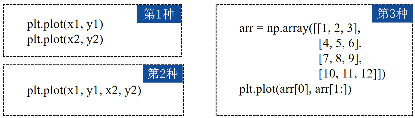
import numpy as np
import matplotlib.pyplot as plt
arr = np.array([[1, 2, 3], [4, 5, 6], [7, 8, 9], [10, 11, 12]])
lines= plt.plot(arr[0], arr[1:])
print("lines ",lines)
plt.show()
输出如下:
lines [<matplotlib.lines.Line2D object at 0x0000024B4C77E6C0>, <matplotlib.lines.Line2D object at 0x0000024B4C77E6F0>, <matplotlib.lines.Line2D object at 0x0000024B4C77E7E0>]

实例1:未来15天最高气温和最低气温
# 01_maximum_minimum_temperatures
import matplotlib.pyplot as plt
import numpy as np
x = np.arange(4, 19)
y_max = np.array([32, 33, 34, 34, 33, 31, 30, 29, 30, 29, 26, 23, 21, 25, 31])
y_min = np.array([19, 19, 20, 22, 22, 21, 22, 16, 18, 18, 17, 14, 15, 16, 16])
# 绘制折线图
plt.plot(x, y_max)
plt.plot(x, y_min)
plt.show()
输出为:

绘制柱形图或堆积柱形图
bar()函数
使用pyplot的bar()函数可以快速地绘制柱形图或堆积柱形图 。
bar(x, height, width=0.8, bottom=None, align='center', tick_label=None,
xerr=None, yerr=None, **kwargs)
x:表示柱形的x坐标值。
height:表示柱形的高度。
width:表示柱形的宽度,默认值为0.8。
bottom:表示柱形底部的y值,默认值为0。
align:表示柱形的对齐方式,包括center和edge两种,其中center表示将柱形中心与刻度线对齐;edge表示将柱形的左边或右边与刻度线对齐。
tick_label:表示柱形对应的刻度标签。
xerr,yerr :若未设为None,则需要为柱形图添加水平/垂直误差棒。
bar()函数会返回一个BarContainer类的对象。
BarContainer类的对象是一个包含柱形或误差棒的容器,它亦可以视为一个元组,可以遍历获取每个柱形或误差棒。
BarContainer类的对象也可以访问patches或errorbar属性分别获取图表中所有的柱形或误差棒。
绘制有一组柱形的柱形图
import numpy as np
import matplotlib.pyplot as plt
x = np.arange(5)
y1 = np.array([10, 8, 7, 11, 13])
# 柱形的宽度
bar_width = 0.3
# 绘制柱形图
plt.bar(x, y1, tick_label=['a', 'b', 'c', 'd', 'e'], width=bar_width)
输出为:

绘制有两组柱形的柱形图
import numpy as np
import matplotlib.pyplot as plt
x = np.arange(5)
y1 = np.array([10, 8, 7, 11, 13])
y2 = np.array([9, 6, 5, 10, 12])
# 柱形的宽度
bar_width = 0.3
# 根据多组数据绘制柱形图
plt.bar(x, y1, tick_label=['a', 'b', 'c', 'd', 'e'], width=bar_width)
plt.bar(x + bar_width, y2, width=bar_width)
plt.show()
输出为:

绘制堆积柱形图
在使用bar()函数绘制图表时,可以通过给该函数的bottom参数传值的方式控制柱形的y值,使后绘制的柱形位于先绘制的柱形的上方。
# 绘制堆积柱形图
import numpy as np
import matplotlib.pyplot as plt
x = np.arange(5)
y1 = np.array([10, 8, 7, 11, 13])
y2 = np.array([9, 6, 5, 10, 12])
# 柱形的宽度
bar_width = 0.3
plt.bar(x, y1, tick_label=['a', 'b', 'c', 'd', 'e'], width=bar_width)
plt.bar(x, y2, bottom=y1, width=bar_width)
plt.show()
输出为:

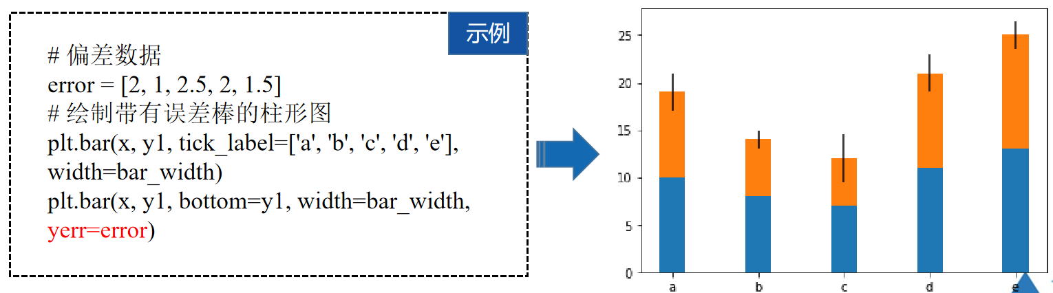
绘制有误差棒的柱形图
在使用bar()函数绘制图表时,还可以通过给xerr、yerr参数传值的方式为柱形添加误差棒。
import numpy as np
import matplotlib.pyplot as plt
x = np.arange(5)
y1 = np.array([10, 8, 7, 11, 13])
y2 = np.array([9, 6, 5, 10, 12])
# 柱形的宽度
bar_width = 0.3
# 偏差数据
error = [2, 1, 2.5, 2, 1.5]
# 绘制带有误差棒的柱形图
plt.bar(x, y1, tick_label=['a', 'b', 'c', 'd', 'e'], width=bar_width)
plt.bar(x, y1, bottom=y1, width=bar_width, yerr=error)
plt.show()
输出为:
实例2:2013-2019财年阿里巴巴淘宝和天猫平台的GMV
# 02_taobao_and_tianmao_GMV
import matplotlib.pyplot as plt
import numpy as np
x = np.arange(1, 8)
y = np.array([10770, 16780, 24440, 30920, 37670, 48200, 57270])
# 绘制柱形图
plt.bar(x, y, tick_label=["FY2013", "FY2014", "FY2015", "FY2016", "FY2017", "FY2018", "FY2019"], width=0.5)
plt.show()
输出为:

绘制条形图或堆积条形图
barh()函数
使用pyplot的barh()函数可以快速地绘制条形图或堆积条形图
barh(y, width, height=0.8, left=None, align='center', *, **kwargs)
y:表示条形的y坐标值。
width:表示条形的宽度。
height:表示条形的高度,默认值为0.8。
left:条形左侧的x坐标值,默认值为0。
align:表示条形的对齐方式,默认值为“center”,即条形与刻度线居中对齐。
tick_label:表示条形对应的刻度标签。
xerr,yerr:若未设为None,则需要为条形图添加水平/垂直误差棒。
barh()函数会返回一个BarContainer类的对象。
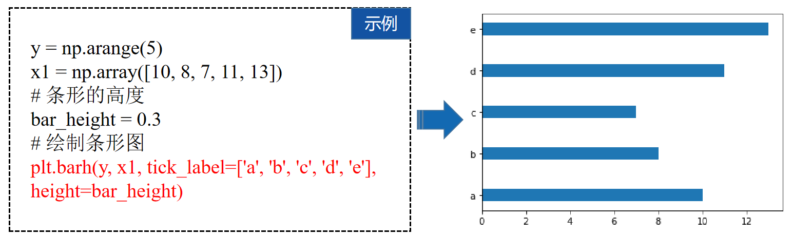
绘制有一组条形的条形图
import numpy as np
import matplotlib.pyplot as plt
y = np.arange(5)
x1 = np.array([10, 8, 7, 11, 13])
# 条形的高度
bar_height = 0.3
# 绘制条形图
plt.barh(y, x1, tick_label=['a', 'b', 'c', 'd', 'e'], height=bar_height)
plt.show()
输出为:
绘制有两组条形的条形图
import numpy as np
import matplotlib.pyplot as plt
y = np.arange(5)
x1 = np.array([10, 8, 7, 11, 13])
x2 = np.array([9, 6, 5, 10, 12])
# 条形的高度
bar_height = 0.3
# 根据多组数据绘制条形图
plt.barh(y, x1, tick_label=['a', 'b', 'c', 'd', 'e'], height=bar_height)
plt.barh(y+bar_height, x2, height=bar_height)
plt.show()
输出为:

绘制堆积条形图
在使用barh()函数绘制图表时,可以通过给left参数传值的方式控制条形的x值,使后绘制的条形位于先绘制的条形右方。
# 绘制堆积条形图
import numpy as np
import matplotlib.pyplot as plt
y = np.arange(5)
x1 = np.array([10, 8, 7, 11, 13])
x2 = np.array([9, 6, 5, 10, 12])
# 条形的高度
bar_height = 0.3
plt.barh(y, x1, tick_label=['a', 'b', 'c', 'd', 'e'], height=bar_height)
plt.barh(y, x2, left=x1, height=bar_height)
plt.show()
输出为:

绘制有误差棒的条形图
在使用barh()函数绘制图表时,可以通过给xerr、yerr参数传值的方式为条形添加误差棒。
import numpy as np
import matplotlib.pyplot as plt
y = np.arange(5)
x1 = np.array([10, 8, 7, 11, 13])
x2 = np.array([9, 6, 5, 10, 12])
# 偏差数据
error = [2, 1, 2.5, 2, 1.5]
# 绘制带有误差棒的条形图
plt.barh(y, x1, tick_label=['a', 'b', 'c', 'd', 'e'], height=bar_height)
plt.barh(y, x2, left=x1, height=bar_height, xerr=error)
plt.show()
输出为:

实例3:各商品种类的网购替代率
# 03_substitution_rate_online
import matplotlib.pyplot as plt
import numpy as np
# 显示中文
plt.rcParams['font.sans-serif'] = ['SimHei']
plt.rcParams['axes.unicode_minus'] = False
x = np.array([0.959, 0.951, 0.935, 0.924, 0.893, 0.892, 0.865, 0.863, 0.860, 0.856, 0.854, 0.835, 0.826, 0.816, 0.798, 0.765, 0.763, 0.67])
y = np.arange(1, 19)
labels = ["家政、家教、保姆等生活服务", "飞机票、火车票", "家具", "手机、手机配件", "计算机及其配套产品", "汽车用品", "通信充值、游戏充值", "个人护理用品", "书报杂志及音像制品", "餐饮、旅游、住宿", "家用电器", "食品、饮料、烟酒、保健品", "家庭日杂用品", "保险、演出票务", "服装、鞋帽、家用纺织品", "数码产品", "其他商品和服务", "工艺品、收藏品"]
# 绘制条形图
plt.barh(y, x, tick_label=labels, align="center", height=0.6)
plt.show()
输出为:

绘制堆积面积图
stackplot()函数
使用pyplot的stackplot()函数可以快速地绘制堆积面积图 。
stackplot(x, y,labels=(), baseline='zero', data=None, *args, **kwargs)
x:表示x轴的数据,可以是一维数组。
y:表示y轴的数据,可以是二维数组或一维数组序列。
labels:表示每个填充区域的标签。
baseline:表示计算基线的方法,包括zero、sym、wiggle和weighted_wiggle。其中zero表示恒定零基线,即简单的叠加图;sym表示对称于零基线;wiggle表示最小化平方斜率之和;weighted_wiggle表示执行相同的操作,但权重用于说明每个填充区域的大小。
stackplot()函数会返回一个FillBetweenPolyCollection类的对象。
绘制有三个填充区域的堆积面积图
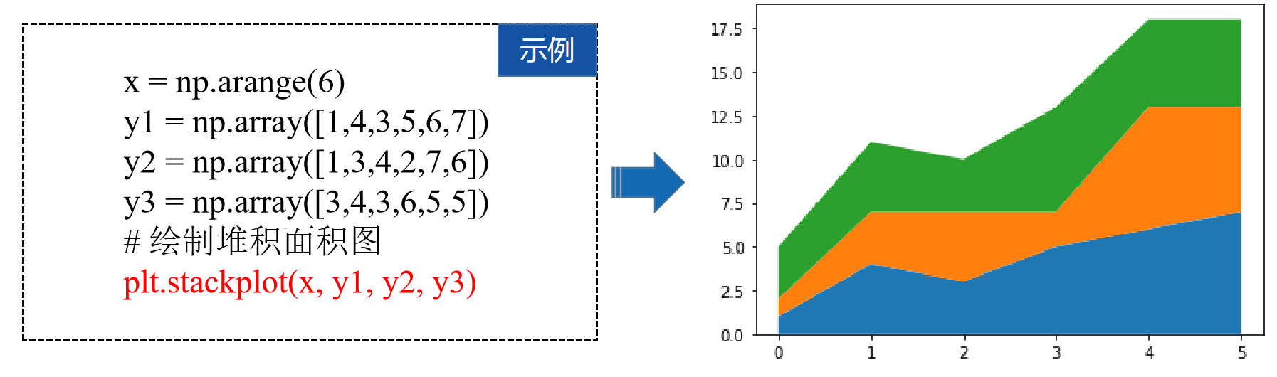
import numpy as np
import matplotlib.pyplot as plt
x = np.arange(6)
y1 = np.array([1,4,3,5,6,7])
y2 = np.array([1,3,4,2,7,6])
y3 = np.array([3,4,3,6,5,5])
# 绘制堆积面积图
plt.stackplot(x, y1, y2, y3)
#plt.show()
输出为:

实例4:物流公司物流费用统计
近些年我国物流行业蓬勃房展,目前已经有近几千家物流公司,其中部分物流公司大打价格战,以更低的价格吸引更多的客户,从而抢占市场份额。

# 04_logistics_cost_statistics
import numpy as np
import matplotlib.pyplot as plt
x = np.arange(1, 13)
y_a = np.array([198, 215, 245, 222, 200, 236, 201, 253, 236, 200, 266, 290])
y_b = np.array([203, 236, 200, 236, 269, 216, 298, 333, 301, 349, 360, 368])
y_c = np.array([185, 205, 226, 199, 238, 200, 250, 209, 246, 219, 253, 288])
# 绘制堆积面积图
plt.stackplot(x, y_a, y_b, y_c)
plt.show()
输出为:

绘制直方图
hist()函数
使用pyplot的hist()函数可以快速地绘制直方图 。
hist(x, bins=None, range=None, density=None, weights=None, bottom=None, **kwargs)
x:表示传入的数据,可以是一个数组或包含多个数组的序列。
bins:表示矩形条的个数,默认值为10。
range:表示数据的范围,若未设置范围,默认数据范围为(x.min(), x.max())。
cumulative:表示是否计算累计频数或频率。
histtype:表示直方图的类型,支持’bar’、‘barstacked’、‘step’、‘stepfilled‘四种取值,其中’bar’为默认值,代表传统的直方图;‘barstacked’代表堆积直方图;‘step’代表未填充的线条直方图;‘stepfilled’代表填充的线条直方图。
align:表示矩形条边界的对齐方式,可设置为’left’、‘mid’或’right’,默认为’mid’。
orientation:表示矩形条的摆放方式,默认为’vertical’,即垂直方向。
rwidth:表示矩形条的相对宽度,默认值为None,表示自动计算宽度。若histtype的值为’step’或’stepfilled’,则直接忽略rwidth参数。
stacked:表示是否将多个矩形条堆叠摆放。
hist()函数的返回值为Polygon类对象
绘制填充的线条直方图

import numpy as np
import matplotlib.pyplot as plt
# 准备 50个随机测试数据
scores = np.random.randint(0, 100, 50)
# 绘制直方图
plt.hist(scores, bins=8, histtype='stepfilled')
#plt.show()
输出为:

实例5:人脸识别的灰度直方图
人脸识别技术是一种生物特征识别技术,它通过从装有摄像头的终端设备拍摄的人脸图像中抽取人的个性化特征,以此来识别人的身份。

# 05_face_recognition
import matplotlib.pyplot as plt
import numpy as np
# 10000 个随机数
random_state = np.random.RandomState(19680801)
random_x = random_state.randn(10000)
# 绘制包含 25个矩形条的直方图
plt.hist(random_x, bins=25)
plt.show()
输出为:

绘制饼图或圆环图
pie()函数
使用pyplot的pie()函数可以快速地绘制饼图或圆环图
pie(x, explode=None, labels=None, autopct=None, pctdistance=0.6, startangle=None, *, data=None)
x:表示扇形或楔形对应的数据。
explode:表示扇形或楔形离开中心的距离。
labels:表示每个扇形或楔形对应的标签文本。
autopct:表示控制扇形或楔形的数值显示的字符串,可通过格式字符串指定小数点后的位数。
pctdistance:表示扇形或楔形对应的数值标签距离圆心的比例,默认为0.6。
shadow:表示是否显示阴影。
labeldistance:表示标签文本的绘制位置(相对于半径的比例),默认为1.1。
startangle:表示起始绘制角度,默认从x轴的正方向逆时针绘制。
radius:表示扇形或楔形围成的圆形半径。
wedgeprops:表示控制扇形或楔形属性的字典。例如,通过wedgeprops = {‘width’: 0.7} 将楔形的宽度设为0.7。
textprops:表示控制图表中文本属性的字典。
center:表示图表的中心点位置,默认为(0,0)。
frame:表示是否显示图框。
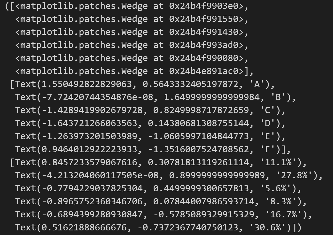
pie()函数返回值为Wedge 类
绘制饼图

import numpy as np
import matplotlib.pyplot as plt
data = np.array([20, 50, 10, 15, 30, 55])
pie_labels = np.array(['A', 'B', 'C', 'D', 'E', 'F'])
# 绘制饼图:半径为 0.5,数值保留1位小数
plt.pie(data, radius=1.5, labels=pie_labels, autopct='%3.1f%%')
plt.show()
输出为:

绘制圆环图
import numpy as np
import matplotlib.pyplot as plt
data = np.array([20, 50, 10, 15, 30, 55])
pie_labels = np.array(['A', 'B', 'C', 'D', 'E', 'F'])
# 绘制圆环图:外圆半径为1.5,楔形宽度为0.7
plt.pie(data, radius=1.5, wedgeprops={'width': 0.7}, labels=pie_labels,autopct='%3.1f%%', pctdistance=0.75)
plt.show()
输出为:

实例6:支付宝月账单报告

# 06_monthly_bills_of_alipay
import matplotlib.pyplot as plt
import matplotlib as mpl
mpl.rcParams['font.sans-serif'] = ['SimHei']
mpl.rcParams['axes.unicode_minus'] = False
# 饼图外侧的说明文字
kinds = ['购物', '人情往来', '餐饮美食', '通信物流', '生活日用', '交通出行', '休闲娱乐', '其他']
# 饼图的数据
money_scale = [800 / 3000, 100 / 3000, 1000 / 3000, 200 / 3000,300 / 3000, 200 / 3000, 200 / 3000, 200 / 3000]
dev_position = [0.1, 0.1, 0.1, 0.1, 0.1, 0.1, 0.1, 0.1]
# 绘制饼图
plt.pie(money_scale, labels=kinds, autopct='%3.1f%%', shadow=True,explode=dev_position, startangle=90)
plt.show()
输出为:

绘制散点图或气泡图
scatter()函数
使用pyplot的scatter()函数可以快速地绘制散点图或气泡图 。
scatter(x, y, s=None, c=None, marker=None, cmap=None, linewidths=None, edgecolors=None, *, **kwargs)
x,y:表示
数据点的位置。
s:表示数据点的大小。
c:表示数据点的颜色。
marker:表示数据点的样式,默认值是 ‘o‘,表示圆形。
alpha:表示透明度,可以取值为0~1。
linewidths:表示数据点的描边宽度,默认值是1.5。
edgecolors:表示数据点的描边颜色,默认值是’face’ 。
scatter()函数返回PathCollection 类
绘制散点图

import matplotlib.pyplot as plt
import matplotlib as mpl
import numpy as np
mpl.rcParams['font.sans-serif'] = ['SimHei']
mpl.rcParams['axes.unicode_minus'] = False
num = 50
x = np.random.rand(num)
y = np.random.rand(num)
plt.scatter(x, y)
输出为:

绘制气泡图

import matplotlib.pyplot as plt
import matplotlib as mpl
import numpy as np
num = 50
x = np.random.rand(num)
y = np.random.rand(num)
area = (30 * np.random.rand(num)) **2
plt.scatter(x, y, s=area)
输出为:

实例7:汽车速度与制动距离的关系


# 07_vehicle_speed_and_braking_distance
import numpy as np
import matplotlib.pyplot as plt
plt.rcParams['font.sans-serif'] = 'SimHei'
plt.rcParams['axes.unicode_minus'] = False
# 准备 x 轴和 y 轴的数据
x_speed = np.arange(10, 210, 10)
y_distance = np.array([0.5, 2.0, 4.4, 7.9, 12.3, 17.7, 24.1, 31.5, 39.9, 49.2,59.5, 70.8, 83.1, 96.4, 110.7,126.0, 142.2, 159.4, 177.6, 196.8])
# 绘制散点图
plt.scatter(x_speed, y_distance, s=50, alpha=0.9)
plt.show()
输出为:

绘制箱形图
boxplot()函数
使用pyplot的boxplot()函数可以快速地绘制箱形图。
boxplot(x, notch=None, sym=None, vert=None, whis=None, positions=None, widths=None, *, data=None)
x:绘制箱形图的数据。
sym:表示异常值对应的符号,默认为空心圆圈。
vert:表示是否将箱体垂直摆放,默认值是True,表示垂直摆放。
whis:表示箱形图上下须与上下四分位的距离,默认为1.5倍的四分位差。
positions:表示箱体的位置。
widths:表示箱体的宽度,默认为0.5。
patch_artist:表示是否填充箱体的颜色,默认不填充。
meanline:是否用横跨箱体的线条标出平均数,默认不使用。
showcaps:表示是否显示箱体顶部和底部的横线,默认显示。
showbox:表示是否显示箱形图的箱体,默认显示。
showfliers:表示是否显示异常值,默认显示。
labels:表示箱形图的标签。
boxprops:表示控制箱体属性的字典。
绘制不显示异常值的箱形图

import numpy as np
import matplotlib.pyplot as plt
data = np.random.randn(100)
# 绘制箱形图:显示中位数的线条、箱体宽度为0.3、填充箱体颜色、不显示异常值
plt.boxplot(data, meanline=True, widths=0.3, patch_artist=True,  showfliers=False)
输出为:

实例8:2017年和2018年全国发电量统计


# 08_generation_capacity
import numpy as np
import matplotlib.pyplot as plt
plt.rcParams['font.family'] = 'SimHei'
plt.rcParams['axes.unicode_minus'] = False
data_2018 = np.array([5200, 5254.5, 5283.4, 5107.8, 5443.3, 5550.6, 6400.2, 6404.9, 5483.1, 5330.2, 5543, 6199.9])
data_2017 = np.array([4605.2, 4710.3, 5168.9, 4767.2, 4947, 5203, 6047.4, 5945.5, 5219.6, 5038.1, 5196.3, 5698.6])
# 绘制箱形图
plt.boxplot([data_2018, data_2017], tick_labels=('2018年', '2017年'),meanline=True, widths=0.5, vert=False, patch_artist=True)
plt.show()
输出为:

绘制雷达图
polar()函数
使用polar()绘制雷达图

polar(theta, r, **kwargs)
theta:表示每个数据点所在射线与极径的夹角,单位是
弧度。
r:表示每个数据点到极点的距离。
thetagrids()函数
使用pyplot的thetagrids()函数可以设置极坐标轴的标签。
thetagrids(angles=None, labels=None, fmt=None, **kwargs)
angles :表示每个数据点所在射线与极径的夹角,单位是角度。
labels :表示每个极轴对应的标签。
角度转换为弧度公式:弧度 = 角度 ÷ 180 × π
弧度转换为角度公式:角度 = 弧度 × 180 ÷ π
案例一:绘制有3条连线的雷达图

import numpy as np
import matplotlib.pyplot as plt
theta1 = np.array([0, np.pi/2, np.pi, 3*np.pi/2])       # 极角
r1 = np.array([6, 6, 6, 6])   # 极径
# 绘制雷达图
plt.polar(theta1, r1)
输出为:

案例二:绘制有一个菱形的雷达图

import numpy as np
import matplotlib.pyplot as plt
# 极角
theta1 = np.array([0, np.pi/2, np.pi, 3*np.pi/2])
r1 = np.array([6, 6, 6, 6]) # 极径
# 拼接数组
r1 = np.concatenate((r1, [r1[0]]))
theta1 = np.concatenate((theta1, [theta1[0]]))
plt.polar(theta1, r1)
输出为:

案例三:绘制有标签的雷达图

import numpy as np
import matplotlib.pyplot as plt
# 极角
theta1 = np.array([0, np.pi/2, np.pi, 3*np.pi/2])
print("theta1 ",theta1)
# theta1  [0.         1.57079633 3.14159265 4.71238898]
r1 = np.array([6, 6, 6, 6]) # 极径
# 拼接数组
r1 = np.concatenate((r1, [r1[0]]))
theta1 = np.concatenate((theta1, [theta1[0]]))
# 标签
radar_labels = np.array(['维度(A)', '维度(B)', '维度(C)', '维度(D)','维度(A)'])
plt.polar(theta1, r1)
plt.thetagrids(theta1 * 180/np.pi, labels=radar_labels)
输出为:

案例四:绘制有填充菱形的雷达图

import numpy as np
import matplotlib.pyplot as plt
# 极角
theta1 = np.array([0, np.pi/2, np.pi, 3*np.pi/2])
print("theta1 ",theta1)
# theta1  [0.         1.57079633 3.14159265 4.71238898]
r1 = np.array([6, 6, 6, 6]) # 极径
# 拼接数组
r1 = np.concatenate((r1, [r1[0]]))
theta1 = np.concatenate((theta1, [theta1[0]]))
# 标签
radar_labels = np.array(['维度(A)', '维度(B)', '维度(C)', '维度(D)','维度(A)'])
plt.polar(theta1, r1)
plt.thetagrids(theta1 * 180/np.pi, labels=radar_labels)# 填充多边形
plt.fill(theta1, r1, alpha=0.3)
输出为:

实例9:霍兰德职业兴趣测试


# 09_holland_professional_interest_test
import numpy as np
import matplotlib.pyplot as plt
plt.rcParams['font.family'] = 'SimHei'
plt.rcParams['axes.unicode_minus'] = False
dim_num = 6
data = np.array([[0.40, 0.32, 0.35, 0.30, 0.30, 0.88],[0.85, 0.35, 0.30, 0.40, 0.40, 0.30],[0.43, 0.89, 0.30, 0.28, 0.22, 0.30],[0.30, 0.25, 0.48, 0.85, 0.45, 0.40],[0.20, 0.38, 0.87, 0.45, 0.32, 0.28],[0.34, 0.31, 0.38, 0.40, 0.92, 0.28]])
# 数据标准化 endpoint=False 不包括最后一个值
angles = np.linspace(0, 2 * np.pi, dim_num, endpoint=False)
# 闭合 [0.         1.04719755 2.0943951  3.14159265 4.1887902  5.23598776]
# print(angles)
angles = np.concatenate((angles, [angles[0]]))
# 闭合 列表的第一个元素等于最后一个元素
data = np.concatenate((data, [data[0]]))
# print("data \n",data)
# 维度标签
radar_labels = ['研究型(I)', '艺术型(A)', '社会型(S)', '企业型(E)', '传统型(C)', '现实型(R)']
# 闭合   ['研究型(I)' '艺术型(A)' '社会型(S)' '企业型(E)' '传统型(C)' '现实型(R)' '研究型(I)']
radar_labels = np.concatenate((radar_labels, [radar_labels[0]]))
# print(radar_labels)
# 绘制雷达图
plt.polar(angles, data)
# <matplotlib.lines.Line2D at 0x24b4fb7dcd0>
# 设置极坐标的标签
# print(angles * 180/np.pi) # [  0.  60. 120. 180. 240. 300.   0.]
plt.thetagrids(angles * 180/np.pi, labels=radar_labels)
# 填充多边形
plt.fill(angles, data, alpha=0.25) # 填充多边形
# <matplotlib.patches.Polygon at 0x24b510ca3c0>
# plt.show()
输出为:

误差棒图
errorbar()函数
使用pyplot的errorbar()函数可以快速地绘制误差棒图。
errorbar(x, y, yerr=None, xerr=None, fmt='', ecolor=None, *, data=None, **kwargs)
x,y:表示
数据点的位置。
xerr,yerr:表示数据的误差范围。
fmt:表示数据点的标记样式和数据点之间连接线的样式。
elinewidth:表示误差棒的线条宽度。
capsize:表示误差棒边界横杆的大小。
capthick:表示误差棒边界横杆的厚度。
errorbar()函数的返回值为ErrorbarContainer类
绘制误差棒图

import numpy as np
import matplotlib.pyplot as plt
x = np.arange(5)
y = (25, 32, 34, 20, 25)
y_offset = (3, 5, 2, 3, 3)
plt.errorbar(x, y, yerr=y_offset, capsize=3, capthick=2)
# plt.show()
输出为:

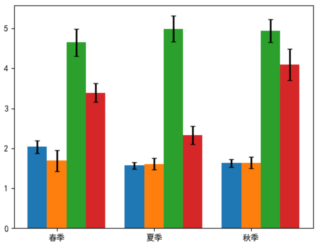
实例10:4个树种不同季节的细根生物量


# 10_fine_root_biomass
import numpy as np
import matplotlib.pyplot as plt
plt.rcParams['font.family'] = 'SimHei'
plt.rcParams['axes.unicode_minus'] = False
# 准备 x 轴和 y 轴的数据
x = np.arange(3)
y1 = np.array([2.04, 1.57, 1.63])
y2 = np.array([1.69, 1.61, 1.64])
y3 = np.array([4.65, 4.99, 4.94])
y4 = np.array([3.39, 2.33, 4.10])
# 指定测量偏差
error1 = [0.16, 0.08, 0.10]
error2 = [0.27, 0.14, 0.14]
error3 = [0.34, 0.32, 0.29]
error4 = [0.23, 0.23, 0.39]
bar_width = 0.2
# 绘制柱形图
plt.bar(x, y1, bar_width)
plt.bar(x + bar_width, y2, bar_width, align="center", tick_label=["春季", "夏季", "秋季"])
plt.bar(x + 2*bar_width, y3, bar_width)
plt.bar(x + 3*bar_width, y4, bar_width)
# 绘制误差棒 : 横杆大小为 3,  线条宽度为 3,  线条颜色为黑色, 数据点标记为像素点
plt.errorbar(x, y1, yerr=error1, capsize=3, elinewidth=2, fmt=' k,')
plt.errorbar(x + bar_width, y2, yerr=error2, capsize=3, elinewidth=2, fmt='k,')
plt.errorbar(x + 2*bar_width, y3, yerr=error3, capsize=3, elinewidth=2, fmt='k,')
plt.errorbar(x + 3*bar_width, y4, yerr=error4, capsize=3, elinewidth=2, fmt='k,')
plt.show()
输出为: